1. Introduction
This post is part of the submission for ISSS608 DataViz Makeover assignment 1. Data visualisation critique and makeover is done on one of the excerpt from “Labour Force in Singapore” 2019 annual report by Singapore Ministry of Manpower (link).
Data tables used are:
- Resident Labour Force Participation Rate by Age and Sex, 2009-2019 (June) - T5
- Resident Labour Force Aged Fifteen Years and Over by Age and Sex, 2009-2019 (June) - T7
Both of them can be found here
The assessment criteria will be based on the visualisation’s clarity and aesthetic, taking reference from “Data Visualization: Clarity or Aesthetics?” by Ben Jones.
He points out that a suitable visualisation type is critical to the clarity of information that we want to convey. A good visualisation should guide the reader in arriving at the correct conclusion as intended by the author. In addition, visual aesthetic plays important role in keeping the reader engaged and giving pleasant experience when looking at the visualisation. This could be in a form of good font and layout, as well as minimising/eliminating harmful “chartjunk”.
To quantify his assessment, he mapped the clarity and aesthetics of a visualisaiton into a cartesian coordinate system with 4 quadrants.
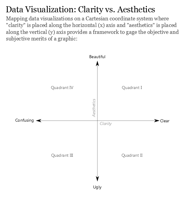
Figure 1: Clarity and aesthetics of data visualisation
The top left (Q4) refers to visualisation with low clarity but high aesthetics. This could be a visualisation with good design and layout, but the message is not clear. What we are trying to achieve is the ideal state (Q1), where the visualisation delivers clear message and aesthetically pleasant.
2. Critique and suggestion
The original data visualisation that will be assessed can be found in page 5 of the report.
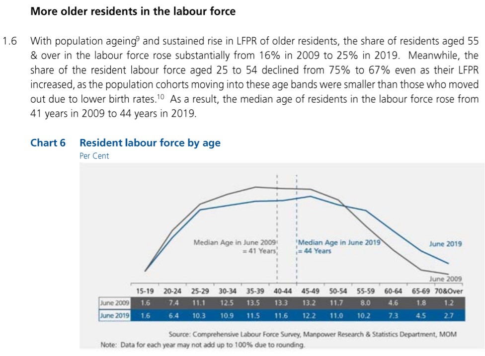
Figure 2: Original data visualisation of labour force by age group
In the 4 quadrant system, the original visualisation can be mapped into Q4 as it has a good aesthetic view, but the reader may find it difficult to tally the visualisation with the underlying conclusion.
Clarity
According to the explanation text preceding the visualisation, the author intends to compare the age distribution of labour force between 2009 and 2019 and highlight the increasing median age due to the following two observations:
- Increasing share of older residents (age 55 & above) in the labour force
- Declining share of younger residents (age 25-54) in the labour force
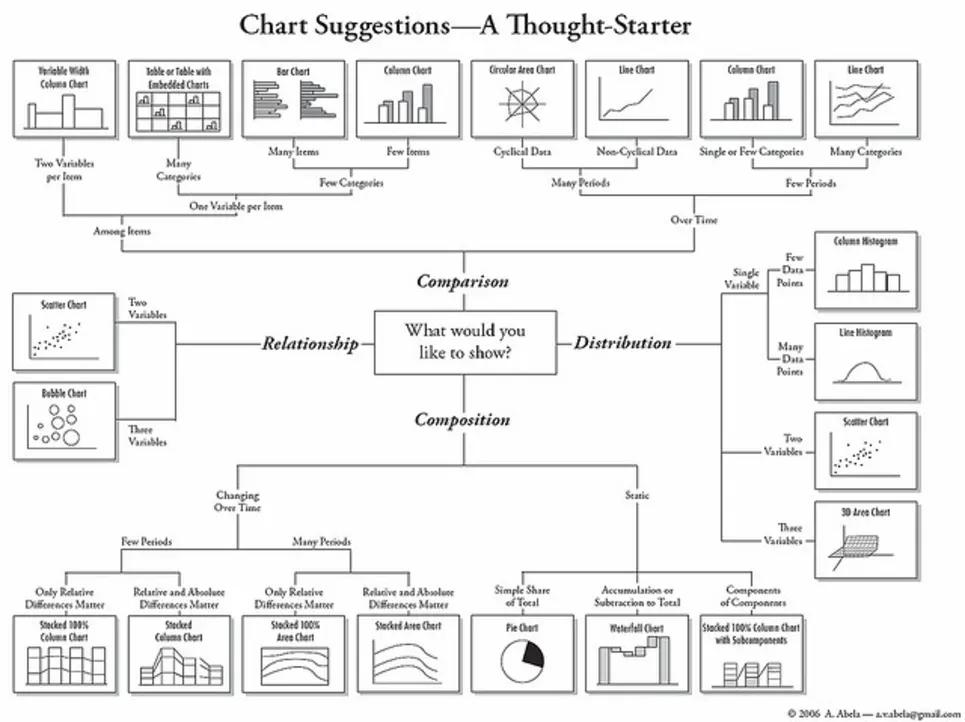
- While the median age is clearly represented by the two reference lines, the two observations above are not directly apparent. In this visualisation, the line chart provides the reader with a quick overview of the shape of distribution among different age groups. However, bar chart is a better option to compare 2009 and 2019 values. As a reference, the following rule of thumb suggest that bar chart is a suggested visualisation type to compare value among few categories, while line chart is more suitable for comparison across many periods.
The current visualisation does not directly provide the percentage change between the two group of interest (25-54 and 55 & above) between 2009 and 2019. Although the value for individual age group in the table allows reader to get to the percentage change (with some mental calculation), it could be added to the visualisation to make the conclusion more visible.
The title of the visualisation does not explain the basis of the percentage used. Although the preceding paragraph alludes to the percentage being a share from total labour force in the year, the title can do more to help reader understand the visualisation. We can amend the title to emphasise the percentage is based on the yearly total labour force.
Aesthetic
The choice of font type and its size are good and clear, which is also consistent throughout the report itself. In addition, differentiation of 2009 and 2019 are consistently done through both colour difference and labelling of line chart, making it easy for reader to differentiate between the two periods.
The author also removes unnecessary data-ink by omitting the y-axis which directs reader straight to the shape of the distribution. However, this requires the author to provide the percentage value in tabular format for reader to make comparison. Positioning of median age at the centre draws the attention to the main conclusion. While the x-axis is of ordinal type (age group), the reference line treats the x-axis as continuous. Although this may contradict the usage of x-axis, the message on “shifting median age” is made clearer by positioning the reference line apart.
The data source and note at the bottom of the visualisation are aligned to the opposing side. Though it may be subjective, having both of them aligned to the same side will keep the layout tidier. Also, it is preferably left aligned, following reading direction from left to right.
3. Proposed visualisation
Sketch
The following sketch shows the proposed visualisation and the rationale behind the choices made are given below.
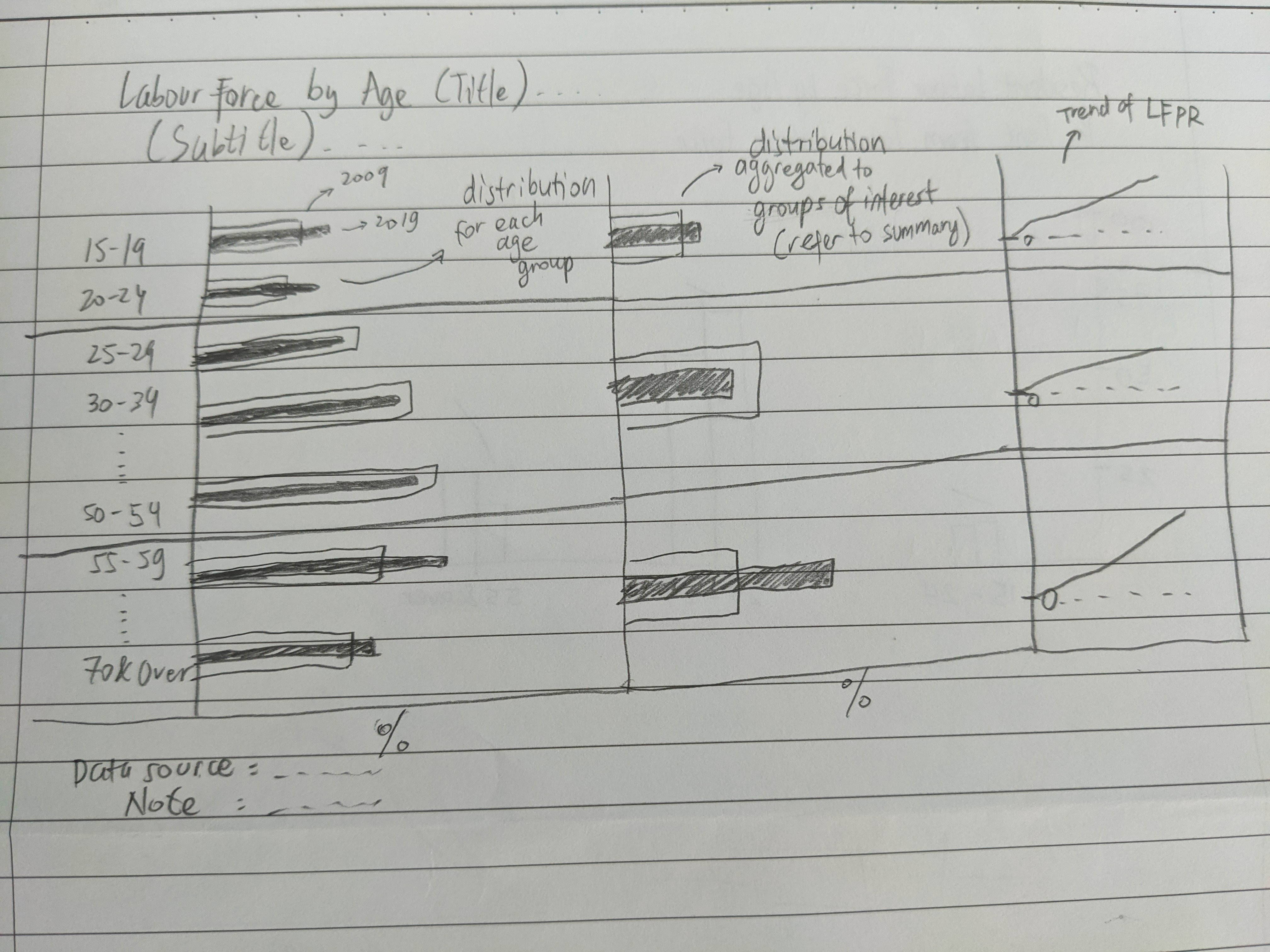
Figure 4: Sketch of proposed visualisation
Rationale
The comparison of two different values (2009 and 2019) is made clearer through the use of bar chart. Specifically, overlapping bar chart is chosen, as opposed to side-by-side bar chart, in order to save some space. It is also less cluttered in comparing 12 different age groups.
To connect the visualisation with the preceding text, additional bar chart is used to aggregate 12 age groups into 3 higher level groups, where 2 of them represent older and younger residents. This makes connecting the statement between the text and visualisation easier.
The author makes reference to the increasing Labour Force Participation Rate (LFPR) to support the conclusion. As this important data is unavailable in the original visualisation, the trend of LFPR is added using line chart to visualise the increasing LFPR stated in the preceding text.
Realising the proposed visualisation
The proposed visualisation is made using Tableau with the 2 tables (mentioned in the first section of this post) as the data source.
Importing data table
Before importing to Tableau, we first open both tables in Excel to look at the table layout.
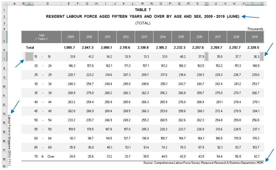
Figure 5: Raw T7 table (T5 has similar layout)
The data table is not readily usable as it includes the title text, side note, data source text, and several patches of empty cells. However, Tableau has a “Data Interpreter” function which could help with data preparation. After importing T7 excel file into Tableau, click on “Data Interpreter” and drag T7_T (referring to total) into the table area.
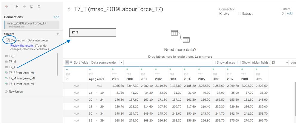
Figure 6: Using data interpreter and import table
Looking at the table view, the first column can be hidden as it does not carry any relevant data (in fact it is the side note of the raw table). Click on the small dropdown menu of the first column and select “Hide”
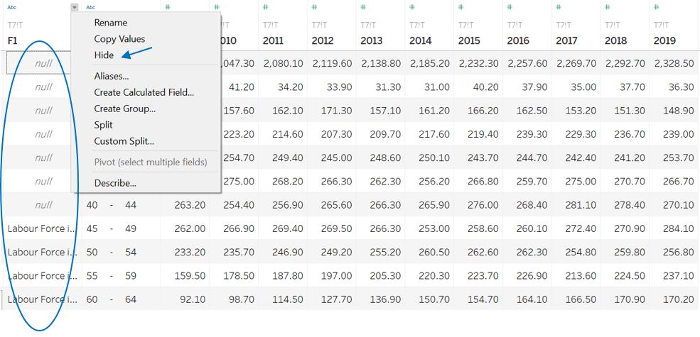
Figure 7: Hide first column
To add the next data source (T5), click on the side of T7 data source and select New Data Source. Subsequently, select “data interpreter” option and drag T5_T into the table area. At this point, both T5 and T7 have been imported into Tableau.

Figure 8: Adding T5 as a new data source
Preparing data
For both T7 and T5, we will remove multiple whitespaces in the original age group text by creating a new calculated field Age group using REPLACE formula. The original age group column can then be hidden.
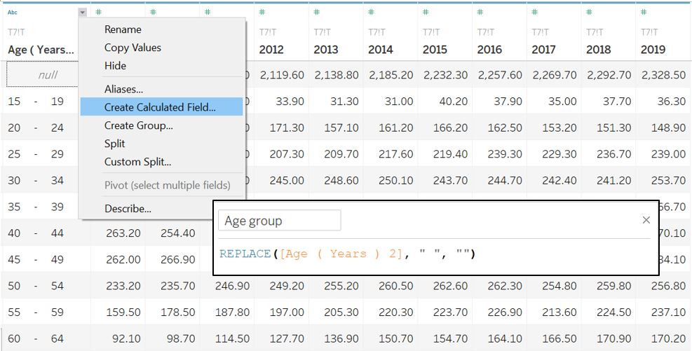
Figure 9: Tidying up age group
At this point, the yearly labour force data in T7 is separated into different columns. This is fine as the first 2 plots will compare the value between 2009 and 2019. The null value under the Age group columnn refers to the total of the entire age group, which we are not going to use.
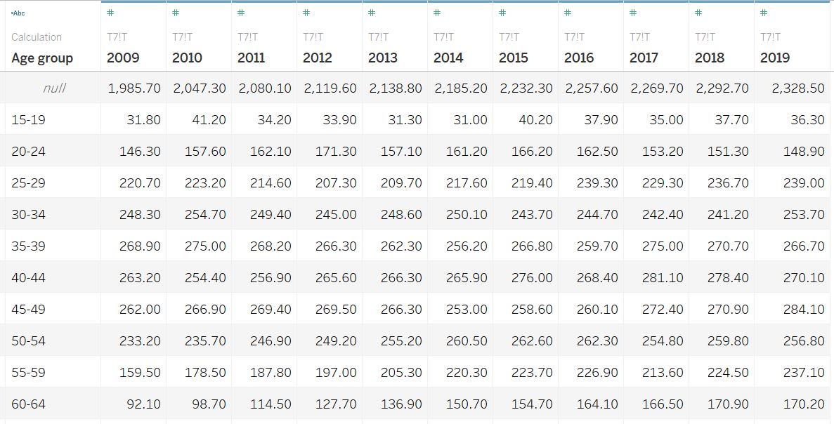
Figure 10: T7 final appearance
Currently, the 2009-2019 LFPR data in T5 are stored separately (each year has its own individual column). For the last plot in the visualisation, we are going to visualise the trend of LFPR, which means the Year has to be one of the measure. To do so, Pivot function is used by selecting all year columns, right click and select Pivot.
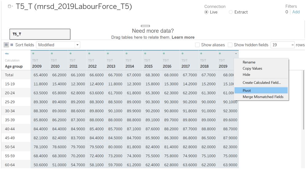
Figure 11: Pivoting T5 columns
Once pivoted, we can change the field name to Year and LFPR for ease of reference. The field type for Year is then changed to represent Date.
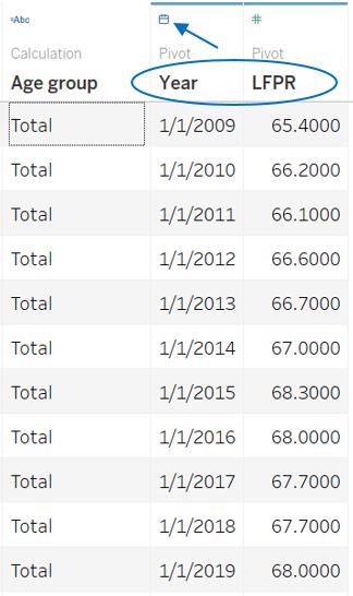
Figure 12: T5 final appearance
Main chart on distribution by age group
The first part of the visualisation basically transforms the original labour force distribution curve into bar charts. Open a new worksheet and select T7_T as the data source.
First, drag the Age group from the Data pane to the Filters shelf. In the dialog box, click Exclude and select the Null value from the list. This will exclude Null row (which refer to the total value) from our plot.
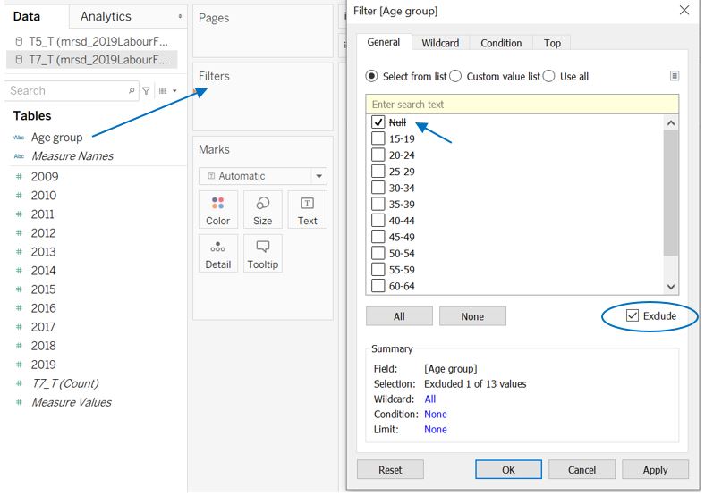
Figure 13: Filter to exclude Null value
Next, drag 2009 and 2019 to the Columns shelf and Age group to the Rows shelf. Right click on 2019 field and select Dual Axis. In the Marks shelf, change the chart type to bar chart for both SUM(2009) and SUM(2019). Right click on the x-axis and set Synchronize Axis. Set the Worksheet View to Entire View.
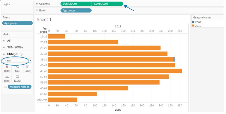
Figure 14: Dual axis for 2019 and 2019 value
At this point of time, the difference between 2009 and 2019 can be seen between 20-24 and 30-44 age groups. To get the percentage for each age group, right click on the SUM(2009) field, select Quick Table Calculation, and choose Percent of Total. Do the same for SUM(2019). To make the comparison clearer, some adjustments are made:
- in the Columns shelf, shift SUM(2019) to the left of SUM(2009) so that it will be displayed on top
- under All pane, change the type of Measure Names from color to size to differentiate bar chart size between 2009 and 2019
- grey and blue color is set for SUM(2009) and SUM(2019) correspondingly
- 20% opacity is set for 2009 to send a message that it is of older time period
At this stage, the chart should look like this.
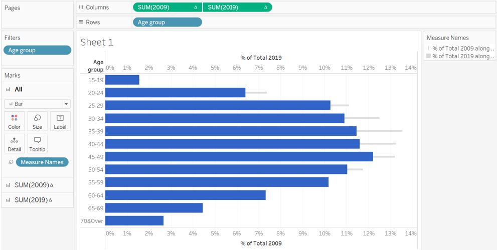
Figure 15: Bar chart with different size
Double click on the legend at the top right, and select Reversed so that 2019 bar chart is smaller than the 2009. Also adjust the right hand slider towards the middle so that the bar size is more comparable. Next, we can remove the top x-axis header, hide the Age group field label, adjust x-axis tick mark, and add the title of the plot.
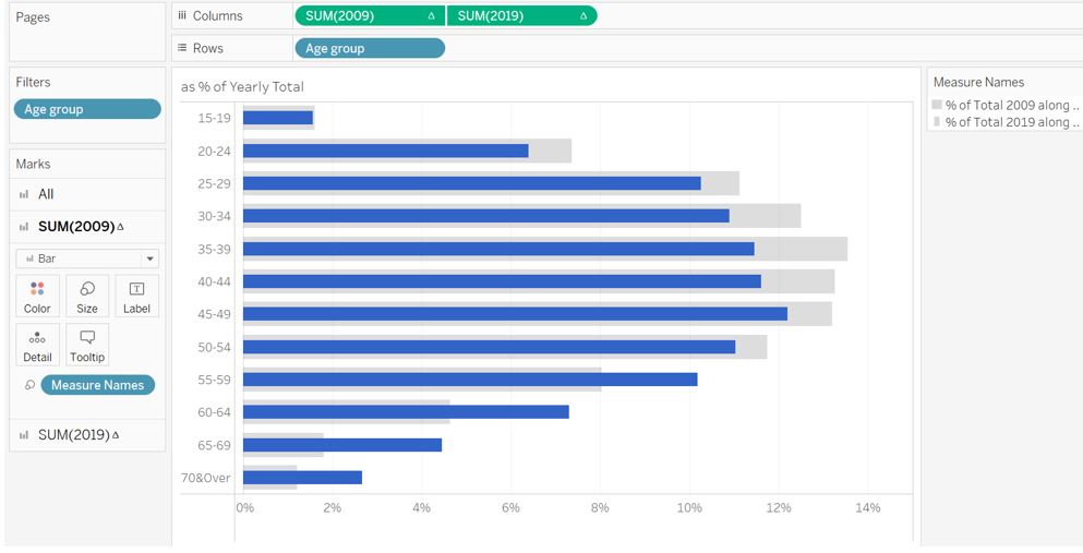
Figure 16: Further adjustment
Additional row divider is then added to clearly show the 2 main groups of interest mentioned in the text. First, we need to create an aggregated age group from Age group. To do so, right click on Age group, go to Create and select Group. In the dialog box, simply select multiple age group (e.g. 15-19 and 20-24), click on Group, and assign a new group name.
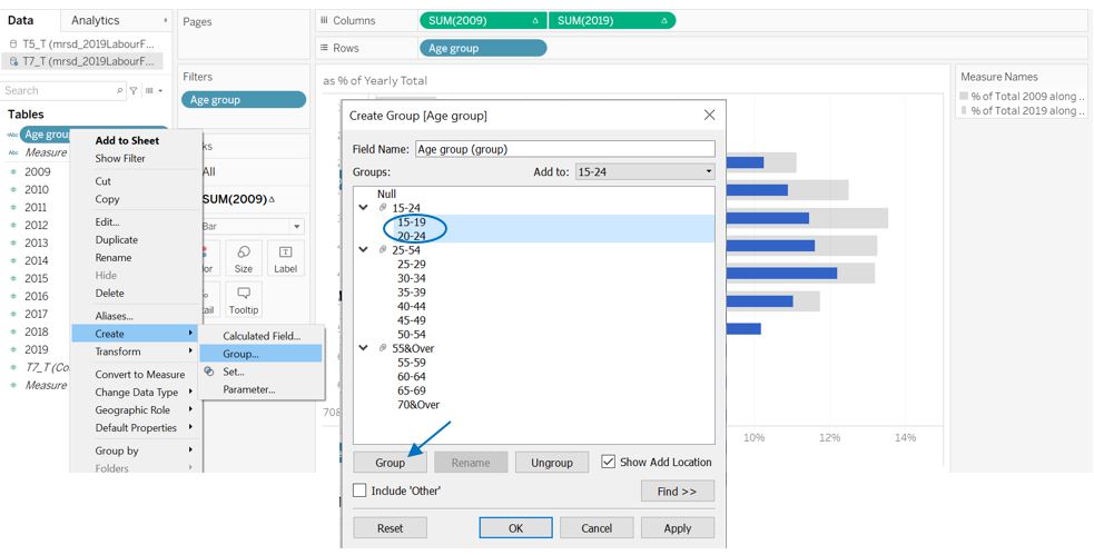
Figure 17: Creating new age group
A new measure Age group (group) is then created. Drag this to the Rows shelf to the left of our initial Age group. Once the row divider is seen, we can remove the header for Age group (group). The final appearance of the plot should look like this. Rename the worksheet as “Part 1” for ease of reference.
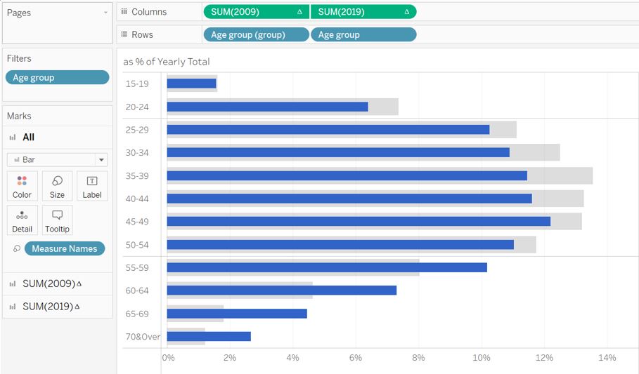
Figure 18: First part of visualisation
Second chart on distribution by aggregated age group
Duplicate the first worksheet and rename it to “Part 2”. Next, remove the Age group field from the Rows shelf so that the distribution is grouped into just the 3 aggregated age groups. Right click on the Age group (group) field and enable Show Header. Adjust the x-tick mark accordingly so that it shows the entire range of bar chart. The bar chart is also adjusted to be slightly thinner.
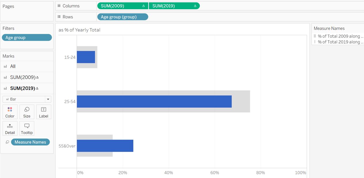
Figure 19: Aggregated age group
There is enough room to show the data label in order to help reader connects the text and the visualisation. Under All pane, click on Label and select Show mark labels. Choose Min/Max and Cell for the label and scope. The minimum label is not required in this case and can be turned off from the Options menu.
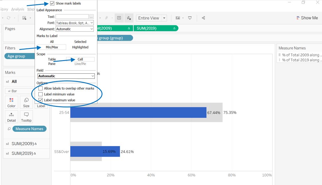
Figure 20: Enabling label
To differentiate the label value between 2009 and 2019 data, some adjustments are made:
- font size for 2009 is made smaller (8pt) with Top-Right alignment
- font size for 2019 is made bigger (10pt) with bold style
The decimal place is also removed to make it clearer. First, right click on the plot area and select Format, this will open a Format pane on the left side of the interface. Click on the Fields menu and select % of Total SUM(2009). Click on Pane, Numbers, and choose Percentage with 0 decimal place. Do the same thing for % of Total SUM(2019) field.
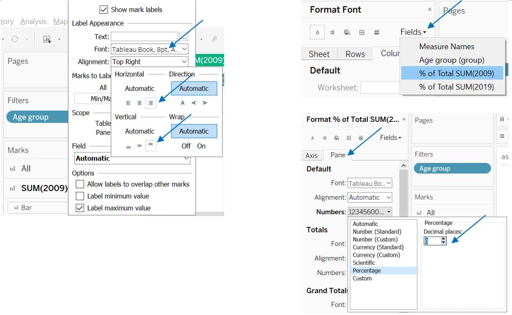
Figure 21: Formatting label
We also activate the row divider for the aggregated age group by setting the slider for the Row Divider level accordingly.
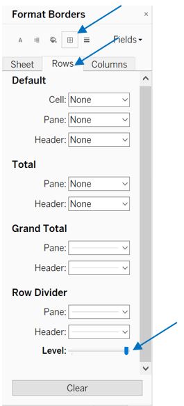
Figure 22: Second part of visualisation
We may want to look at how it pans out when the two plots are joined together. First, we create a new dashboard and drag the 2 worksheets to the dashboard side-by-side.
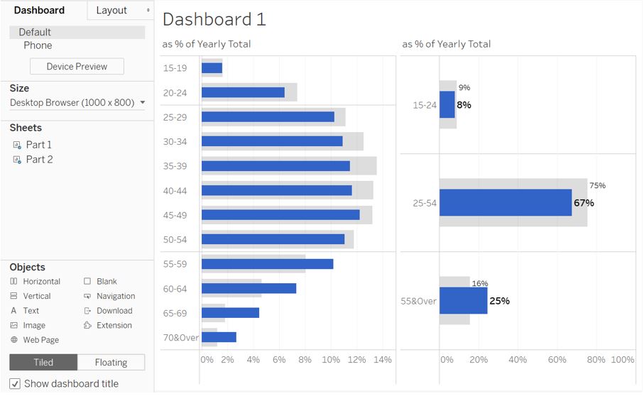
Figure 23: Joined view of Part 1 and Part 2
Now the visualisation has both the granularity of individual age group and the aggregated age group. The reader can now afford to connect the percentage in the text (67% and 25% for 2019) with the visual. However, there is a downside with this view as the row dividers are not aligned between the 2 plots as compared to the initial sketch. We will address this issue later.
Third chart on LFPR trend by aggregated age group
The last part of the visualisation is to show the reader that the LFPR for the younger and older residents have increased since 2009, as what the original author has highlighted. For this, we will use the data from T5.
First, we create new worksheet called “Part 3” and select T5_T in the data pane. Take note that T5_T contains overlapping age group, hence we should first filter out those groups and keep only the individual age groups similar to T7.
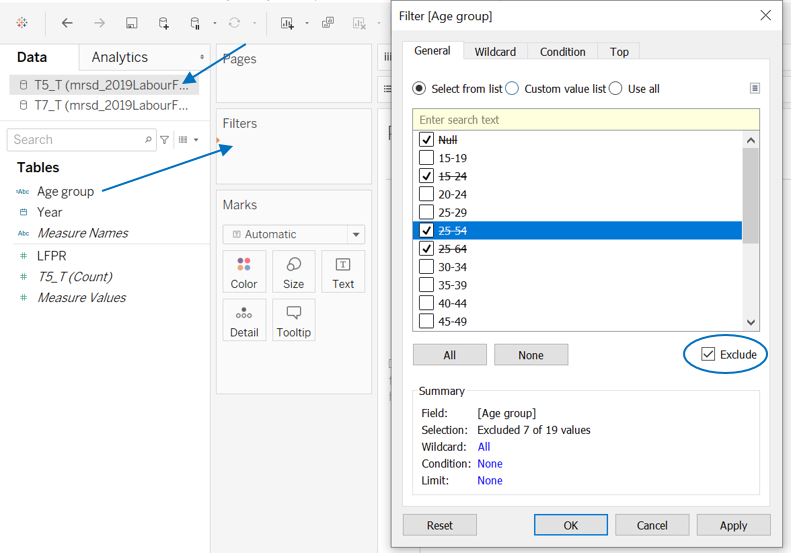
Figure 24: Filter T5 age group
Similar to part 2, we then proceed to create a new aggregated age group. As there are predefined aggregated group inside T5_T, we add “group” to the group name to differentiate.
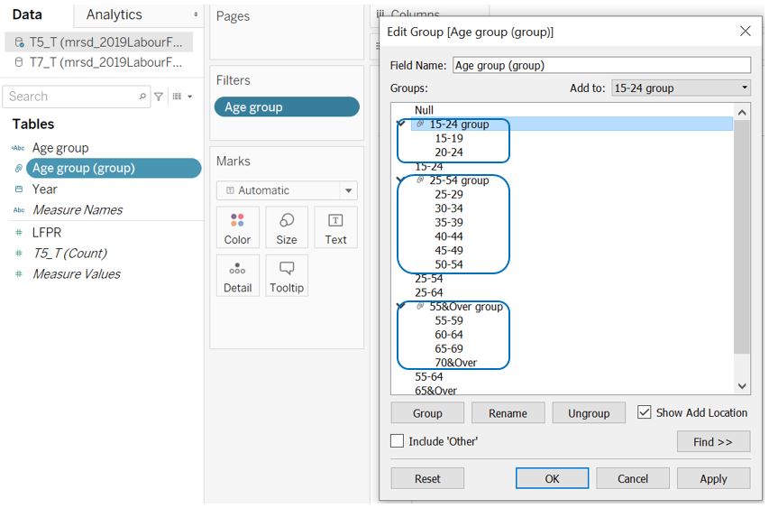
Figure 25: Create aggregated age group
To plot the trend of average LFPR within each group, drag the Year to Columns shelf while Age group (group) and LFPR to the Rows shelf. Change the SUM(LFPR) to AVG(LFPR) by right clicking the field, select Measure and Average.
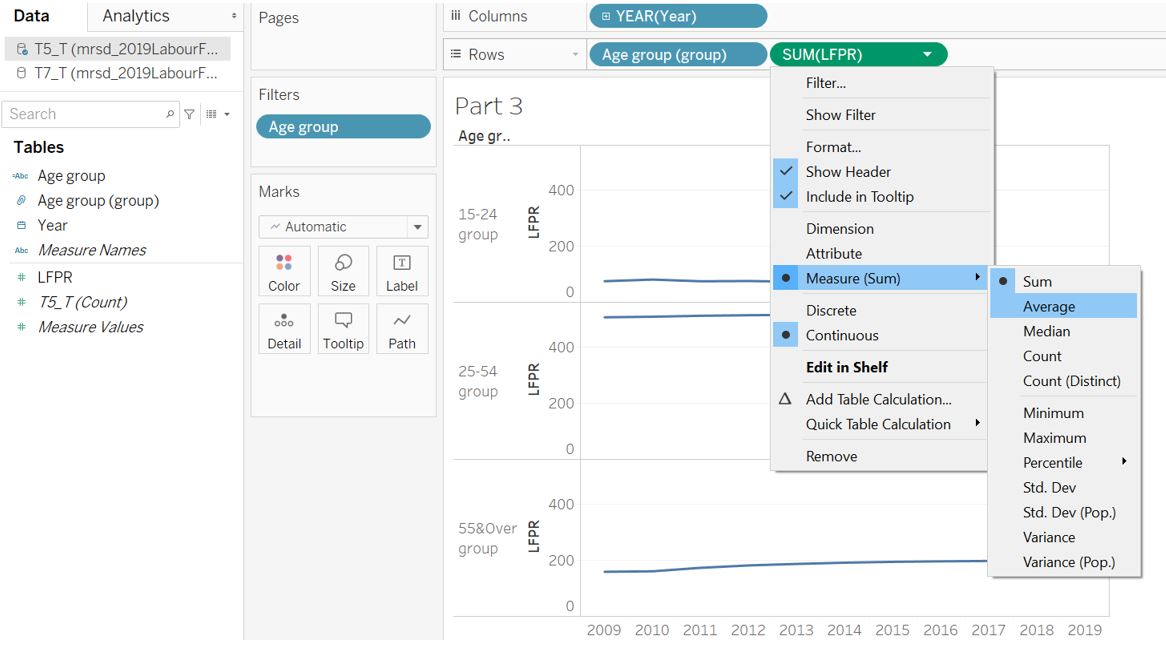
Figure 26: Calculate average value
As each group has different initial average LFPR value, it is difficult to compare among them. Therefore, we will set the AVG(LFPR) in 2009 as the baseline and chart the difference in each year as compared to 2009. To do so, right click on the AVG(LFPR) field, select Quick Table Calculation, and choose Percent Difference. To use 2009 (first value) as the baseline, select Relative to and choose First.
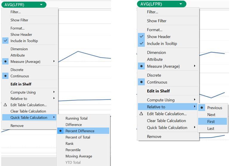
Figure 27: Average LFPR difference from 2009
Color gradation is then added to the line chart from 2009-2019. However, we have to first change the Year measure from Discrete to Continuous type.
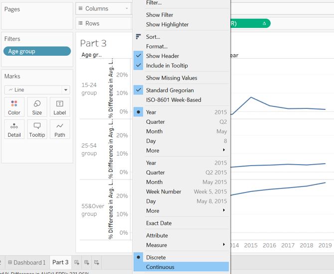
Figure 28: Continuous Year measure
Hold Ctrl in the keyboard while clicking the continuous Year field, drag it from Columns shelf into the Color pane to activate coloring on the line chart.
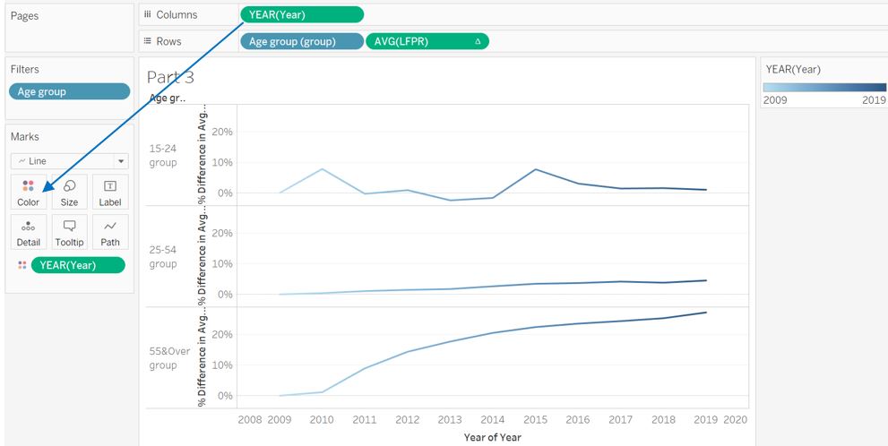
Figure 29: Line chart with color gradation
As the whole visualisation is about comparing 2009 and 2019, we can remove the x-axis title to reduce non data-ink. In addition, the color gradation helps to allude a trend towards 2019. Y-axis is also removed as the starting point for all 3 age groups is zero. Data label for 2019 is added to provide reader a comparative value between 2009 and 2019. Click Show mark labels and select Most Recent.
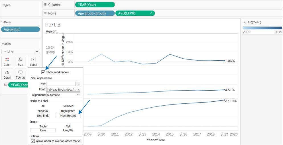
Figure 30: Adding label to the most recent data point
Right click on one of the data label and select Format. Click Fields and select % Difference in AVG(LFPR). Click Pane and change the Numbers format to Percentage with 0 decimal place.
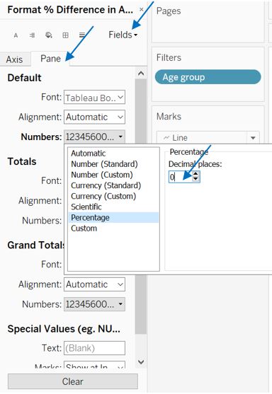
Figure 31: Label formatting
The final appearance for the third part of visualisation will look like this.
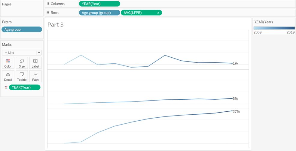
Figure 32: Third part of visualisation
Putting it all together
If we put all 3 parts together, we will get something like shown below. As pointed out before, the row divider among 3 parts are not the same as in the initial sketch. The label for the LFPR trend plot also now becomes illegible as it overlaps with the line plot, hence text alignment has to be adjusted. The height of the LFPR trend plot also jutted out of alignment as compared to the other 2 plots.
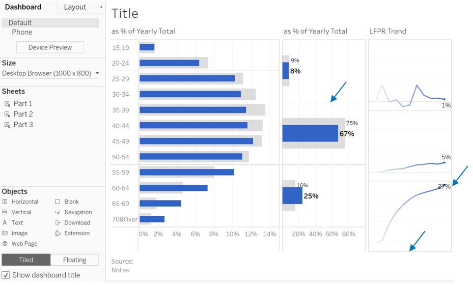
Figure 33: Putting it all together, not quite right
In order to have the intended row divider for the last 2 plots, we have to create 3 different plots to represent each aggregated age group.
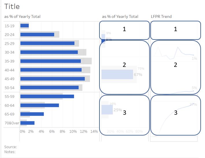
Figure 34: Putting it all together, with some workaround
Duplicate part 2 into 3 new worksheets where in each worksheet, we will show only 1 age group. Reactivate Show Header for Age group (group), right click the group to be hidden, and select Hide.
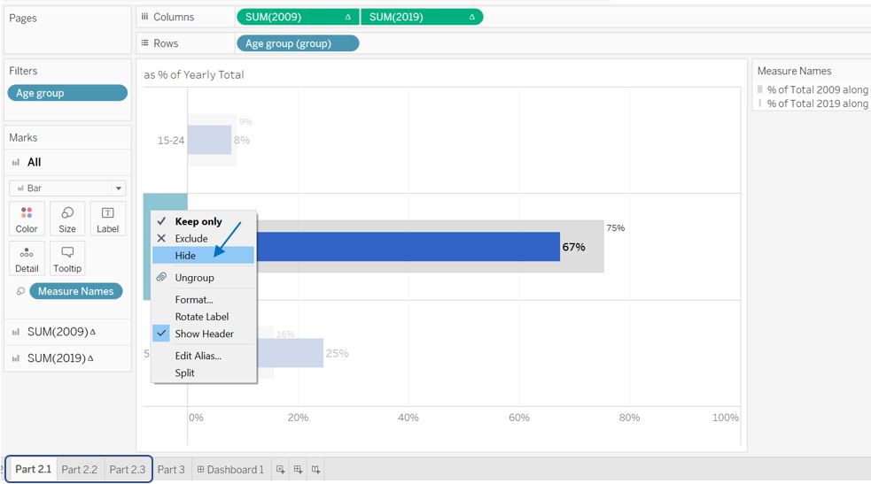
Figure 35: Hide specific age group from view
We then hide the title and x-axis according to the order of the plots in the dashboard i.e. only the bottom plot require x-axis, only the top plot requires title.
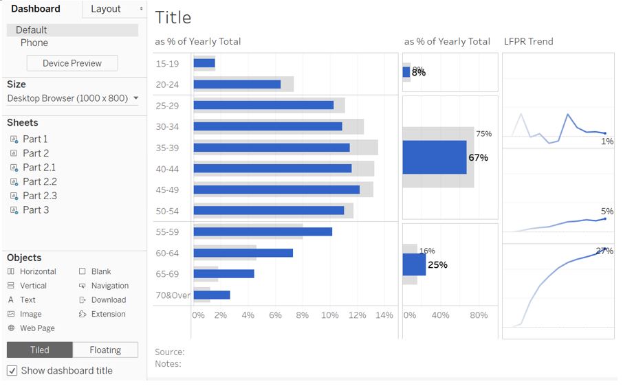
Figure 36: Putting it all together, with duplicated worksheets
Adjustment to the border setting and x-axis range for each plot are done to get standardised format. Only the top and bottom plot would have horizontal border line, while the middle plot is left borderless.
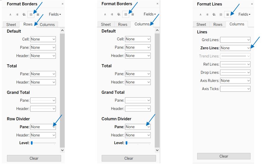
Figure 37: Formatting borders and lines
Slight layout padding adjustment is also made in the dashboard setting to achieve better alignment between the plots. Finally, we can achieve the following appearance.
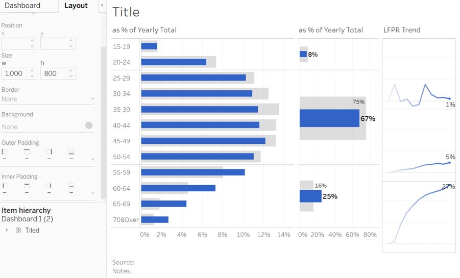
Figure 38: Putting it all together, part 2 segregated and aligned
Repeating the same process for LFPR trend plot, we arrive at the following appearance where all 3 plots are now aligned properly.
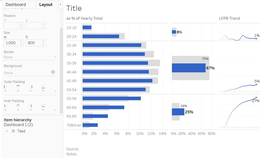
Figure 39: Putting it all together, part 3 segregated and aligned
Adding the main conclusion into the title and subtitle with some formatting done to highlight the key points:
- Year 2019 uses bold style and colored blue so that reader may relate blue color with 2019
- Younger and older residents are highlighted in bold style
- Percentage change and LFPR are also highlighted in bold style
- Shift in median age is in bold and inserted as the final statement to end the subtitle
Finally, inserting data source and notes at the bottom to complete the visualisation.
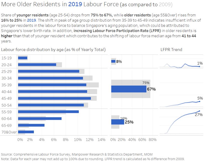
Figure 40: Putting it all together, final visualisation
Note: The final visualisation is saved under “Desktop” dashboard. Uploading to Tableau Public makes the row divider misaligned and hence requires additional adjustment. The Tableau Public version is saved under “Public” dashboard (Tableau Public).
4. Observations from visualisation
- There is less younger residents aged 25-54 in the 2019 labour force. Their percentage share in the total labour force drops from 75% in 2009 to 67% in 2019. In contrast, the share of older residents aged 55 & above increases from 16% to 25%.
- The distribution in 2009 has its peak percentage residing in the 35-39 age group. The peak has moved to 45-49 age group in 2019, pointing to the insufficient influx of younger age group in the labour force to balance Singapore’s aging population. This could be attributed to Singapore’s lower birth rate as pointed out by the original author.
- Average participation rate of older residents (age 55 & above) into the labour force increases by 27% as compared to 2009. This is in contrast to the 5% increase in the average participation rate of younger age group. This comparison helps to explain why the share of younger resident falls despite the increasing participation rate. In addition, this observation could be useful to initiate further exploration on the retirement and re-employment policy that Singapore took towards 2019.
5. Conclusion
A critique and makeover on labour force distribution plot have been done by first assessing both clarity and aesthetics aspects of the original visualisation. Subsequently, a proposed new visualisation has been developed with the intention to improve the clarity of author’s intended message and visual aspects of the original visualisation. The rationale behind the choice of visualisation type and components have also been provided. Lastly, the visualisation has been realised in Tableau, with observations from the new visualisation explained.
Any suggestion and feedback is much appreciated! Email: kevin.albindo@gmail.com