1. Introduction
This post is part of the submission for ISSS608 DataViz Makeover assignment 2. Data visualisation critique and makeover is done on the visualisation of survey response regarding public willingness regarding COVID19 vaccination. The data is available from “Imperial College London YouGov Covid 19 Behaviour Tracker Data Hub” [link]
The assessment criteria will be similar to the previous blog post, based on the clarity and aesthetic aspect of the visualisation (taking reference from “Data Visualization: Clarity or Aesthetics?” by Ben Jones).
2. Critique and suggestion
The original data visualisation that will be assessed is shown below.
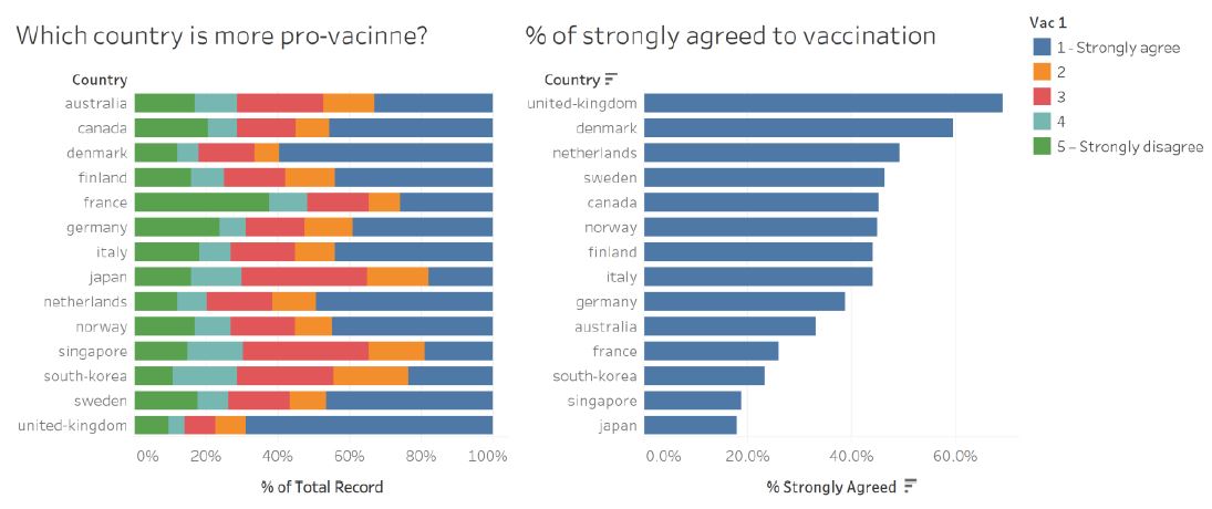
Figure 1: Original data visualisation of survey response on public willingness to be vaccinated
There are room for improvement to enhance the clarity and aesthetic of the original visualisation. Currently, while the intention is clearly stated by the questions posed in the title, reader may find it difficult to navigate through the visualisation and make appropriate conclusion.
Clarity
The original author would like to compare the public willingness on vaccination between countries. While the first chart provides the distribution of public opinion in each country, it does not allow reader to compare between countries easily. The visualisation is sorted according to the country name in an alphabetical order, which requires reader to search for the longest blue bar to find country with highest number of strong opinions towards vaccination. In this case, the highest percentage is by any chance belongs to UK at the bottom (not so difficult to find).
On the other hand, the second bar chart on the right answer the question more directly as it is sorted in descending order by the percentage of strong opinion in each country. However, both the 100% stacked bar chart and the sorted bar chart fails to convey the fact that the number of respondents from each country varies between 2000 and 5000. It is important to inform the reader about the difference in sample size and hence the uncertainty that comes when estimating the percentage of public opinion.
There is also room for improvement in terms of the textual explanation. Currently, the title poses the main question that the author would like to answer. However, more explanation should be added in the visualisation to orientate the reader in reading the visualisation.
It is also beneficial to understand the respondent profile (overall or within each country) to help the reader assess the validity/significance of the different opinion between countries e.g. whether the response is skewed due to the distribution of a particular respondent’s profile (age, gender, etc.). This is not present in the original visualisation.
Aesthetic
The existing color palette (green, cyan, red, orange, blue) does not help in representing the opposing view of public opinion. To address this, diverging color palette like blue-grey-red will be used to represent positive, neutral, and negative opinion accordingly.
Legend title is not elaborated further and left with the default field name (vac_1). Reader may wonder what is the variable/survey question being visualised here. Also, there is minor inconsistency in the length of dash character (-) in the label text. We will fix this by showing the exact question (vac_1 and others) that were asked to the respondent.
Position of legend is selected at the top right corner which leaves a lot of whitespace at the bottom right. The space usage can be maximised by embedding the legend into the chart instead, if we choose to show both charts together. However, the proposed visualisation will use 2 dashboards instead and use tooltip to provide more interactivity for reader to explore.
3. Proposed visualisation
Sketch
The following sketch shows the proposed visualisation and the advantage as compared to the original visualisation.
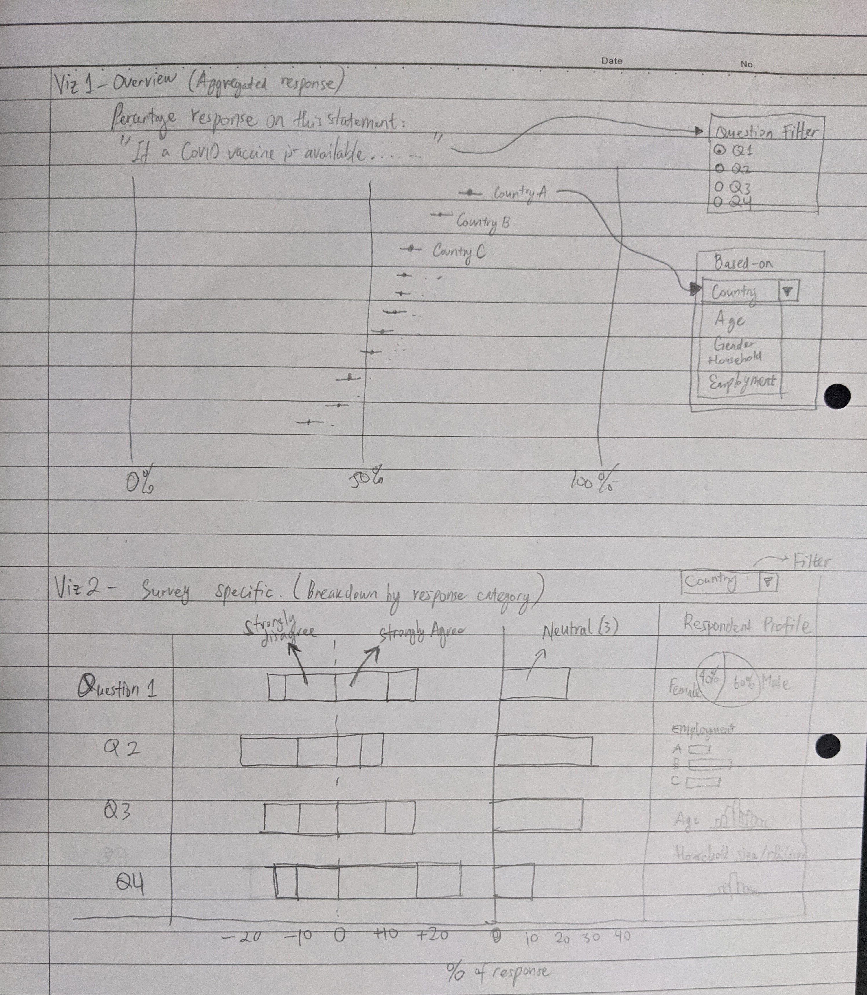
Figure 2: Sketch of proposed visualisation
Advantage of the proposed visualisation
The visualisation is divided into 2 parts, each with its own dashboard to allow a quick overview of “strongly agree” response among different variables e.g. country, gender, age group, followed up by a more detailed information for each survey questions.
To improve the comparison of response between countries and other variables, diverging bar chart is used instead of 100% stacked bar chart. By doing so, contrast between agree and disagree will be more apparent. I also choose to plot Neutral response separately rather than distributing it equally to both sides of the response, as it is important to understand how many percentage are sitting on the fence regarding vaccination and this may warrant further investigation.
It is also important to understand the uncertainty in the survey response which differs between countries due to the different sampling size. We can use dot plot with error bar to better convey the uncertainty to the reader. This will also aid in the comparison of response between different variables.
To allow more meaningful insight, respondent profile is also considered in the analysis. This is included through interactive visualisation, leveraging the tooltip function in Tableau.
The link to Tableau visualisation can be found here
Variable list
For this visualisation, we are going to consider the following variables.
Survey questions on vaccination
| Field | Survey question |
|---|---|
| vac_1 | “If a Covid-19 vaccine were made available to me this week, I would definitely get it.” |
| vac2_1 | “I am worried about getting COVID19” |
| vac2_2 | “I am worried about potential side effects of a COVID19 vaccine” |
| vac2_3 | “I believe government health authorities in my country will provide me with an effective COVID19 vaccine” |
| vac2_6 | “If I do not get a COVID19 vaccine when it is available, I will regret it” |
| vac_3 | “If a Covid-19 vaccine becomes available to me a year from now, I definitely intend to get it” |
Respondent profile
| Field | Description |
|---|---|
| gender | Gender of respondent |
| age | Age of respondent |
| household_size | Number of people in respondent’s household |
| household_children | Number of children under 18 in respondent’s household |
| employment_status | Employment status of respondent |
Data preparation
As each data file corresponds to one country, it is easier if we combine all data tables into one before we proceed with creating the visualisation. We can do this by creating Union of all countries’ data. First, add connection to one of the csv file. The list of other table within the same folder can be seen in the left side panel.
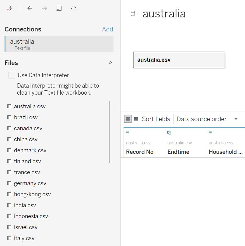
Figure 3: Importing one of the csv file
Click on the “australia.csv” table menu and select Convert to Union.
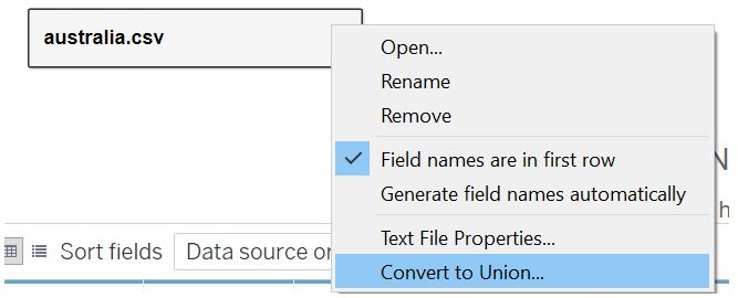
Figure 4: Creating union
Select all the csv files to be added from the left side panel and drag them to the window box. Once all the countries are added, click OK (the union creation process may take some time).
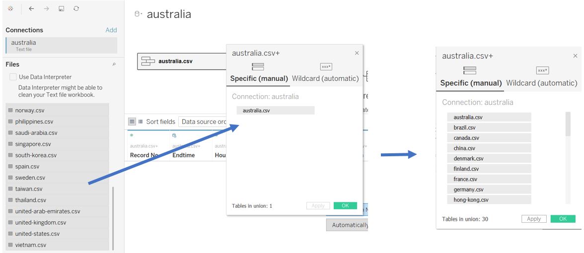
Figure 5: Add files to be combined
Some columns are specific to a certain country. For example, field “UAEEmirates” is relevant only to united-arab-emirates.csv data table. Therefore, we need to check if all countries have information on the relevant variables that we need. Notice that Tableau also automatically add a new field (Table Name) to indicate the table source.
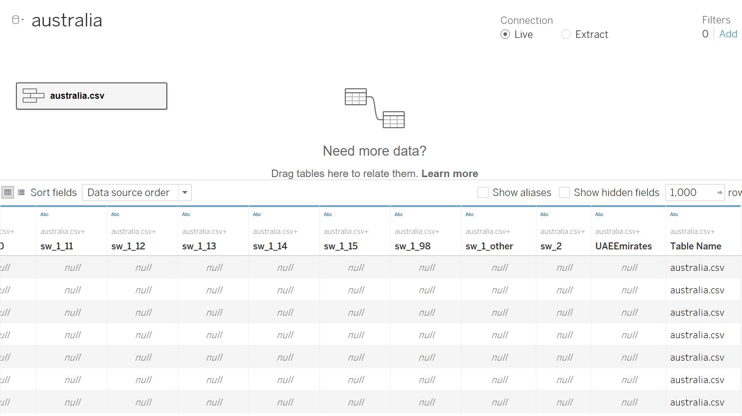
Figure 6: Variation in field names between data form different countries
We can use Table Name field as Country indicator by creating new calculated field to remove “.csv” extension in the Table Name. Once created, convert the data type from “String” to “Country/Region”.
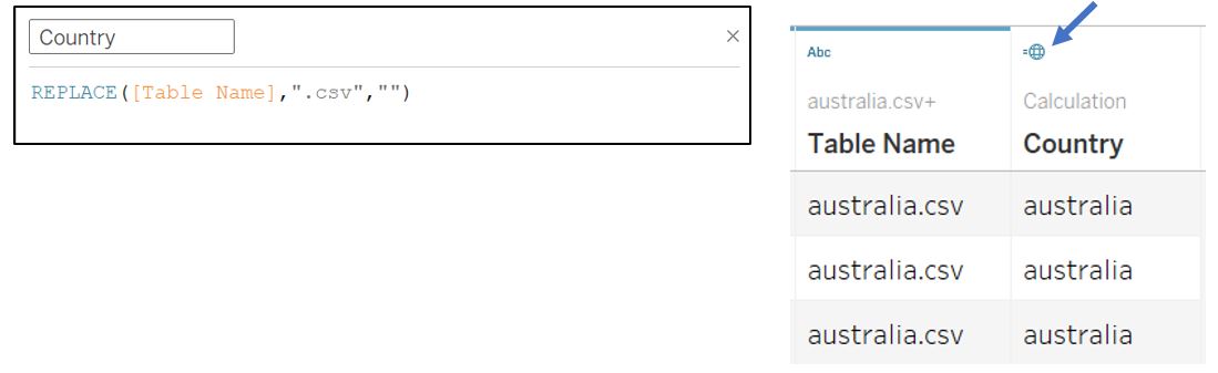
Figure 7: Get country name from Table Name field
Next, we can remove those fields that are not in our variable list by selecting them, right click, and select Hide.
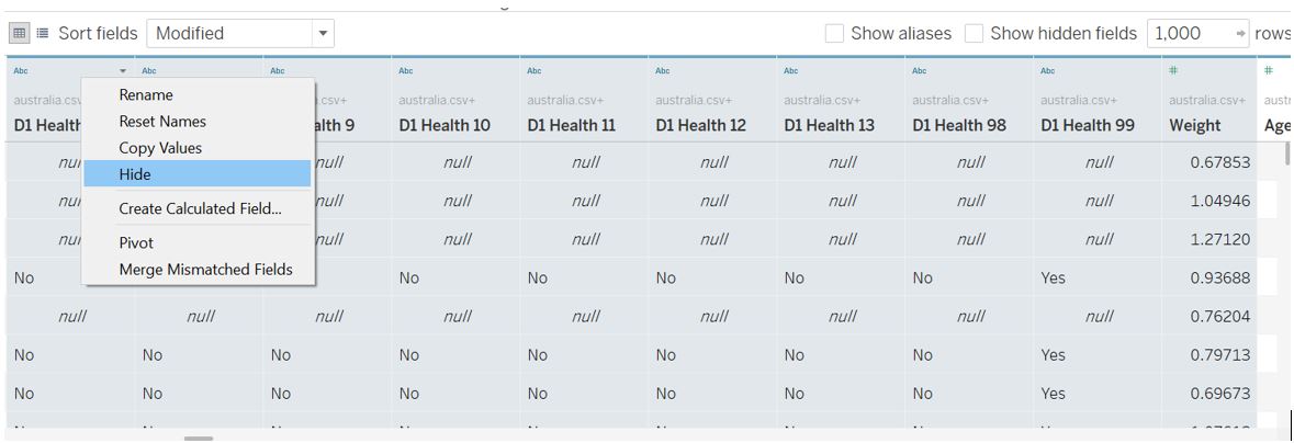
Figure 8: Hide unused fields
However, there are some fields with similar name and not indicated in the data codebook. We can display the metadata of our table by clicking on the Manage metadata icon shown below. Upon further check of the csv files, some countries like Sweden and Norway have different encoding format for Employment Status where one-hot-encoding is used (the fields employment_status_N are of Boolean type - zero or one). Other fields with similar name are profile_household_children and profile_work_stat. We should investigate this further to understand what data resides within these fields.
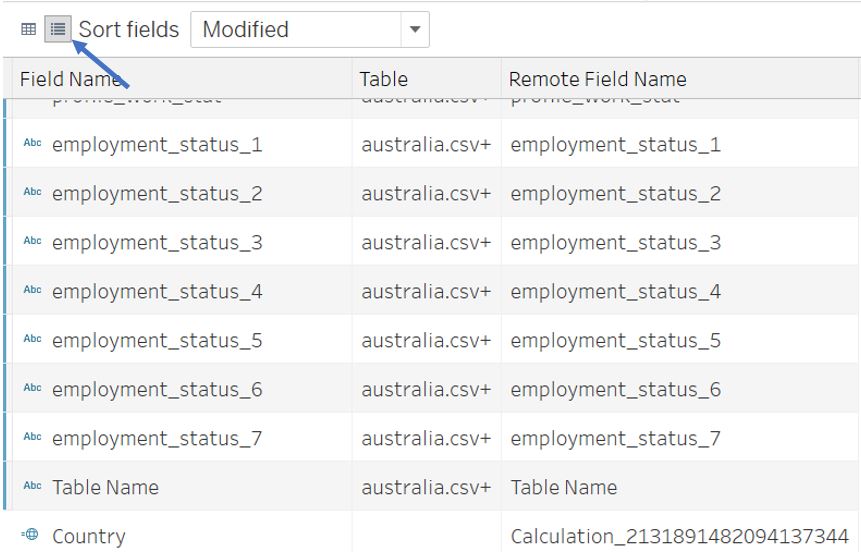
Figure 9: Different encoding for employment status
By tabulating the count of records for each ambiguous field by countries, we can assess if we need to clean the data further. In the screenshot below, we first find out the countries with response recorded for Vac_1, which is our main variable of interest. Sweden, Norway, Finland, and Denmark have different employment status record and they also have records on Vac_1. Therefore, we cannot exclude those employment_status_N fields and we need to standardise them with records from other countries.
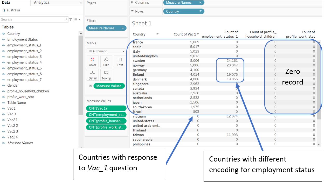
Figure 10: Checking data in our table
On the other hand, we can hide profile_household_children and profile_work_stat as they have zero record for countries with response to Vac_1 variable. Select both from the Data pane and right click to select Hide.
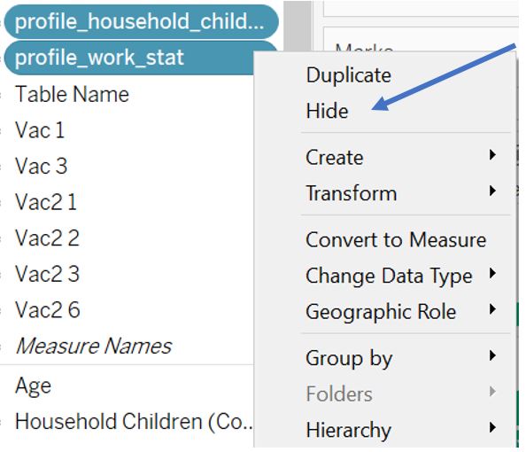
Figure 11: Hide fields with zero record
As the data volume is quite huge, we can improve the performance by creating a Context Filter to include only countries of interest . Drag Country to Filters pane and set the filter criteria using Condition tab as shown below.
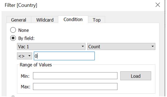
Figure 12: Filter country with response to Vac_1 question
Click on the Country pill in the Filters pane and select Add to Context. Click on Apply to Worksheets and select All Using Related Data Sources.
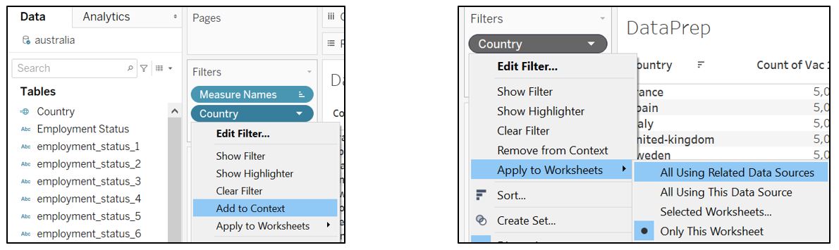
Figure 13: Apply country filter as context filter to all visualisation using related data sources
To standardise the employment status into 1 field, we need to create a new calculated field with the following formula.
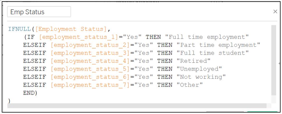
Figure 14: Standardise employment status field from different countries
To check if the new field works correctly, drag the new Emp Status field to the Columns shelf, change the Measure to Count and drag it to Measure Values pane.
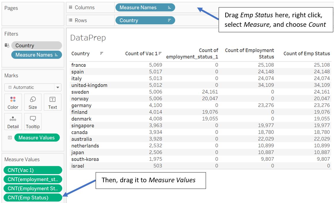
Figure 15: Check new field Emp Status
Now, all employment status info is consolidated into Emp Status field. Note that there is no employment info for Israel. As we would like to compare the respondent profile (which include employment status), we should exclude Israel from our visualisation (the original author also excludes Israel from the list).
We can then proceed to hide Employment Status and employment_status_N fields by selecting them in the Data pane and right click to select Hide (note that we have to remove them from the Measure Values pane before we can hide it).
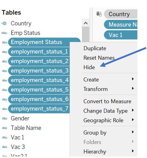
Figure 16: Hide original employment status fields
Notice that the count of Emp Status entries are higher than the count of Vac 1 which means not all respondents have answered vaccination questions. As the number of respondents who answer the Vac 1 question is roughly only 20% of the total respondent, there are significant number of records that will not be used. But first, let’s see if all Vac 1 responses are accompanied by the respondent information (age, employment status, household size, etc.).
Drag the Age, Household Children, and Household Size fields to the Measure Values shelf and change the aggregation for Age to Count (CNT). Also, drag the Vac 1 field to Filters pane and exclude Null value. At this point, we can see that the number of counts for all fields are equal (except Israel).
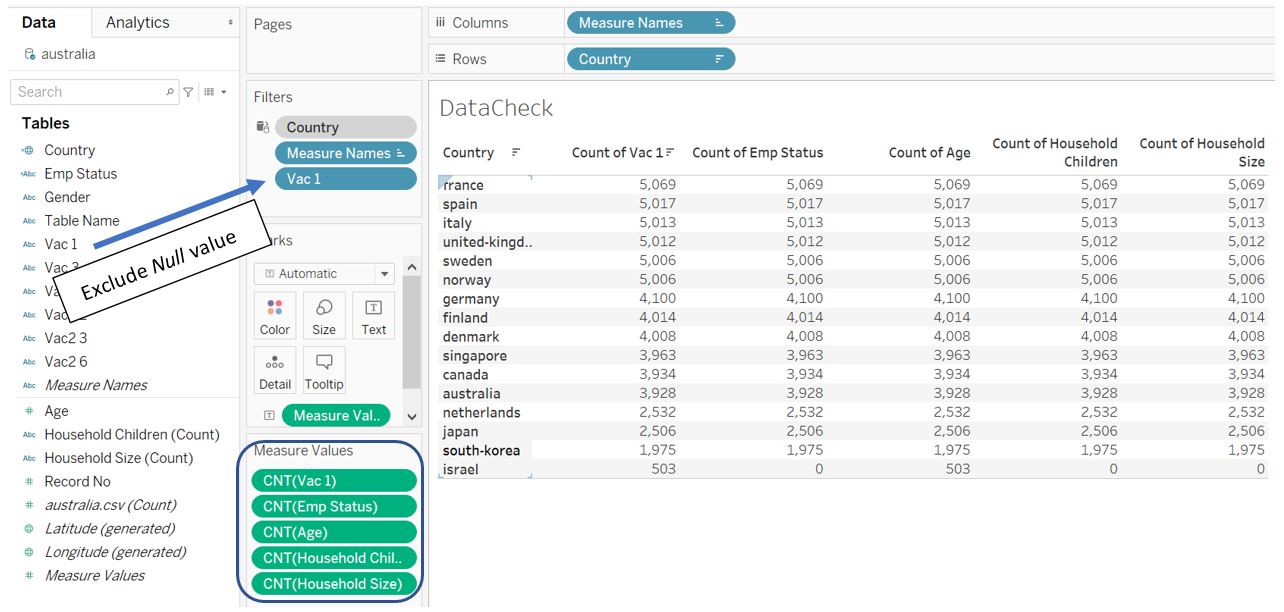
Figure 17: Check information completeness for Age, Household Children, and Household Size
Next, for Gender, Vac 3, Vac2 1, Vac2 2, Vac2 3, Vac2 6, select all of them and drag to the Rows shelf. Select all of them by using Shift and mouse click, use right click to change the Measure to Count.
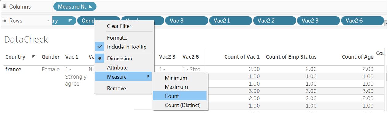
Figure 18: Create Gender, Vac 3, Vac2 1, Vac2 2, Vac2 3, Vac2 6 as measure Count
Once they are converted to measure Count, select and drag all of them to Measure Values shelf.
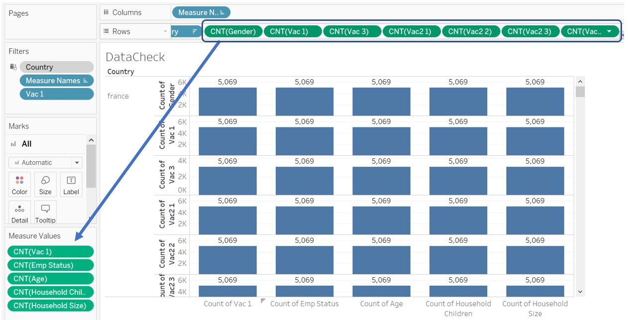
Figure 19: Count records of Gender, Vac 3, Vac2 1, Vac2 2, Vac2 3, Vac2 6
Now, we know that the count for Vac 3 is less than the other fields. This means not all respondent answer Vac 3 question even though they have responded to Vac 1 question. However, we are also convinced that all countries in the list (except Israel) that has responded to Vac 1 question are accompanied by the respondent profile information (they all have the same count of records).
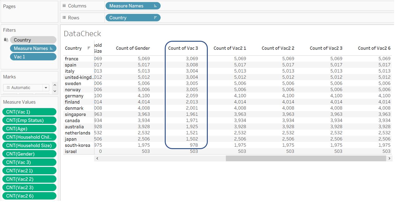
Figure 20: Check information completeness for Gender, Vac 3, Vac2 1, Vac2 2, Vac2 3, Vac2 6
As we navigate the steps so far, it takes quite some time for Tableau to process/query the data. Therefore, it is better to exclude those unused records from the data set, rather than using context filter. To do so, export the current data into csv by choosing View Data and Export All. Save it as “FilteredData.csv”.
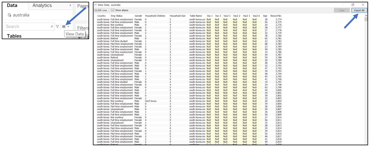
Figure 21: View and export data
With the help of excel, we can remove those records where Vac 1 column is blank. We can first sort Vac 1 column ascendingly.
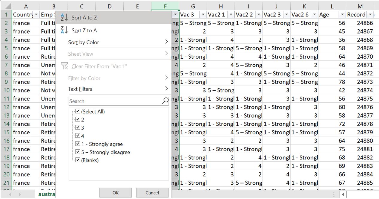
Figure 22: Sort Vac 1 ascendingly
Delete rows with empty Vac 1 column at the bottom of the table.
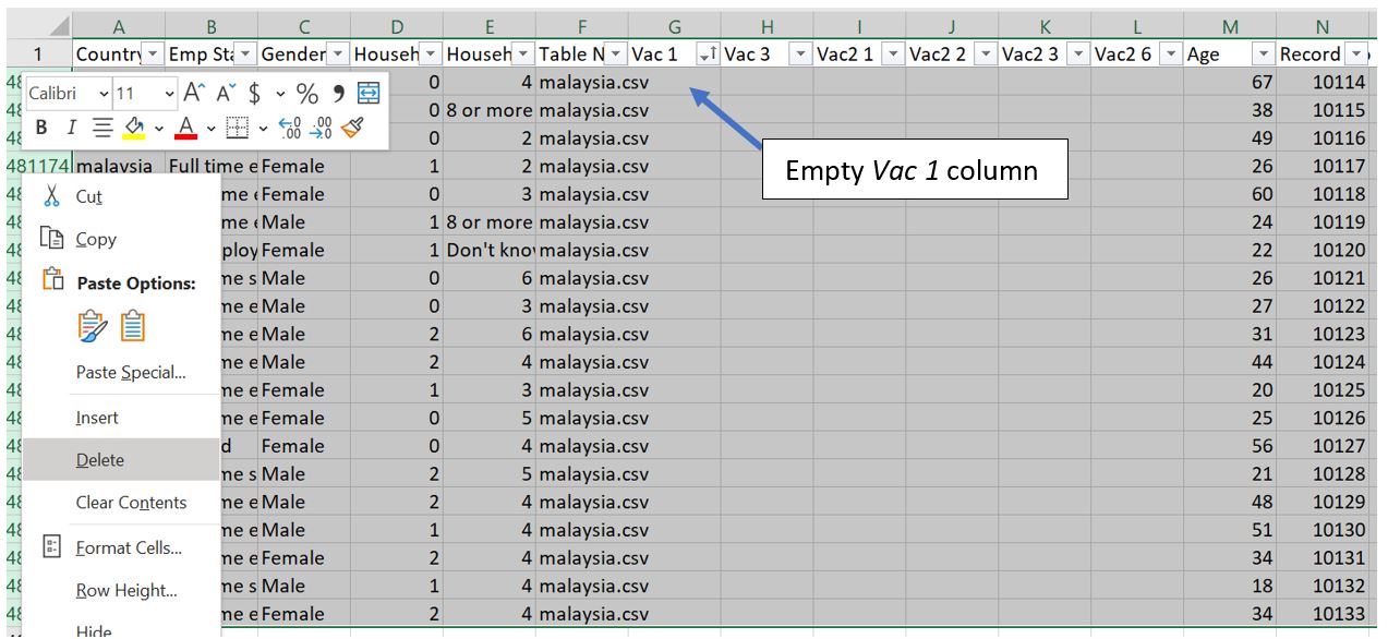
Figure 23: Delete rows with empty Vac 1 at the bottom of table
Also, delete all rows which correspond to Israel.
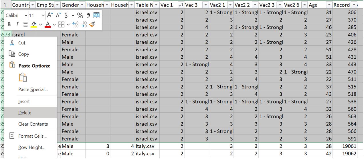
Figure 24: Delete rows corresponding to Israel data
Finally, we can save the filtered file (at this point, the file size is around 6MB) and connect the data to Tableau.
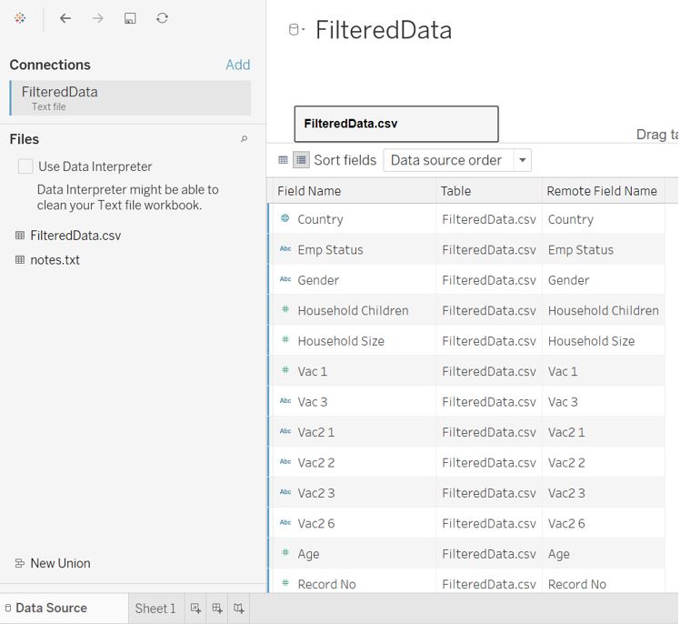
Figure 25: Import filtered data to Tableau
As recommended in the Tableau blog on preparing survey data, it is a good practice to have a ‘tall and thin’ data. To do so, we can pivot the Vac fields. Rename the new header accordingly to Question and Response.
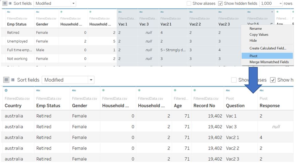
Figure 26: Reshape survey response fields
The response is currently of String type and we can better handle the values by converting it to integer 1-5 through calculated field. Subsequently, change the data type to Number (whole).
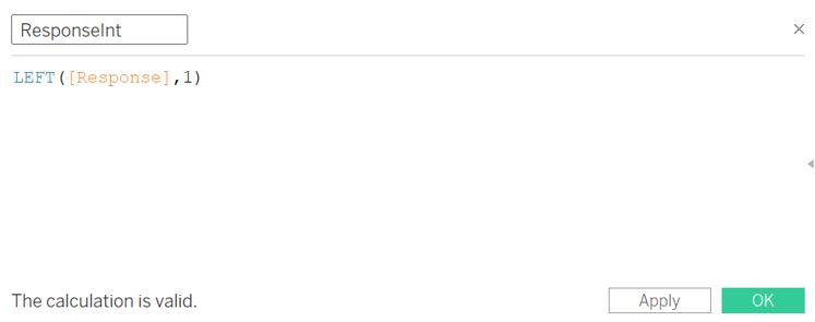
Figure 27: Convert response to integer 1 to 5
The final data table will look like this.
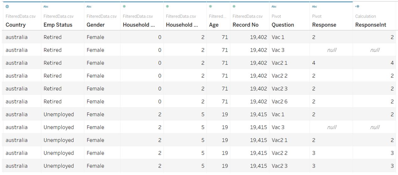
Figure 28: Final appearance of data table
If you are very particular about having Country label with initial capital letter, proceed to this section first before continuing.
Visualisation part 1 – Dot plot with error bar
As the sample size between countries is different, we convey this fact by using a dot plot to represent the % of “strongly agree” response and error bars to represent the uncertainty. To do so, we create new calculated fields for these estimates: % strongly agree, upper, and lower bound for 95% and 99% confidence interval. But first, create new calculated field to count the number of records easier.
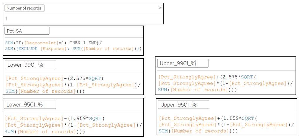
Figure 29: Calculated Fields for number of records, %strongly agree, and confidence interval
Drag Measure Values to the Columns shelf. Remove all the fields from Measure Values pane except for the lower and upper 95% and 99% confidence interval. Subsequently, drag Country field to Rows shelf. Change the chart type to Line and add Measure Names to the Path in Marks shelf to connect our upper and lower bound values. To differentiate 95% and 99% bar, once again drag Measure Names to the Color in Marks shelf.
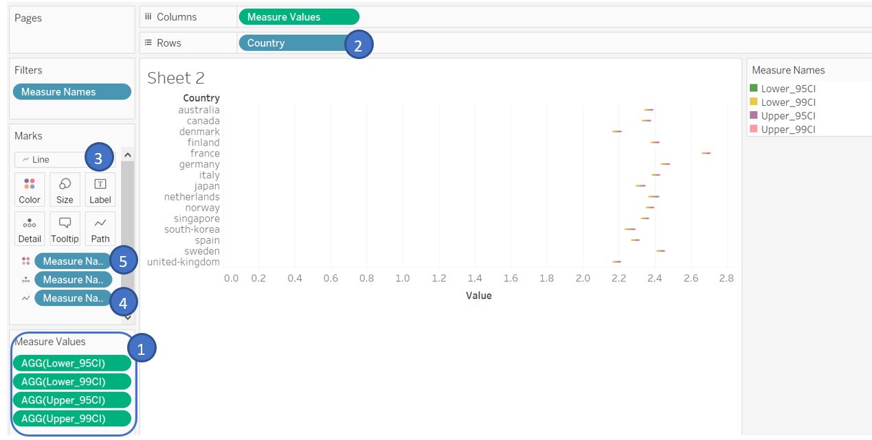
Figure 30: Displaying confidence interval as line
To show our % of “strongly agree” as a dot plot, drag Pct_SA field to Columns shelf, select Dual Axis and choose Synchronize Axis. Change the chart type for Pct_SA field to Circle type. Edit the X-axis and set to fixed 0 - 1 with tick mark every 0.2. Sort the X-axis based on Pct_SA and hide the top X-axis as it is redundant.
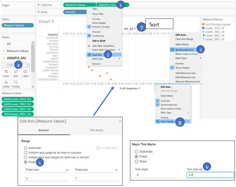
Figure 31: Displaying % strongly agree as dot plot
We should filter by Vac 1 question to show the response on public willingness to be vaccinated. Drag Question field to Filters shelf and select Vac 1. We can then add a reference line at value equals to 0.5 which represent 50% response.
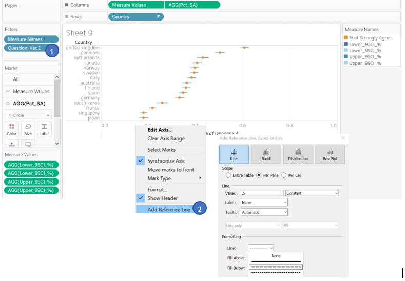
Figure 32: Set reference line
Adjust the error bar color by clicking on the Measure Names color legend and the bar size by adjusting Size in the Marks shelf. Note that the order of the lower and upper bound in the legend affect the display accordingly (arrange such that 99% confidence interval at the top, followed by 95% confidence interval and % of strongly agree value).
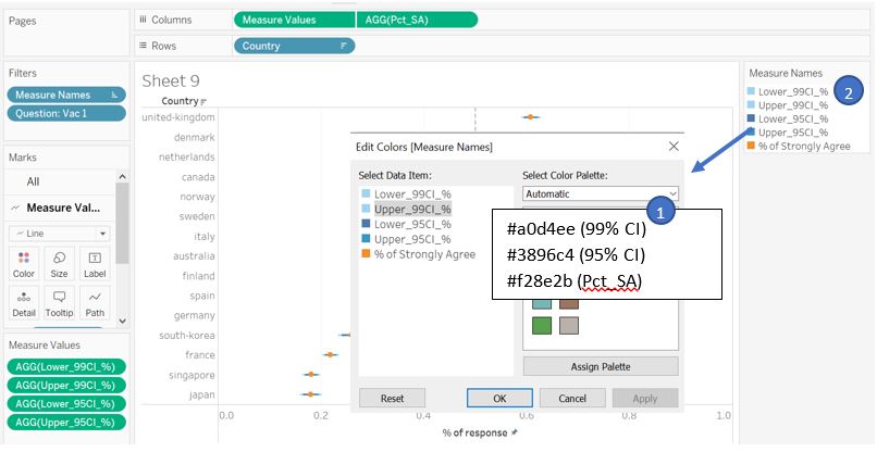
Figure 33: Adjust plot color
As it is difficult to trace the dot plot to the country label at the left header, we can instead label each dot with the country name and remove the Y-axis. To do so, drag Country field to Label of Measure Values in Marks shelf, change the alignment to Middle vertical and Allow labels to overlap.
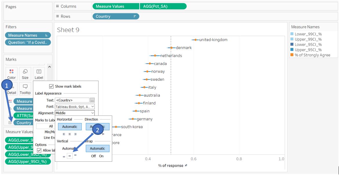
Figure 34: Create label near the data point
To allow reader to cycle among different survey question, we can show the filter by Show Filter for Question field. However, the value under Question is not intuitive and hence we need to create aliases for each question. Right click on Question in the Data pane and choose Aliases…. Fill the Value (Alias) column according to the actual survey question.
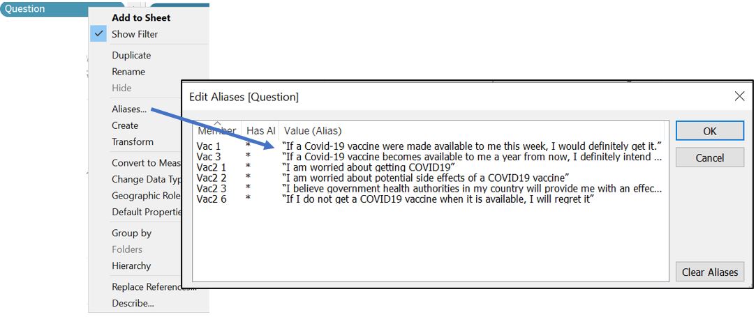
Figure 35: Create alias for Question
Click on the Question filter card and select single Single Value (list). Also, go to Customize and turn off Show “All” Value.
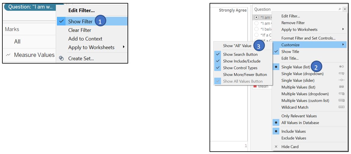
Figure 36: Show filter for Question
Next, we would like to provide options for reader to select how they want to split the percentage of response; not only by Country, but also by other respondent profile such as age, gender, household size, and employment status. To do so, create a new parameter Based-on Selector and add these attributes to the List of values (taking reference from here). Right click on the parameter and select Show Parameter.
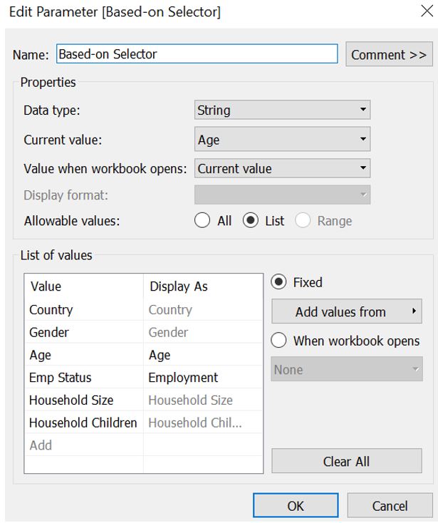
Figure 37: Create new parameter to select attributes
We also need to create new calculated fields for the respondent profile data. For Age, create new group so that we can assign respondents into one of the age group. 4 groups are created to represent different generation: babyboomer, Gen X, Y, and Z. For Household Size and Household Children, we need to right click and choose create new calculated field for new categorical fields Household Size (Grp) and Household Children (Grp).
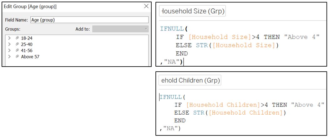
Figure 38: Create new calculated fields for respondent attributes
Next, create a new calculated field Placeholder1 to receive input from our [Based-on selector] parameter and drag it to our Rows shelf and Label card (replacing Country). The idea is that when reader choose the attribute from the parameter list, it will change the input to our Rows shelf.
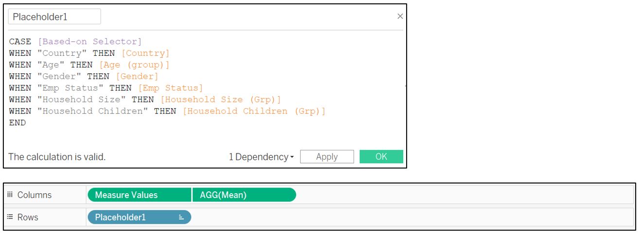
Figure 39: Create new calculated field to receive attribute selection
Finally, add title to link the percentage response towards the selected question. As we have observed previously, one of the survey questions has less respondent as compared to the rest. We can highlight this fact by showing the number of respondents in the title. Create new calculated field SumRecords to sum up record excluding the grouping by variable in Placeholder1. Drag it to the Detail in Marks shelf so that it will show up when we edit the title.
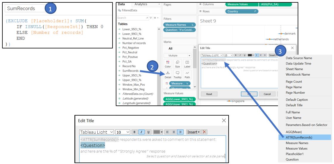
Figure 40: Create title with number of respondent
For the individual data point, we also provide the number of respondents by dragging the Number of records to the Tooltip of AGG(Pct_SA) in Marks shelf. Add Placeholder1, % of strongly agree, and number of records as shown below.
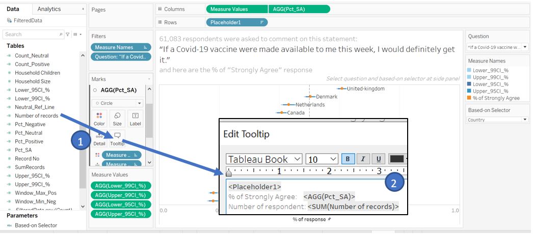
Figure 41: Create tooltip for Pct_SA
As for the tooltip of the confidence interval bar, we can show the category (Placeholder1) and the value of the confidence interval. Go to Measure Values card in Marks shelf and click on Tooltip.
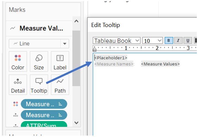
Figure 42: Create tooltip for confidence interval
Finally, change the Measure Names legend title to “Legend” and format the Measure Values and Pct_SA fields to percentage type.
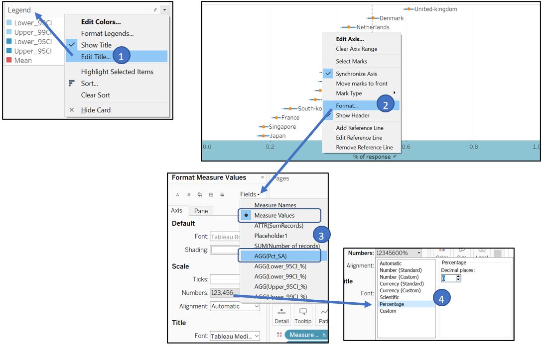
Figure 43: Final touch up
Edit the Filter title to orientate reader to the selection of questions.
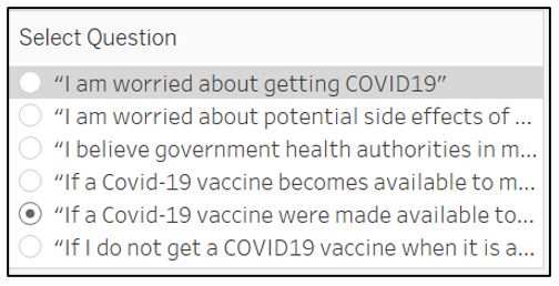
Figure 44: Change filter caption
The visualisation for part 1 will look like this.
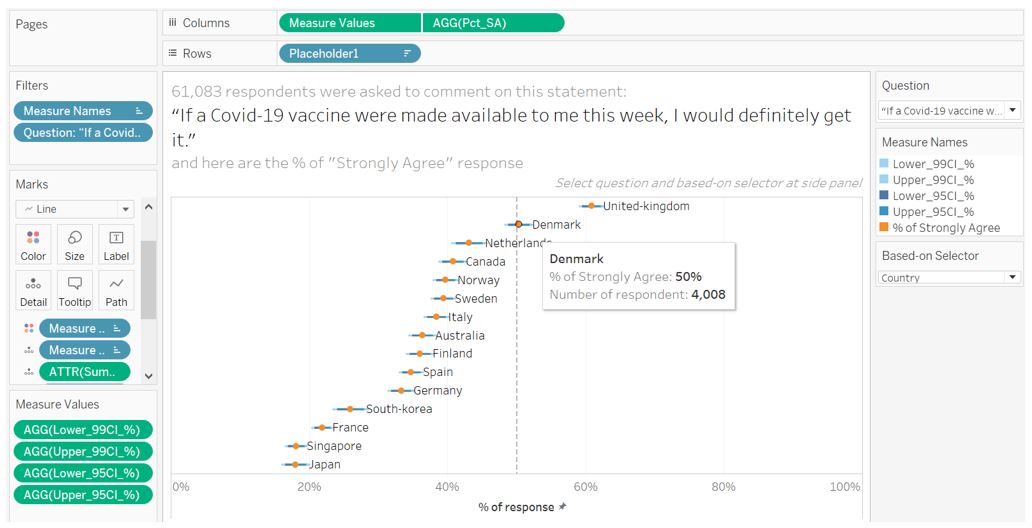
Figure 45: Final appearance for part 1
Visualisation part 2 – Diverging bar chart for Likert scale survey
In the next part, we want to count the percentage of responses for each category (1-5), hence we first need to count the positive, negative, and neutral response for ResponseInt using calculated field.
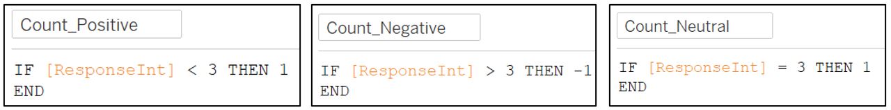
Figure 46: Count response
Next, create another calculated field for percentage of each response category. We need to use EXCLUDE:[Response] so that the sum of number of records are calculated to include all categories (1-5) for a selected survey question.
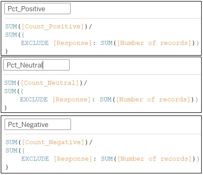
Figure 47: Count percentage of response
We then create a dual-axis chart by dragging Pct_Positive and Pct_Negative to Columns shelf, and Question to the Rows shelf. Right click on AGG(Pct_Negative) and choose Dual Axis. For neutral response, we will show it separately at the side by dragging the Pct_Neutral to the side of AGG(Pct_Negative).
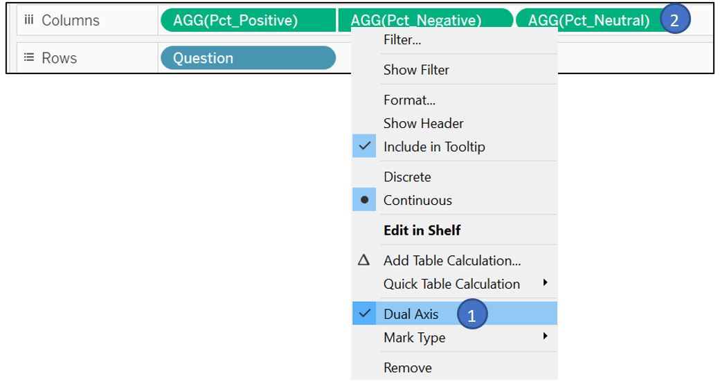
Figure 48: Drag measure to Rows and Columns shelf
Synchronise the two axis and change the format of X-axis label to percentage. The top X-axis can be hidden to save space.
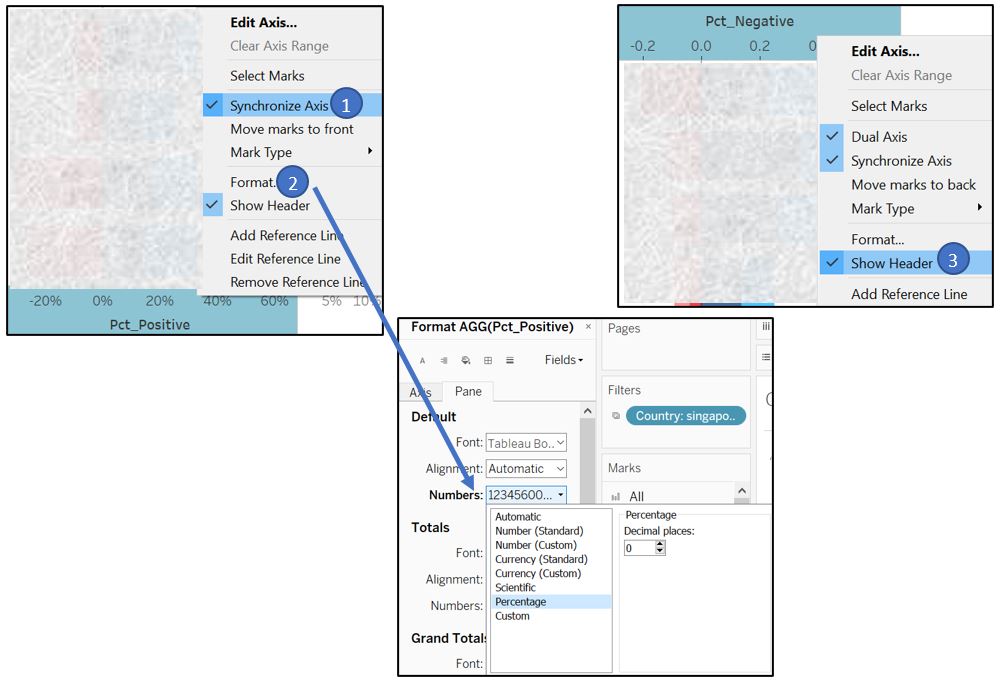
Figure 49: Sync X-axis and hide
Change the plot type to Bar and drag Response to Color in Marks shelf to color the bar according to the response. Change the default color by clicking on the Legend. Also, adjust the color legend so that the strongly agree and strongly disagree are centred for easy comparison. This is done by arranging the label in the color legend accordingly. We can reduce the bar size as well.
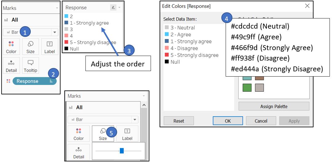
Figure 50: Adjust color legend
In addition, 0% reference line is added to assist reader in finding the centre point. Set Value at 0 and Constant type, set Label as None, and use dashed line.
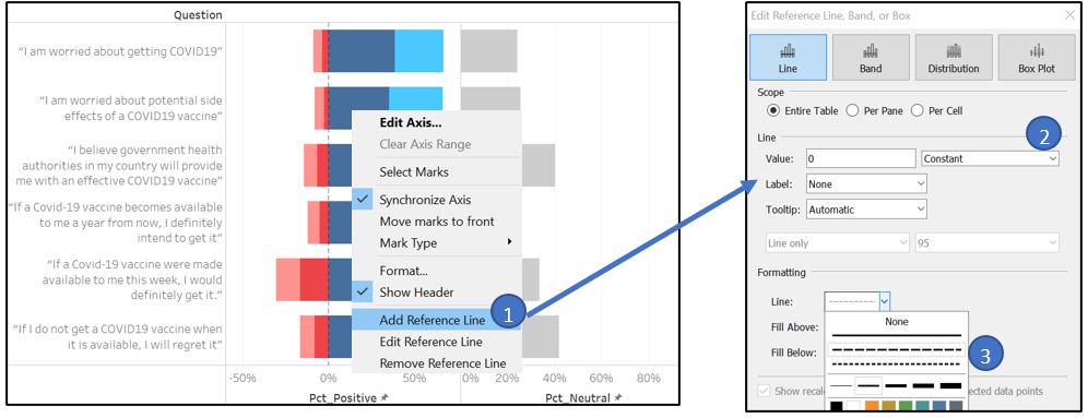
Figure 51: Set zero reference line
We can create Aliases for Response field to better clarify the response category and fix the incosistent dash character (-) between 1 and 5.
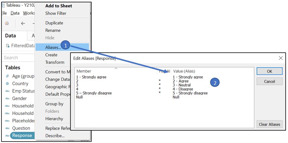
Figure 52: Set aliases for Response
To understand the respondent profile for each response category, we can make use of Tableau tooltip to show the visualisations of each respondent’s attribute. But first, we need to prepare a visualisation for each respondent attribute.
1. Gender
As there are only 2 categories under gender, we can use pie chart to compare the percentage between male and female respondents. Drag Gender to Rows shelf and Number of records to Columns shelf.
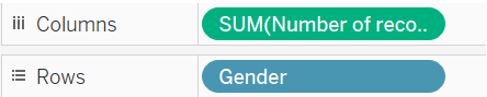
Figure 53: Gender measure and number of records
Open Show Me feature from the top right corner and select pie chart.
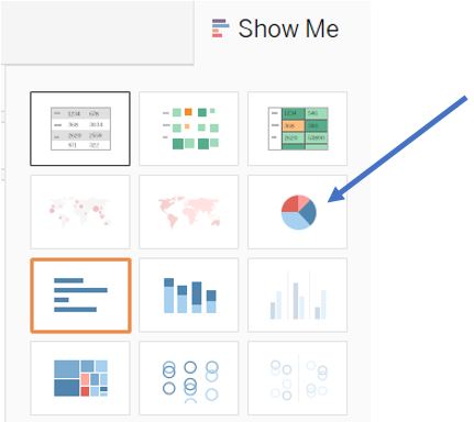
Figure 54: Select pie chart from Show Me feature
Drag Number of records to the Label in Marks shelf, go to Quick Table Calculation and select Percent of Total to convert the value to percentage.
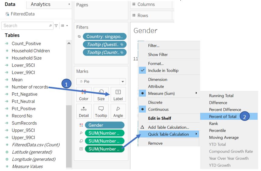
Figure 55: Add percentage value
Change the format of % of Total field to remove decimal place.
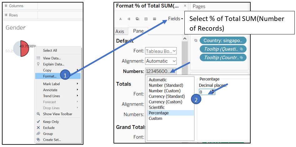
Figure 56: Set label decimal format
Drag Gender to Label in Marks shelf and adjust the format of the label.
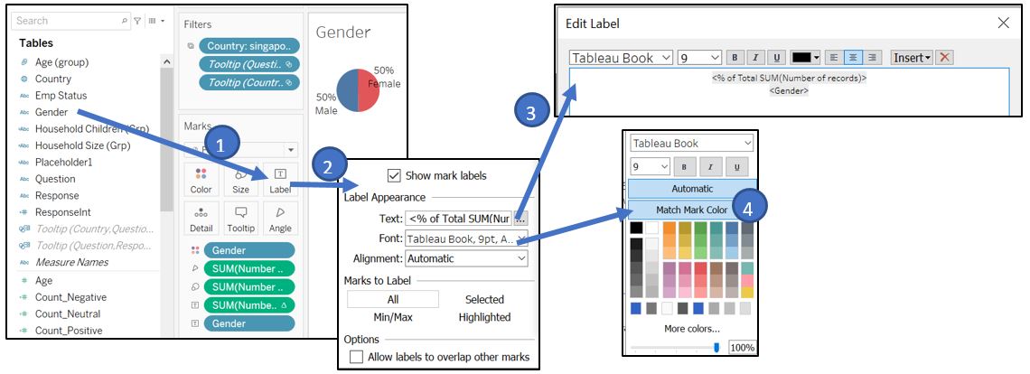
Figure 57: Add gender and set label format
Set the Fit setting to Entire View.
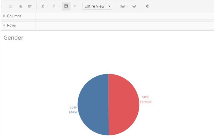
Figure 58: Final appearance for gender pie chart
2. Age
There are 4 age groups created in the previous part and we can use donut chart to represent the percentage among them. We can refer to this blog post to create a donut chart in Tableau.
Double-click on Rows shelf and write “avg(0)” and press enter. Repeat the same step next to the newly created AGG(avg(0)).
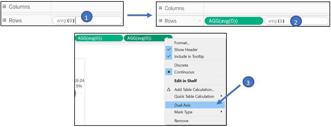
Figure 59: Create empty cards
This will create 2 cards in Marks shelf. On the first card, change the type from Automatic to Pie. Drag Age (group) and Number of Records to Label in Marks shelf. Drag another Age (group) to Color.
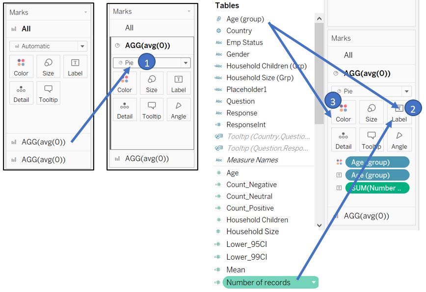
Figure 60: Create pie chart
Change the label to percent of total.
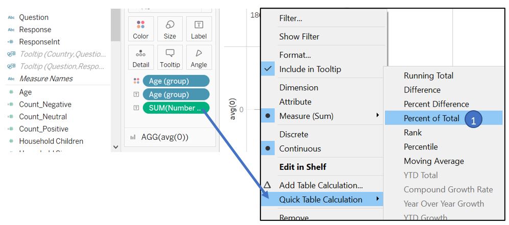
Figure 61: Create percentage label
Remove the decimal place through formatting.
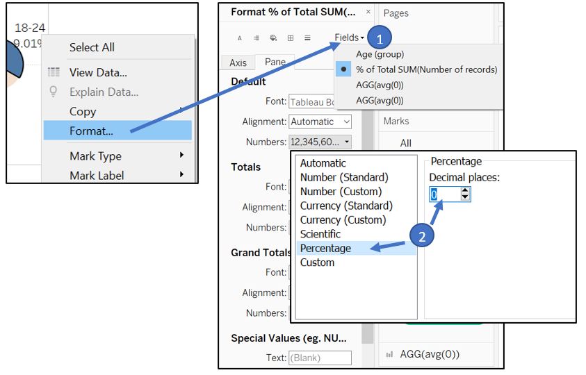
Figure 62: Remove decimal place
Edit the label to show category and value side-by-side, set font size to 5, and allow overlap.
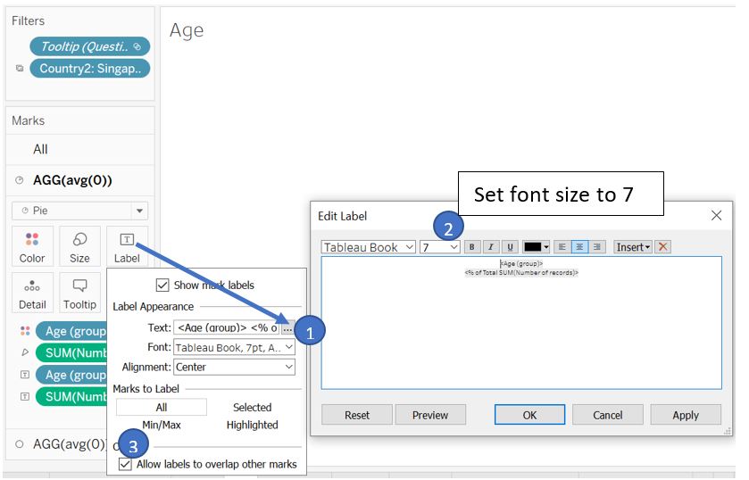
Figure 63: Adjust label
On the second card, change the type to Circle. Adjust the Size (make it smaller) and set Colour to white to get the intended donut chart. Remove the Y-axis as well.
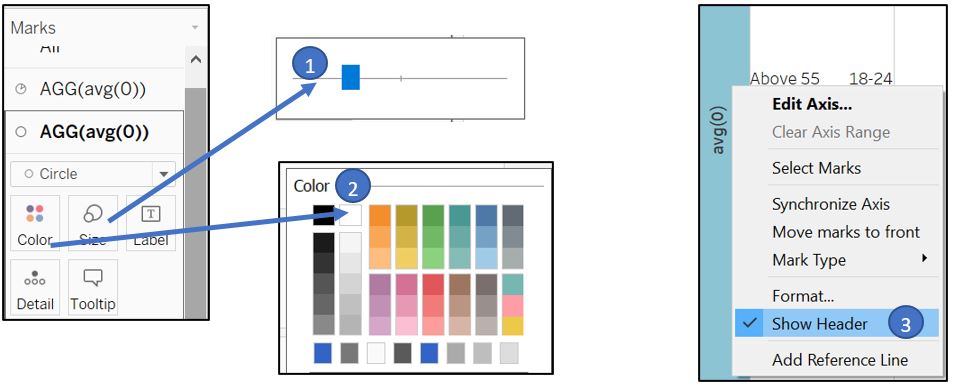
Figure 64: Create donut shape
To add “Age” in the middle of the donut chart, drag Age (group) to the Label for the second AGG(avg(0)) and change the Text to “Age” instead of the age group value. Set Alignment to Middle and tick Allow labels to overlap other marks.
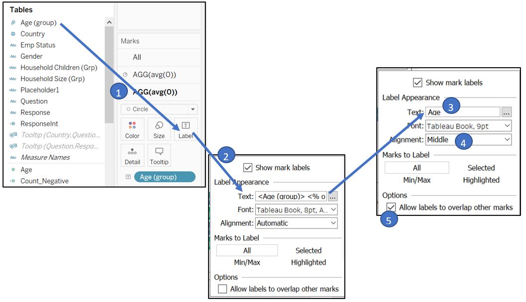
Figure 65: Add age title in the middle of donut
Set the Fit setting to Entire View.
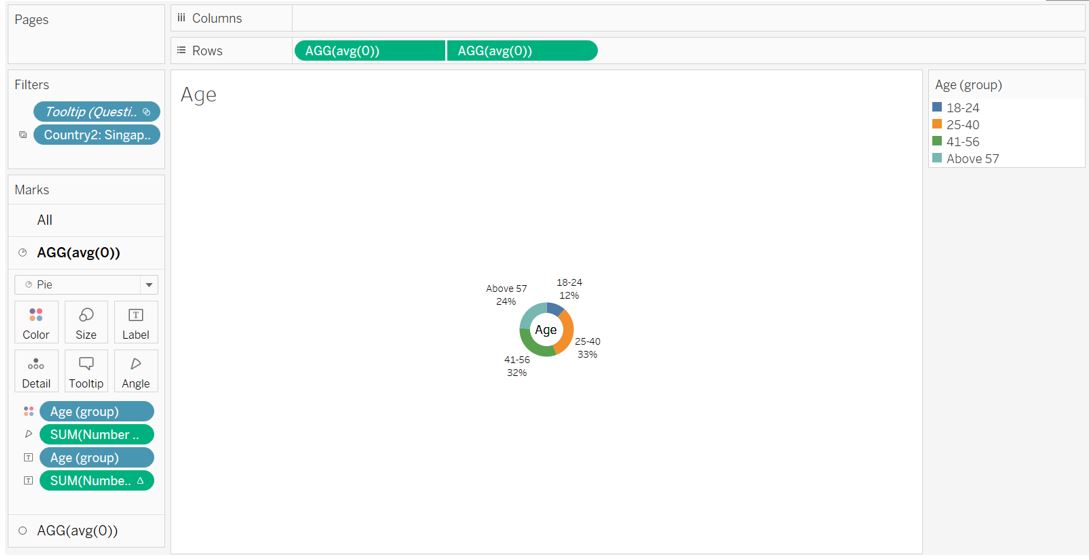
Figure 66: Final appearance for age donut chart
3. Employment status
For employment status, we will use horizontal bar chart with percentage label to show the distribution. Drag Emp Status to Rows shelf and Number of records to the Columns. Right click on the SUM(Number of records), go to Quick Table Calculation and select Percent of Total to convert the value to percentage.
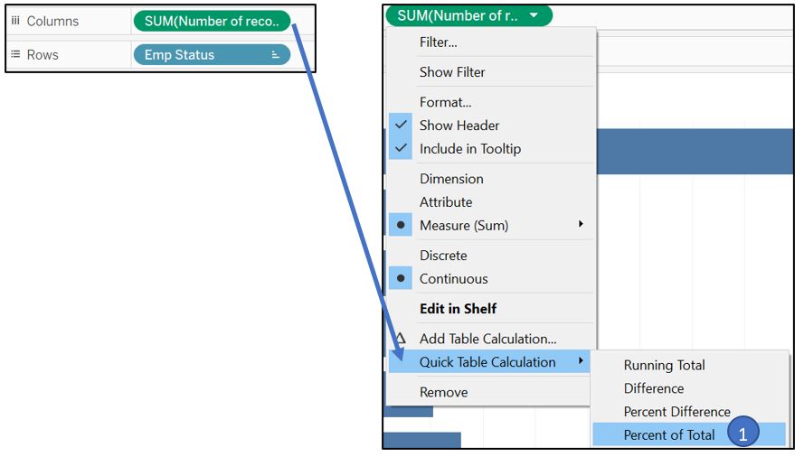
Figure 67: Add measure and set to Percent of Total
Turn on the Label and change the format of % of Total field to remove decimal place.
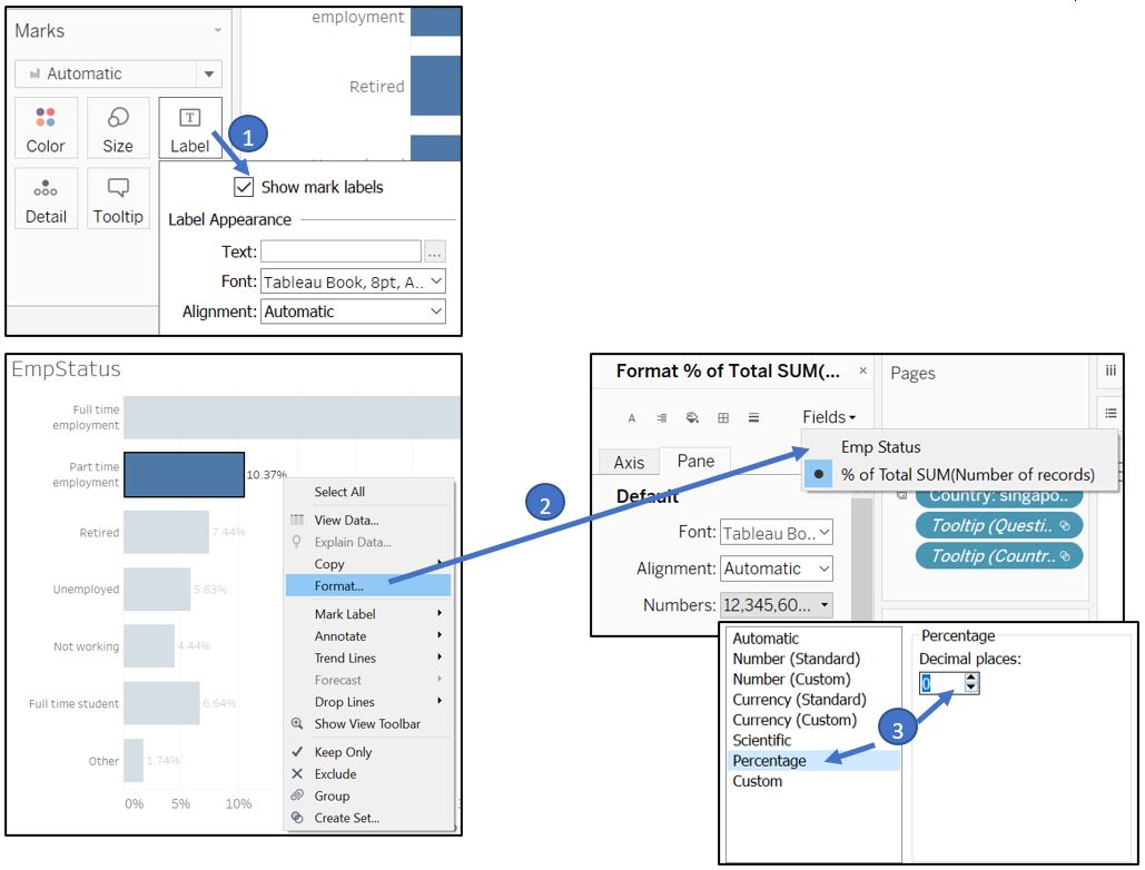
Figure 68: Turn on the label and remove decimal place
Remove X-axis and re-arrange the order of employment status accordingly.
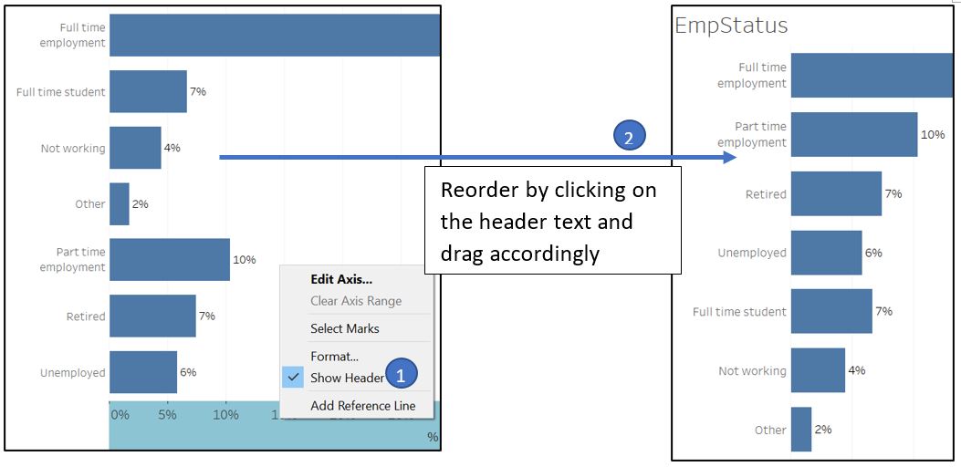
Figure 69: Reorder employment status and remove X-axis
Set the Fit setting to Entire View.
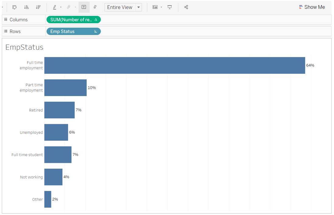
Figure 70: Final appearance for employment status bar chart
4. Household Size and Children
For these 2 attributes, we will use vertical bar chart. Drag Household Size (Grp) to Rows shelf and Number of records to the Columns. Right click on the SUM(Number of records), go to Quick Table Calculation and select Percent of Total to convert the value to percentage.
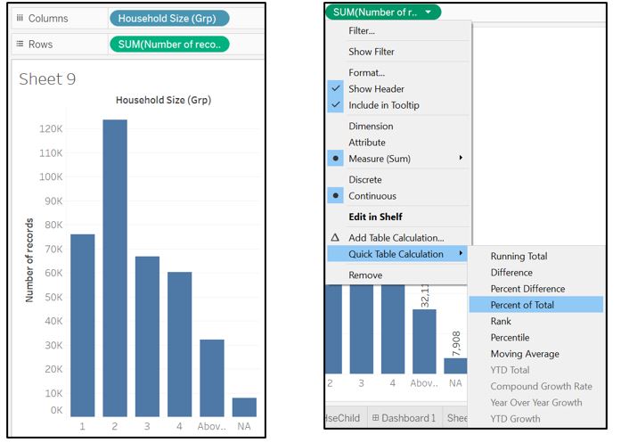
Figure 71: Add measure and change to Percent of Total
Turn on the Label and change the format to remove decimal place.
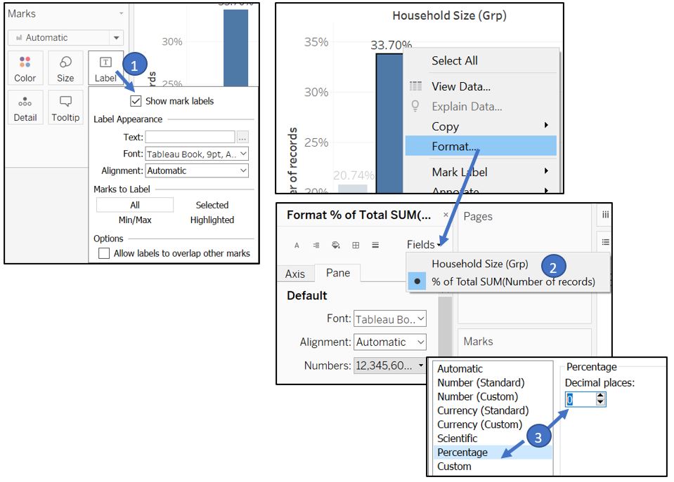
Figure 72: Add label and change the format
Remove the Y-axis and set the Fit setting to Entire View.
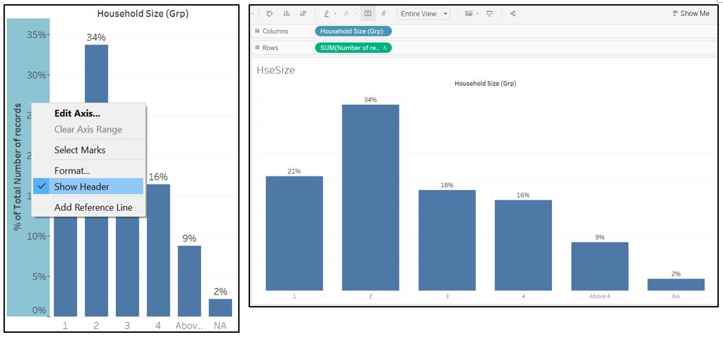
Figure 73: Final appearance for household size bar chart
Repeat the same step for Household Children (Grp).
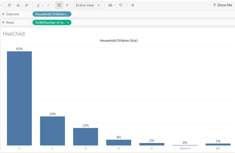
Figure 74: Final appearance for household children bar chart
Tooltip integration
Before we add the above visualisation to the tooltip, make sure that each of them has Entire View selected as the Fit setting. Back to the Likert scale worksheet, we want to allow reader to view country specific responses. Drag our Country to the Filters shelf, go to Apply to Worksheets, and choose Selected Worksheets…. Ensure all worksheets corresponding to our respondent’s attribute are selected.
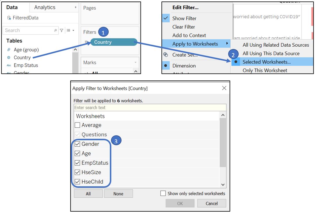
Figure 75: Link filter to individual visualisation of each respondent attribute
Activate Show Filter and use Single Value (dropdown) format for the filter interface.
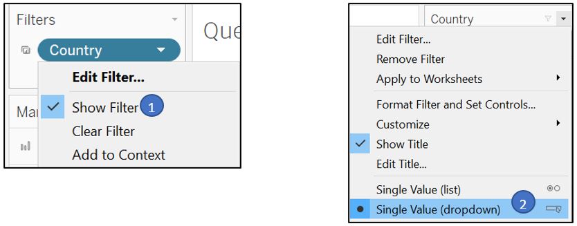
Figure 76: Show filter with dropdown list
Drag Country and Number of records to the Tooltip for All in the Marks shelf.
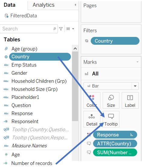
Figure 77: Add tooltip
Click on Tooltip and insert all the visualisations that we prepared before. For the Gender, Age, and EmpStatus worksheet, we can fit them into one row (add a space between each of them). Press enter after we insert Emp Status to go to the next row, and insert HseSize and HseChild worksheet. Please note that the maxwidth and maxheight of each worksheet has been modified to fit into the tooltip. Change the Show tooltips setting to On Hover so that it does not unnecessarily show the additional info when reader is moving the pointer across the visualisation (avoid overwhelming the reader).
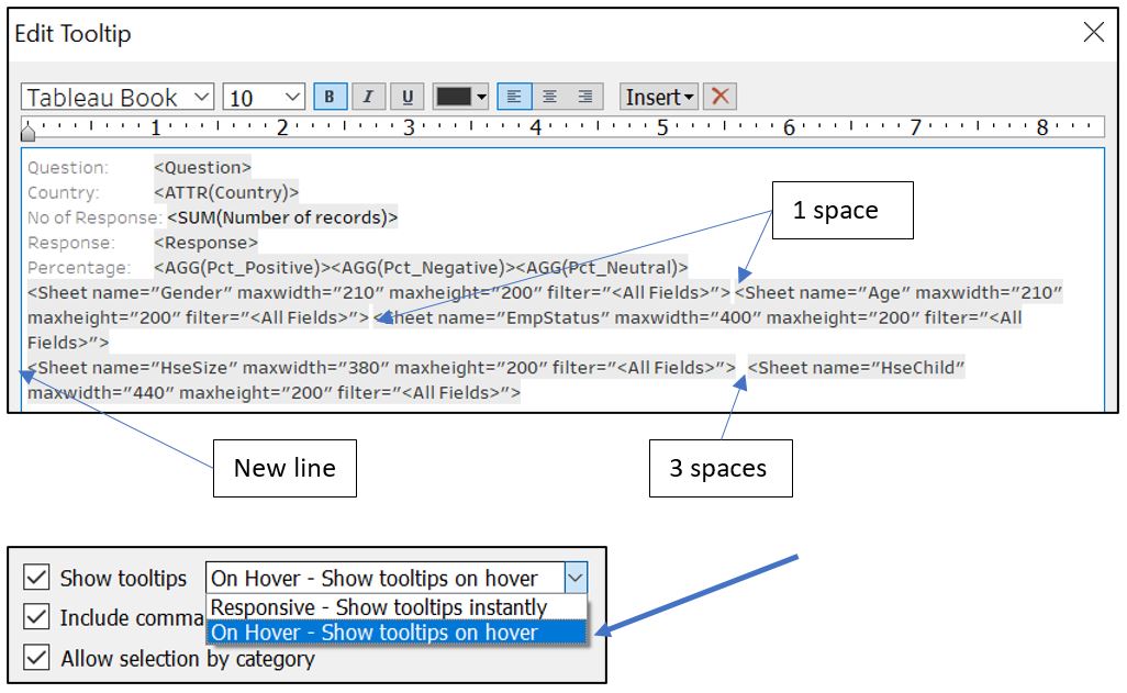
Figure 78: Edit tooltip content
Next, put the percentage of response as a label on the box so that the X-axis can be removed. Select Pct_Positive, Pct_Negative, Pct_Neutral and drag them to the Label for All in Marks shelf. Subsequently, adjust the format of the value to percentage with 0 decimal place.
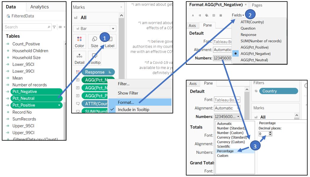
Figure 79: Add label and format
Select AGG(Pct_Positive) card in Marks shelf and remove AGG(Pct_Negative) and AGG(Pct_Neutral) from the Marks shelf. Do the same for AGG(Pct_Negative) and AGG(Pct_Neutral) Marks shelf, but retain AGG(Pct_Negative) and AGG(Pct_Neutral) accordingly.
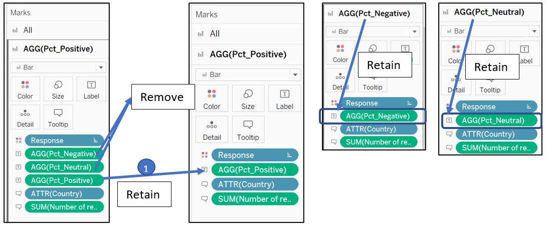
Figure 80: Remove label in each card
However, now we notice that the box length for the two plots are currently not proportionally the same. For example, the neutral box for 25% is bigger than the 29% of positive box side by side.
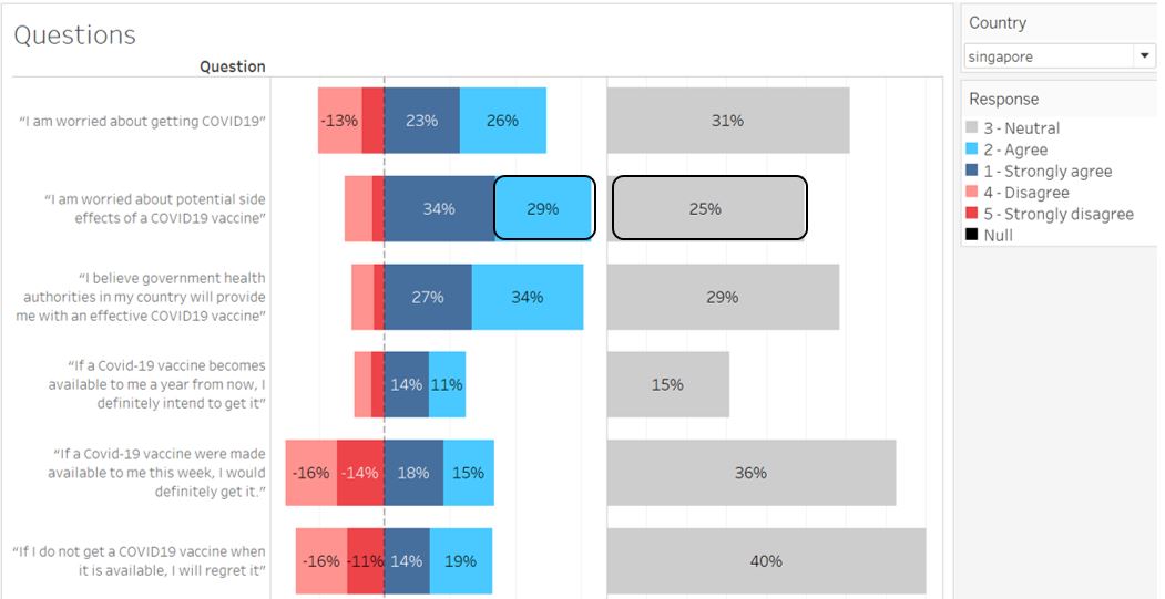
Figure 81: Box size is not proportional between Neutral and others
To fix this, we can follow a workaround described in Steve Wexler’s blog. However, there is a bit of adjustment required as we have different Level of Detail than the example in the blog. First, create new calculated fields to get highest range between positive and negative response. This will determine our Neutral X-axis range by setting an invisible reference line with that range value.
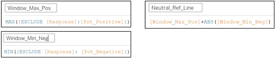
Figure 82: Create new calculated fields to set up Neutral reference line
Bring Neutral_Ref_Line to the Detail of AGG(Pct_Neutral). Right click the X-axis of Pct_Neutral and Add Reference Line. Set Value to our Neutral_Ref_Line with Total aggregate, and set the Label and Line to None as we don’t really need to show it.
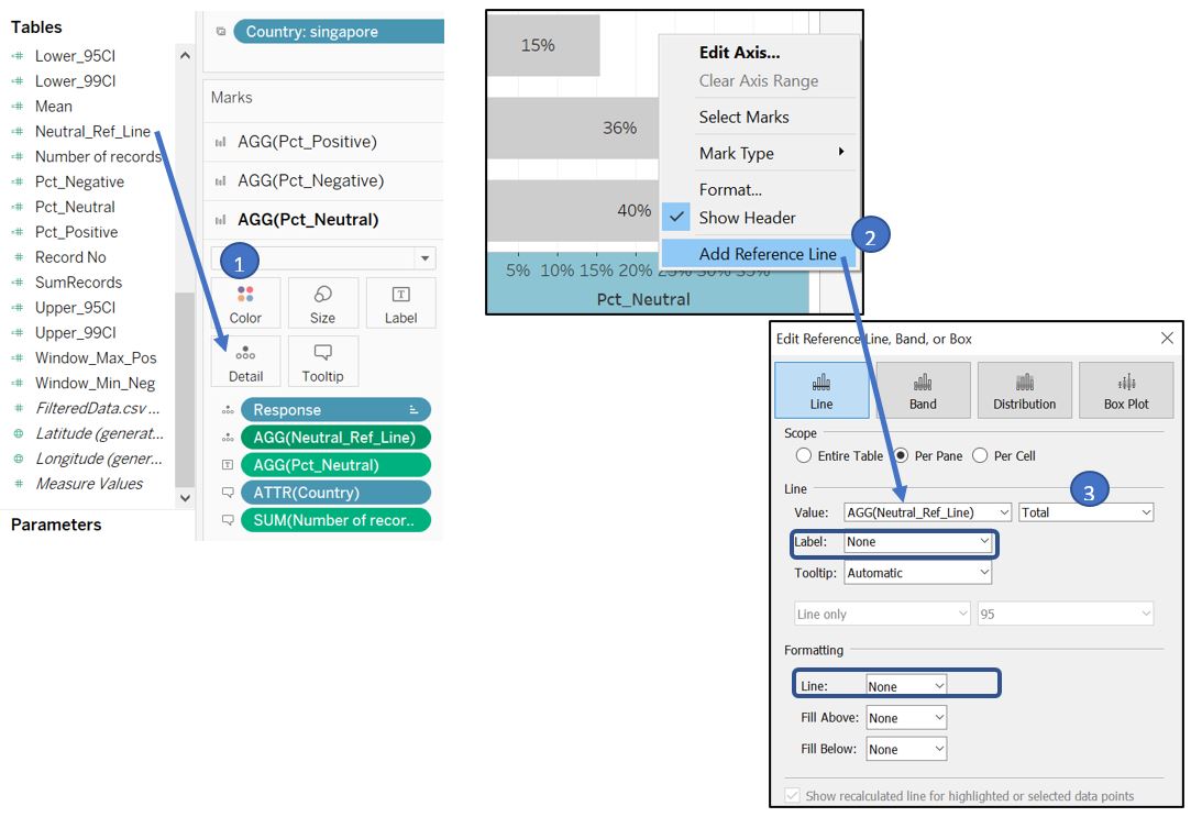
Figure 83: Create new calculated fields to set up Neutral reference line
Now, the box size for Neutral and Positive / Negative is proportional: the 29% response in both sides are now of similar size. We can proceed to hide the X-axis as the label has shown the percentage value.
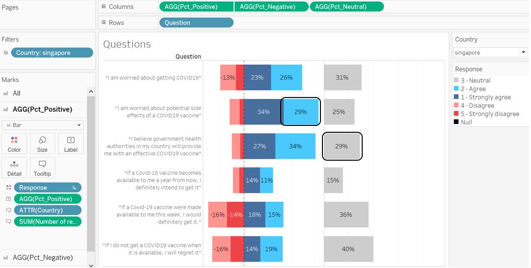
Figure 84: Proportional box size
The tooltip appearance will look like this when reader hover into one of the response boxes. Note: if gender label overlaps with the pie chart, go to the gender worksheet and reduce the size of the pie chart
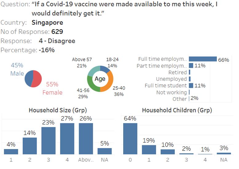
Figure 85: Tooltip appearance upon hovering on the box response
We can also rearrange the Question to follow the original order accordingly.
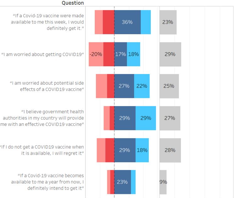
Figure 86: Rearrange question order
Capitalise country label
This part can be skipped if you don’t mind having country label in lower case.
To capitalise the initial letter of each Country label, create new calculated field Country2.
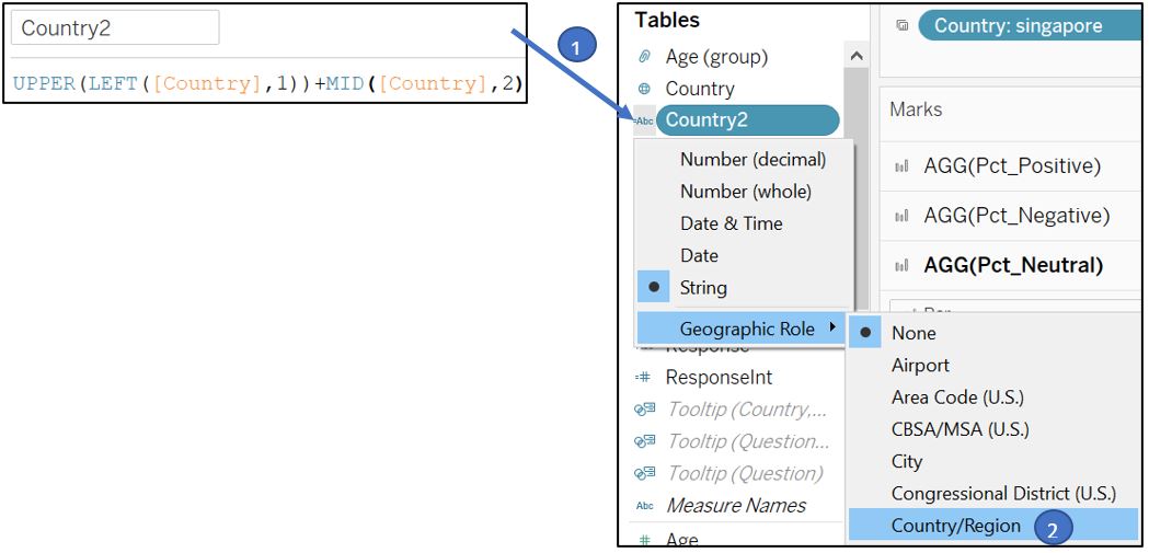
Figure 87: Capitalise country name
If you were redirected here from data preparation section, go back to this section to continue with the visualisation, and use Country2 instead of Country in the subsequent steps
Change all measure Country in both visualisation part 1 and 2 with Country2.
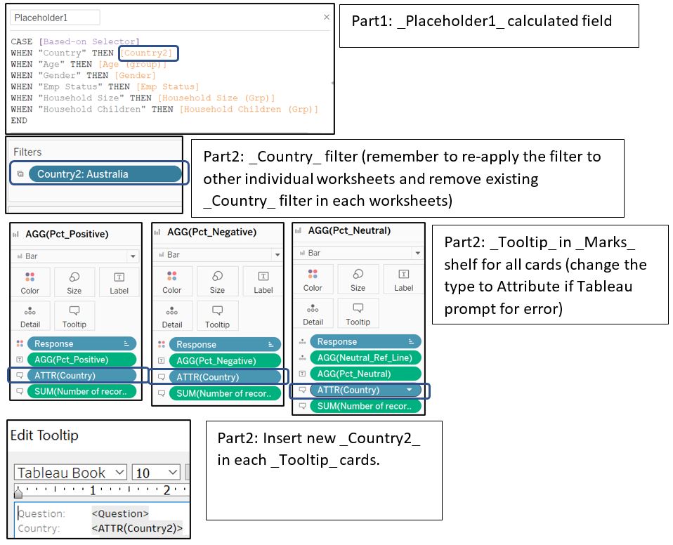
Figure 88: Change country label
Finally, add title to the visualisation and edit the Filter title to better orientate the reader.
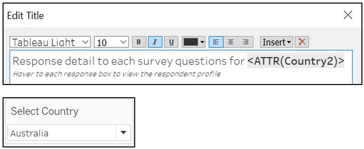
Figure 89: Edit title and filter caption
Creating dashboard
Create new dashboard and drag Percent worksheet to the dashboard. The blue color rectangle below shows the component of our worksheet. The other components like image, text, and blank are highlighted accordingly with different colors. The image is taken from here.
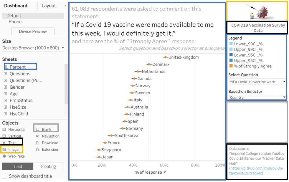
Figure 90: Dashboard 1
Create new dashboard and drag Questions worksheet to the dashboard. Similarly, the components are highlighted with different colors below.
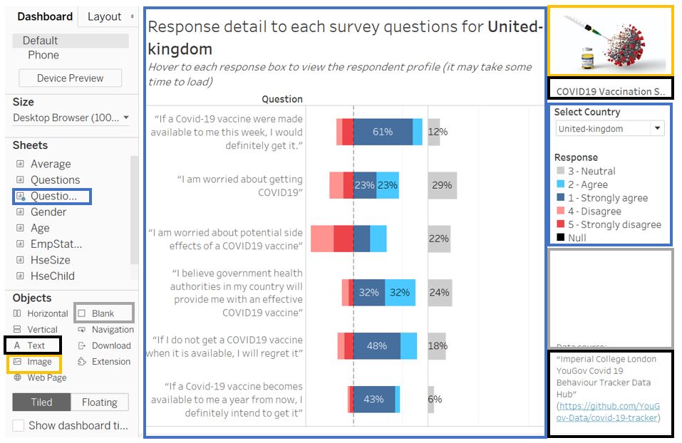
Figure 91: Dashboard 2
Often, the format of the visualisation is not properly displayed in Tableau Public (due to different display setting between browser and desktop). Some adjustments like font size and filter type are made to address this issue.
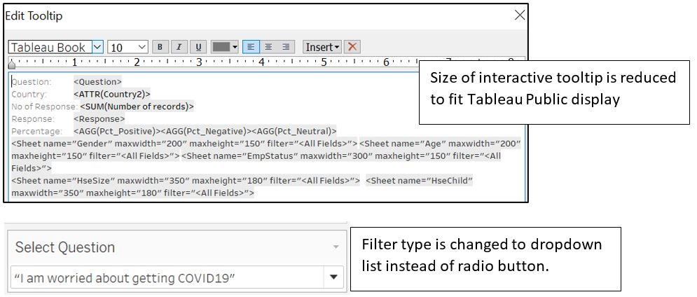
Figure 92: Adjustment before publishing to Tableau Public
4. Observations
- From this interactive visualisation, we can observe that United Kingdom has the most positive response towards vaccination while Singapore is at the bottom with low positive response. If we look at another question on “whether they will regret if they do not get a vaccine”, Singapore response is also the least positive which may suggest that majority of Singapore respondents do not see getting vaccinated as a necessity.
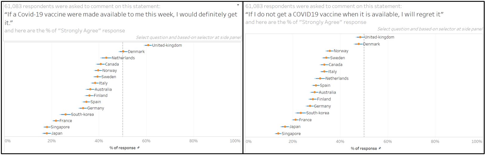
Figure 93: Which country is more positive towards vaccination?
- In the previous chart, Japanese respondent is the least positive about getting vaccinated. However, the chart below shows that despite the Japanese respondent is worried about getting COVID (2nd place), they are also concerned about the potential side effects from the vaccine (3rd place). While France leads in the 1st place with the most worried respondent, Singapore is at 4th place which may suggest the reason against vaccination.
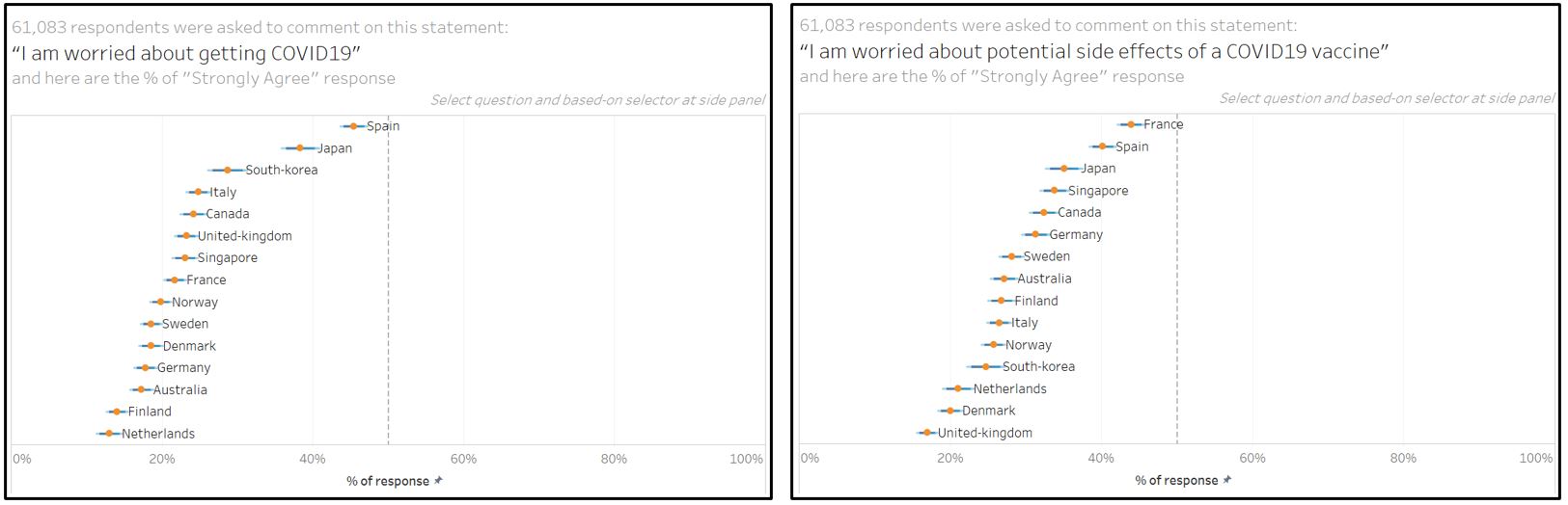
Figure 94: Which country is the most concerned about vaccine side effect?
- When we investigate the response by employment status, retired respondents are more willing to get vaccinated as compared to the rest. Interestingly, this aligns with them being the least worried about the side effect and most supportive and trusting of their government to provide effective vaccine.
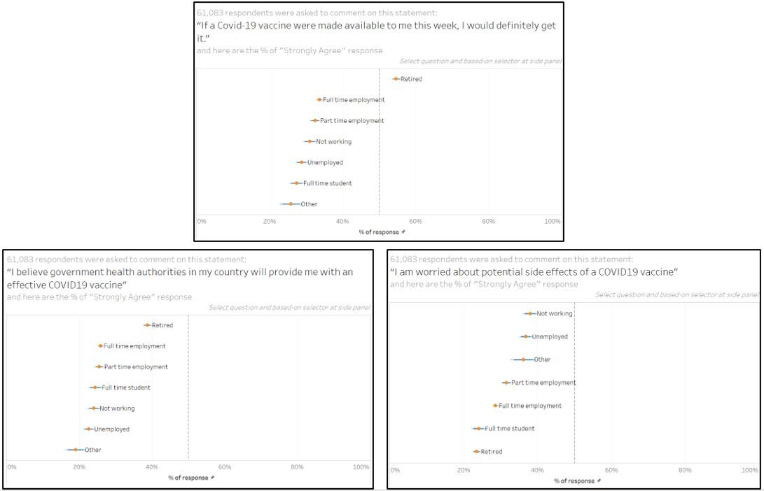
Figure 95: Retired respondent is more willing towards vaccination
- From the Likert scale and interactive tooltip for Singapore, the higher observation for male respondents who are willing to be vaccinated may stem from the fact that there are more female respondents who are worried about the side effects.
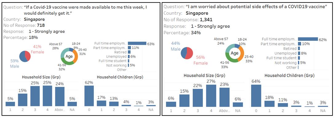
Figure 96: Different response based on gender in Singapore
Comparing “strongly agree” response towards vaccination between Singapore and UK (18% vs 61%), it becomes apparent that UK has higher percentage of retired respondent (and older age group). This may suggest a possible link between a country’s demographic and country’s response towards vaccination.
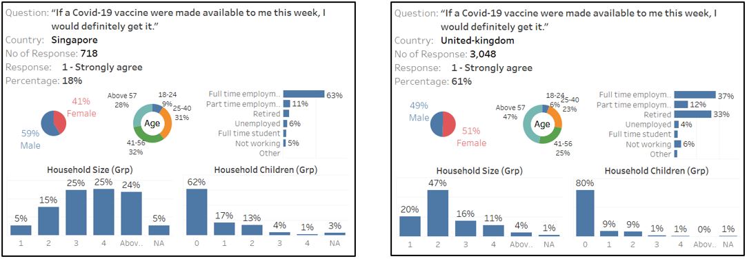
Figure 97: Demographic and response
This is also true for Germany and France (high percentage of old and retired person), even though negative sentiment rules the majority of France respondent.
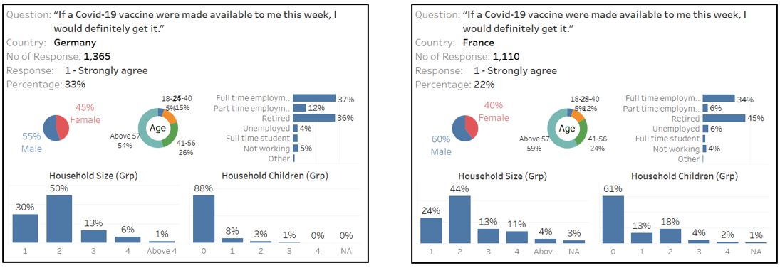
Figure 98: Germany and France respondent who strongly agree with vaccination
Between Japan and UK, although the respondent who “strongly agree” to get vaccinated has similar percentage of old age (above 57), the percentage is totally different (61% vs 18%). This shows that older person is generally more willing to get vaccinated, be it he/she is a retiree or not.
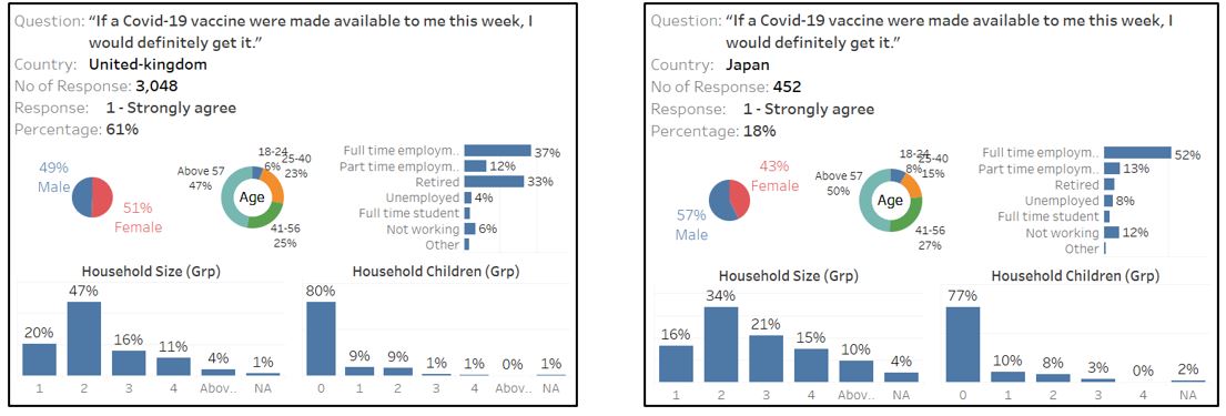
Figure 99: Japan and UK respondent who strongly agree with vaccination
Any suggestion and feedback is much appreciated! Email: kevin.albindo@gmail.com