1. Introduction
This post is part of the submission for ISSS608 DataViz Makeover assignment 3. Data visualisation critique and makeover is done on South-east Asia Armed Conflict Analysis dashboard.
The data is extracted from The Armed Conflict Location & Event Data Project (ACLED) database for Southeast Asia region between 2010 and 31 October 2020. More info about ACLED can be found here.
The assessment criteria will be similar to the previous blog post, based on the clarity and aesthetic aspect of the visualisation (taking reference from “Data Visualization: Clarity or Aesthetics?” by Ben Jones). In addition, since the dashboard is meant to be interactive, we will also assess its interactive feature based on utility.
2. Critique and suggestion
The screenshot of original dashboard that will be assessed is shown below.
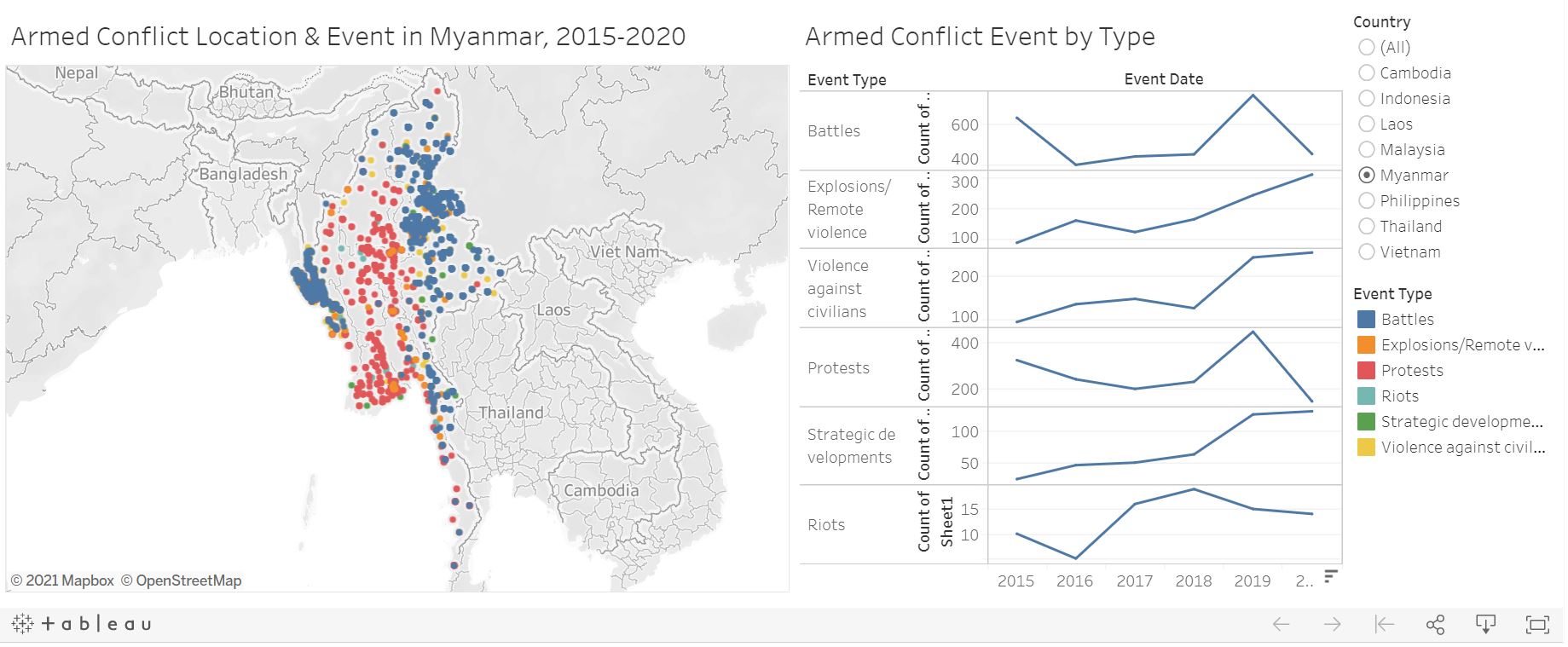
Figure 1: Original South-east Asia Armed Conflict Analysis dashboard
There are room for improvement to enhance the clarity, aesthetic, and interactivity of the original dashboard. The dashboard is created with the intent to reveal the spatio-temporal patterns of armed conflict in selected South-east Asia countries between 2015-2020.
Currently, while the combination of map view and trend line chart serves the basic purpose of displaying the data, there are some limitations that prevent reader to do further exploration and derive more useful insights. The next few sections will elaborate some of these limitations.
Clarity
The visualisation is at the deepest level of detail which is the individual event point. There is no option for aggregated view which allows comparison between countries. The reader may not be able to derive insights directly such as which country has higher frequency of conflicts relative to others in the region.
The line chart at the right side of the map provides conflict breakdown based on different event type. This allows reader to see the trend over time for each event type. However, they are plotted separately with different y-axis scale, making it difficult for reader to compare the value between event types.
The tooltip information for the map lacks important detail such as fatalities and actors involved. It will be clearer to have key event details in the tooltip, instead of the event ID and coordinate.
Aesthetics
Although it is quite safe to assume that the Y-axis of the line chart refers to the count of event type, it is better to describe it properly rather than using “Count of Sheet1”. The long text also leads to truncation of axis title which is not good. Field label such as Event Type and Event Date are redundant because the title has stated Event Type and the year label at the bottom is self explanatory.
Individual events are colored according to event type which helps to differentiate them. However, the color is set to solid which makes the display cluttered, allowing events to be hidden under other nearby events. In addition, the line chart should be colored accordingly by Event Type for consistency.
Interactivity
While the map provides spatial information for each event point, it is detached with the temporal information in the line chart i.e. yearly number of events. It fixates the reader on the conflict period between 2015-2020 which constrains the ability to perform analysis for specific time period of interest.
The visualisation allows reader to filter based on event type which is a useful drilldown function. It can be further complemented with the ability to change level of details (e.g. individual event vs country level) to provide more flexibility in exploring the data.
In addition to the above points, information on fatality is not made available in the visualisation even though it is available in the dataset. The additional information will help reader to have better understanding regarding armed conflict event e.g. how severe it is, based on the number of fatalities.
3. Proposed visualisation
Sketch
The following sketch shows the proposed visualisation and the advantages over the original visualisation will be elaborated. Tableau link
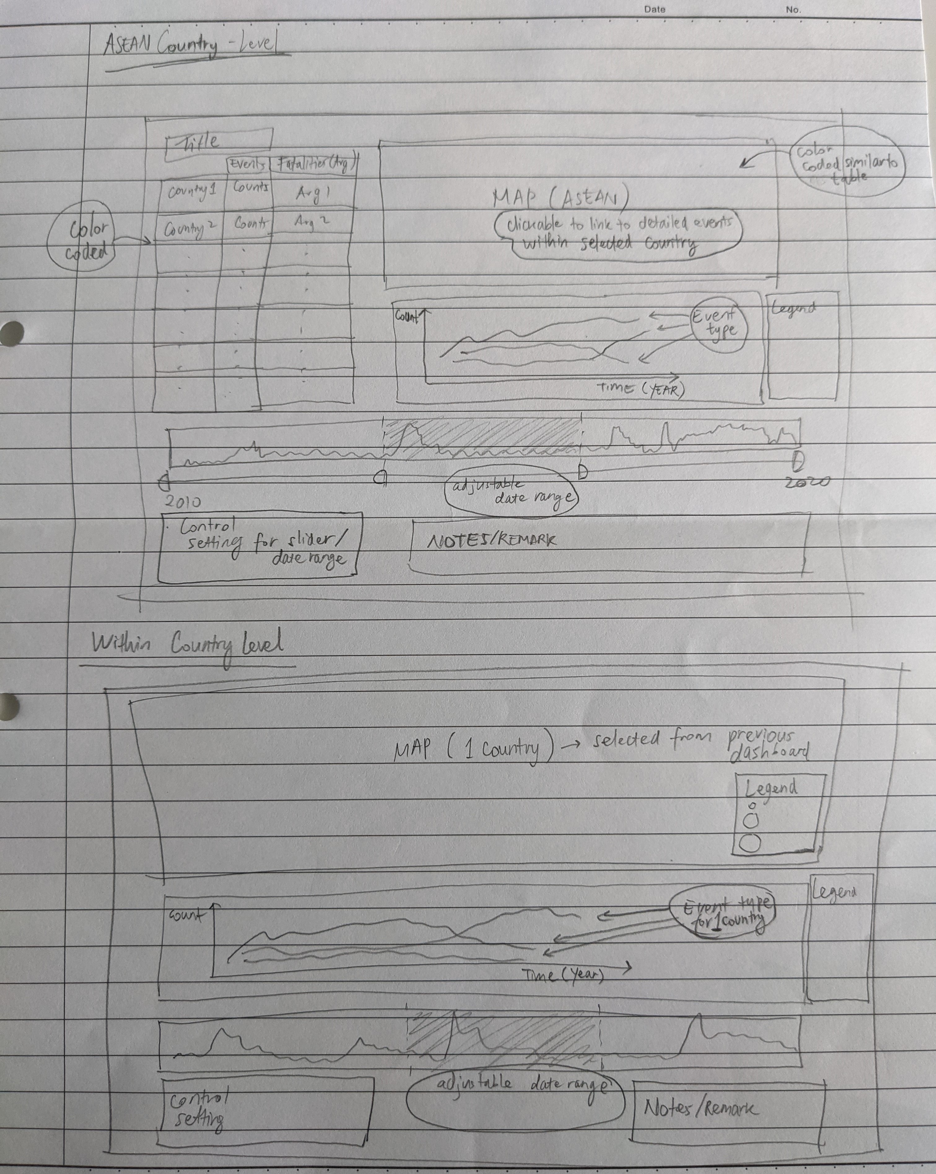
Figure 2: Sketch of proposed visualisation
Advantage of the proposed visualisation
The proposed visualisation comprises 2 parts, each with its own dashboard to allow overview of conflict in different countries within Southeast Asia region, followed by a more detailed information for each country.
To provide comparison among countries, a choropleth map is used to display the number of conflicts with different color coding. A tabular view is included to ease the comparison between countries. Average fatalities per event is given as additional information with different color coding.
Visualisation on different event types will be displayed in one plot as line chart so that comparison among event types is more convenient on a single Y-axis scale. Color variation which exists in the original dashboard is retained to differentiate the event types.
Selection of date is made possible by using a bar chart view with adjustable date range through parameters function in Tableau. This introduces flexibility for reader to explore conflicts within different period of interest.
Focus analysis on a particular country is also made possible through “Details-on-Demand” concept. Reader can first view the overview of Southeast Asia countries, after which he/she will be redirected to the country level dashboard upon selecting a particular country from the overview dashboard. Fatalities information is also encoded as the size of individual event points in the dashboard for ease of reference.
Variable list
For this visualisation, we are going to consider the following variables.
| Variable | Description |
|---|---|
| Actor1 | The named actor involved in the event |
| Actor2 | The named actor involved in the event |
| Country | The country in which the event took place |
| Event Date | The day, month, and year on which an event took place |
| Event Type | The type of event |
| Latitude | The latitude of the event location |
| Location | The location in which the event took place |
| Longitude | The longitude of the event location |
| Fatalities | The number of reported fatalities which occurred during the event |
Data import
The extracted data from ACLED covers the conflicts in South East Asia region between 2010 and Oct 2020. First, import the excel data file to Tableau.
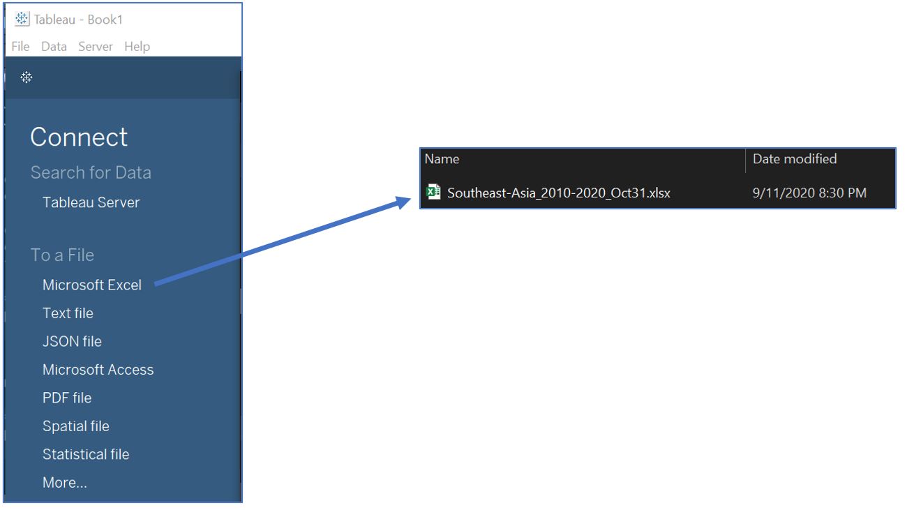
Figure 3: Importing excel file
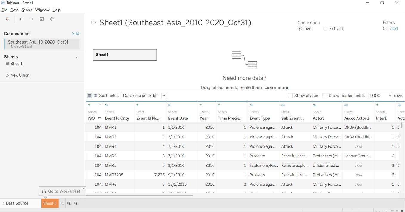
Figure 4: Imported data table view
Once imported, check the data format from metadata view. There is no further action needed as the required variables are already in the correct format.
Figure 5: Format for each variable
Preparing components of dashboard
First, we will create a choropleth map to represent the number of conflicts in each country. Drag Country dimension into the plot area.
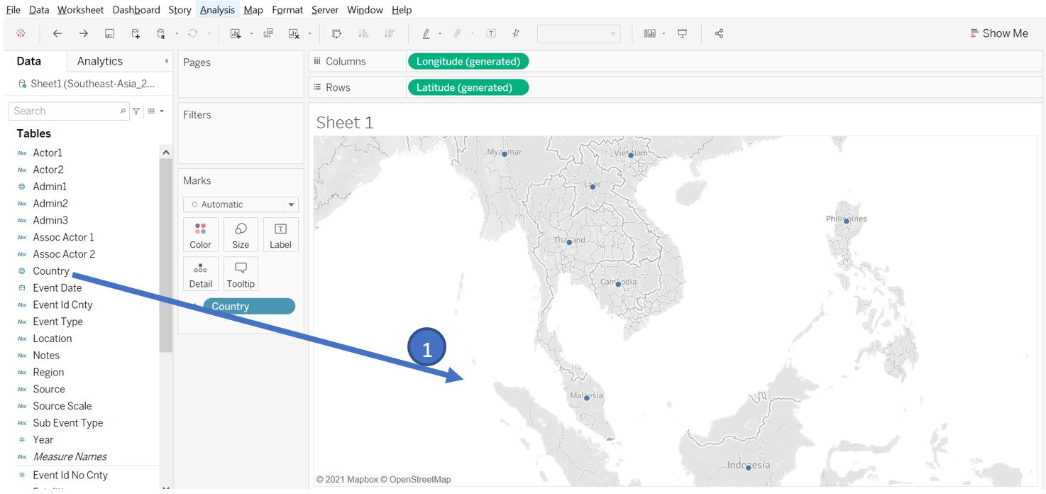
Figure 6: Drag country to plot area
Create new calculated field as a row counter of our data table.
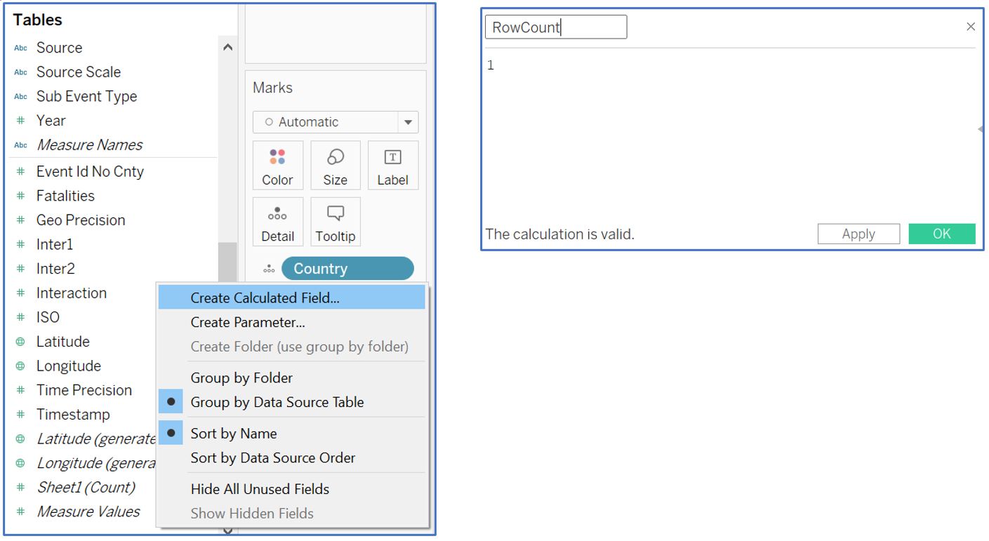
Figure 7: Calculated field for row count
Drag the RowCount measure to the Color card in the Marks panel. Double click on the legend and select the Palette to Red. Click on Advanced option and set the Start to 0 and End to 12000. Rename the worksheet to Map1.
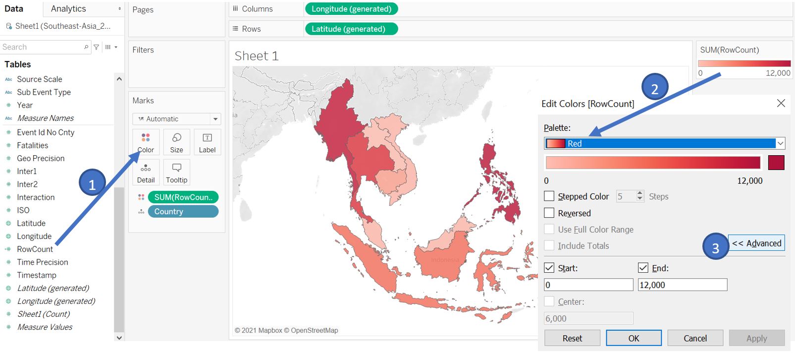
Figure 8: Add color based on number of rows/events
Next, we will create a separate map to show each individual event according to their longitude and latitude. Select both Latitude and Longitude (by Ctrl+click) and drag them to the centre of the plot area.
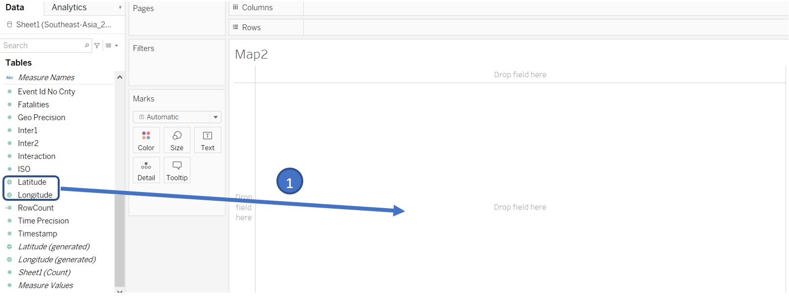
Figure 9: Plot individual data points based on latitude and longitude
Tableau by default will show the aggregated value (average) of latitude and longitude. Go to Analysis menu and untick Aggregate Measures to map each individual event. Drag Event Type to the Color card in Marks shelf, adjust the color Opacity to 50%, and set Border to white.
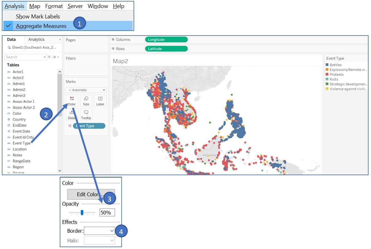
Figure 10: Color based on event type
We also want to show the number of fatalities by the size of the circle. Drag Fatalities to the Size card in Marks shelf. Double click on the Legend and slightly increase the smallest and largest size by sliding them to the right. Set the minimum and maximum value accordingly. Rename this worksheet to Map2.
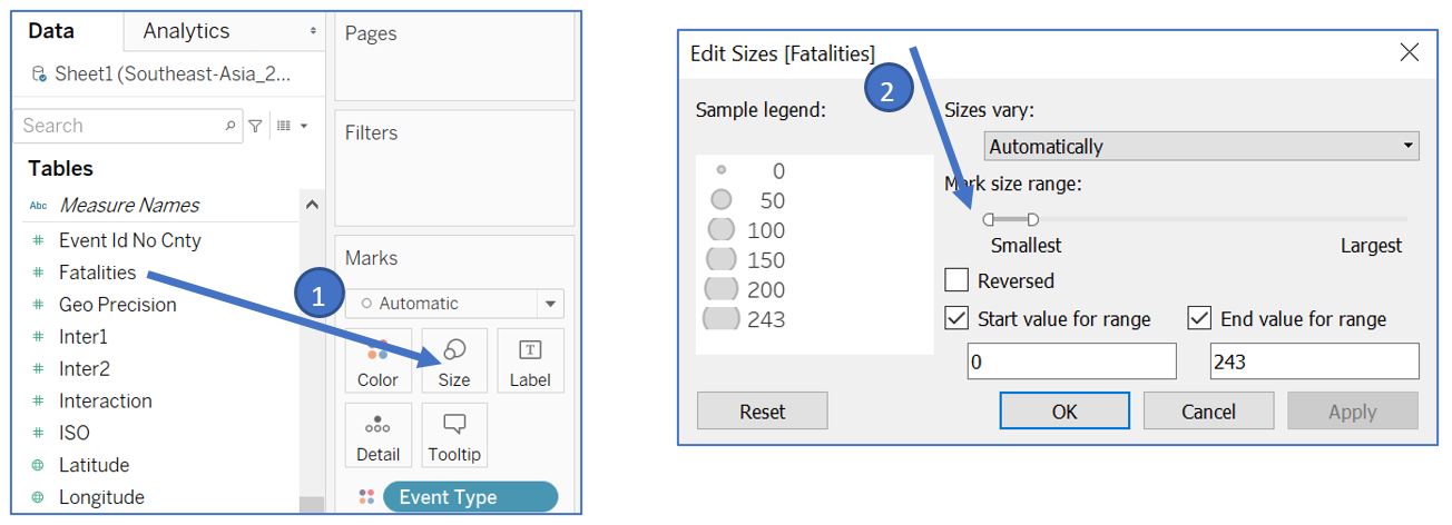
Figure 11: Add fatalities information as the size of circle
Next, we will create the highlight table to make the comparison between countries easier by showing the total number of events and average fatalities per event. Drag Country dimension to Rows shelf. Select Event Id No Cnty and Fatalities by holding Ctrl+click and drag them to the blank space in the middle of the plot area.
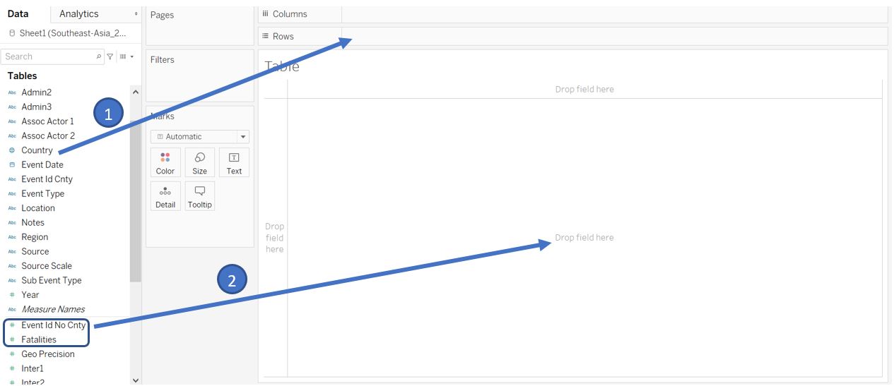
Figure 12: Create tabular view of event counts and fatalities
Change the measure of Event Id No Cnty from Sum to Count (Distinct) and Fatalities to Average.
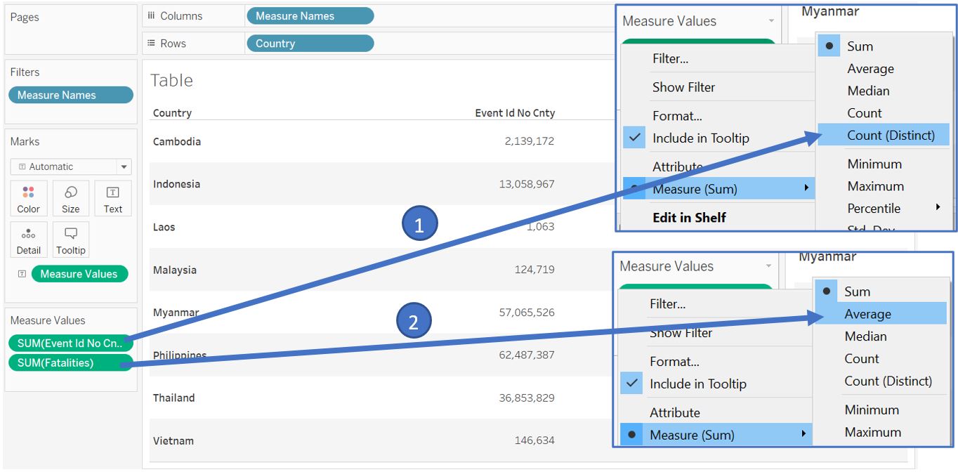
Figure 13: Change calculation for event count and average fatalities
Sort the values based on the number of events from highest to lowest. Edit the header of the column by right click and select Edit Alias. Change the Name to Events.
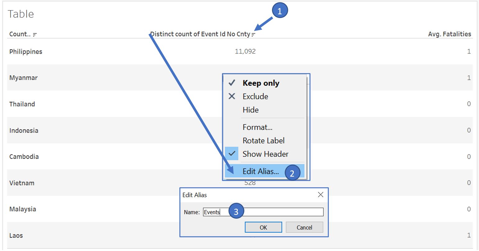
Figure 14: Sort table values
Next, set the number format for average fatalities to 2 decimal places. From the top menu bar, choose Format and select Font to open the Format pane at the left side. Click on Fields option and select AVG(Fatalities). In the Numbers selection, choose Number (Custom).
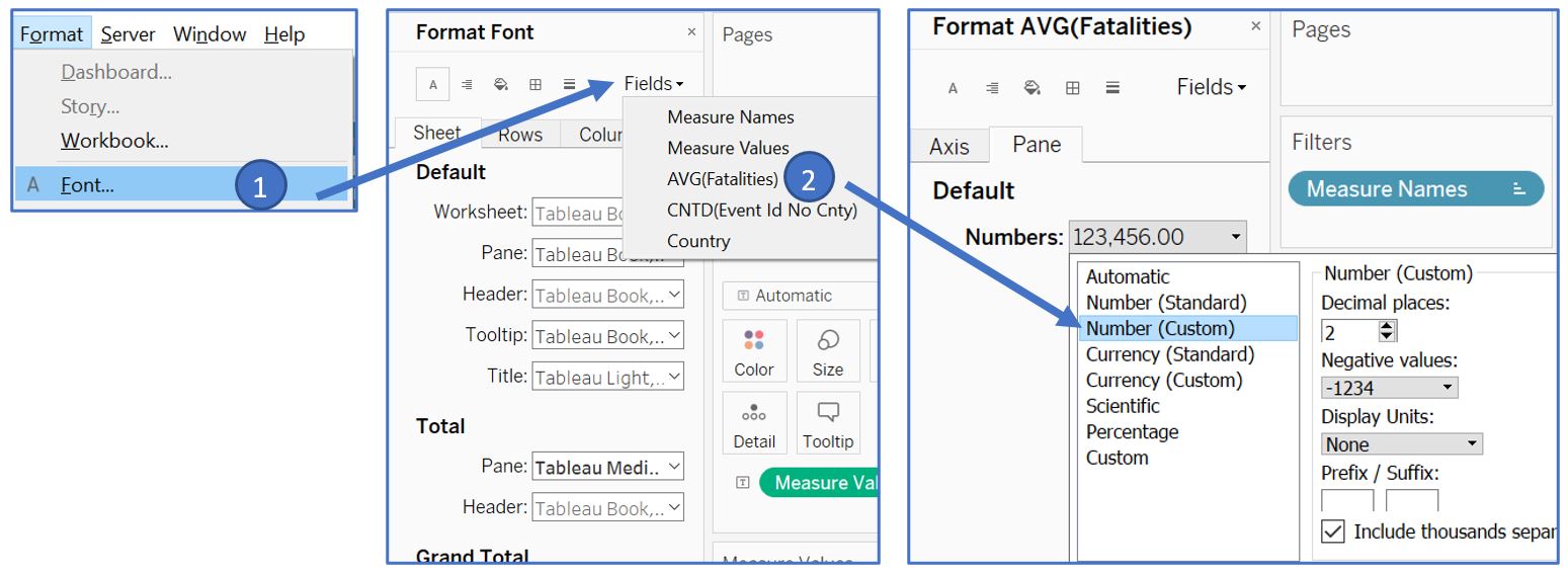
Figure 15: Set number formatting
Next, we will color the country numbers to show the difference qualitatively. Drag Measure Values to Color card in Marks shelf. Subsequently, right click on it and select Use Separate Legends. Double click on the Legend and set the color to red and brown for the number of events and average fatalities respectively. Change the visualisation type to Square in the Marks shelf.
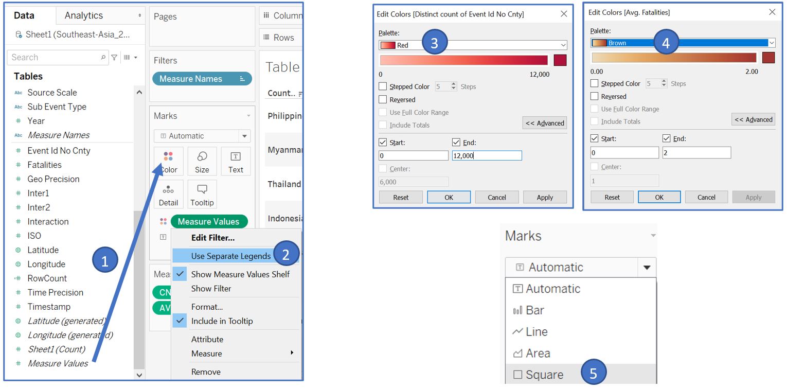
Figure 16: Assign color according to the values
The appearance of the table is shown below. Rename the worksheet as Table.
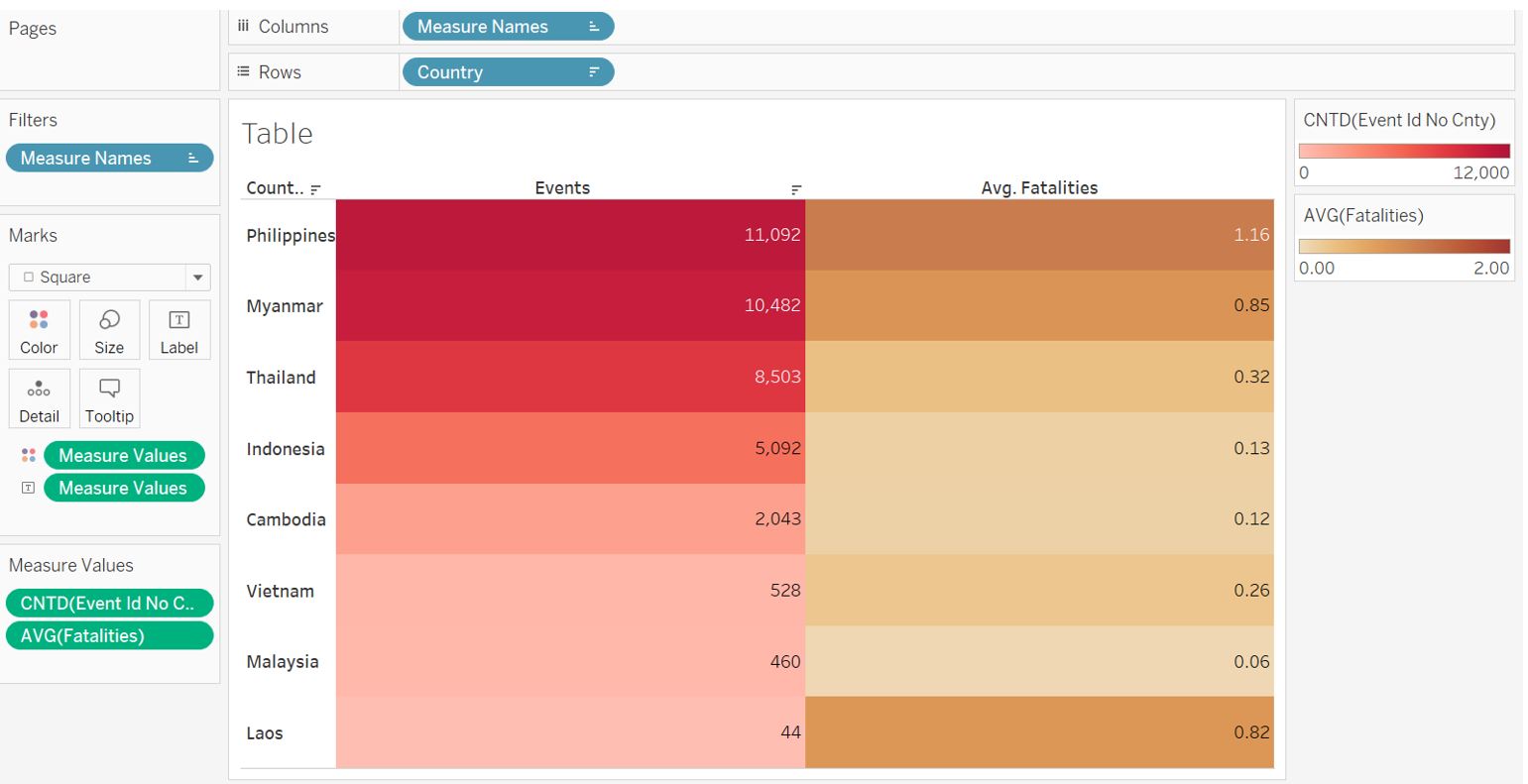
Figure 17: Appearance of highlight table
For the next part, we will plot the trend of events over the year based on the event type. Create a new worksheet and drag Event Date to Columns shelf, RowCount to Rows shelf, and Event Type to Color card in the Marks shelf. Set the Fit type to Entire View. Right click on the Y-axis, select Edit Axis… , and edit the title to “Events”. Rename the worksheet to Type.
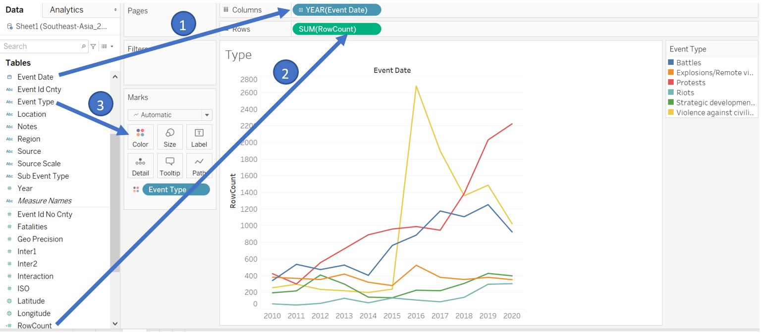
Figure 18: Create line chart with different color for each event type
At the point of this makeover exercise, Tableau does not allow filtering action in dashboard using the Legend. To allow filtering action based on event type, we will create a table to replicate a legend which can be used for filtering action. Create new worksheet named Type2 and drag Event Type to Rows shelf and Color card in Marks shelf. This will create a table with colored box which is similar to the legend that we saw in the Type worksheet.
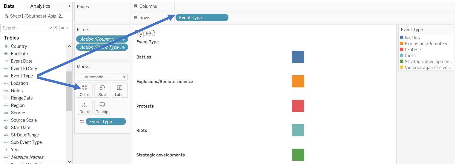
Figure 19: Create table view to replicate event type legend
Remove the row borderline by navigating to Format menu bar and select Borders. Set the Pane and Header to None.
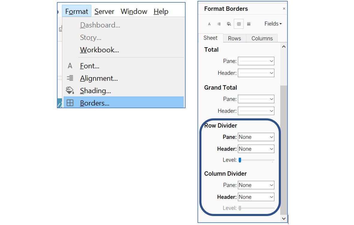
Figure 20: Remove borderline
Next, we will create bar chart to allow reader to select a specific period of interest. The reference article on scrolling bar chart can be found in this link. Create a new worksheet and rename it to Scroll. We will use week as the smallest unit to show the bar chart. Drag Event Date to Columns shelf and Event Id No Cnty to Rows shelf. Set the Event Date to Week Number and Event Id No Cnty to Count (Distinct).
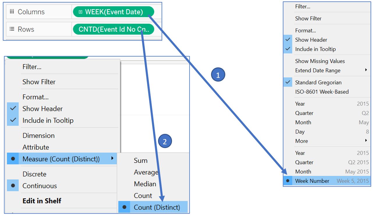
Figure 21: Create weekly chart for event counts
We need to create a parameter to represent our selected date when we click on the bar chart. Right click on the blank space at the left pane and select Create Parameter. Name it BaselineDate and choose Date as the Data type. We can set the current value to any date within our data set and select All for the Allowable values. Create another parameter called Range to represent the range of date selection i.e. how many days before and after the BaselineDate. Set Integer as the Date type, 2000 as the current value, and set Range as Allowable values with 0 to 2000 and step size of 1.
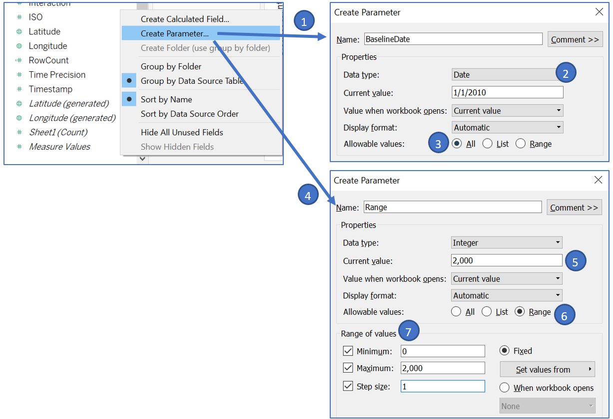
Figure 22: Create two parameters representing selected date and range
Based on these 2 parameters, we can create our set our start date and end date. Create new calculated fields: StartDate and EndDate with the following formula. To limit the start and end date, we use the MIN and MAX of Event Date as the constraint to the formula. To color the bar chart within the start date and end date, create new calculated field Color.
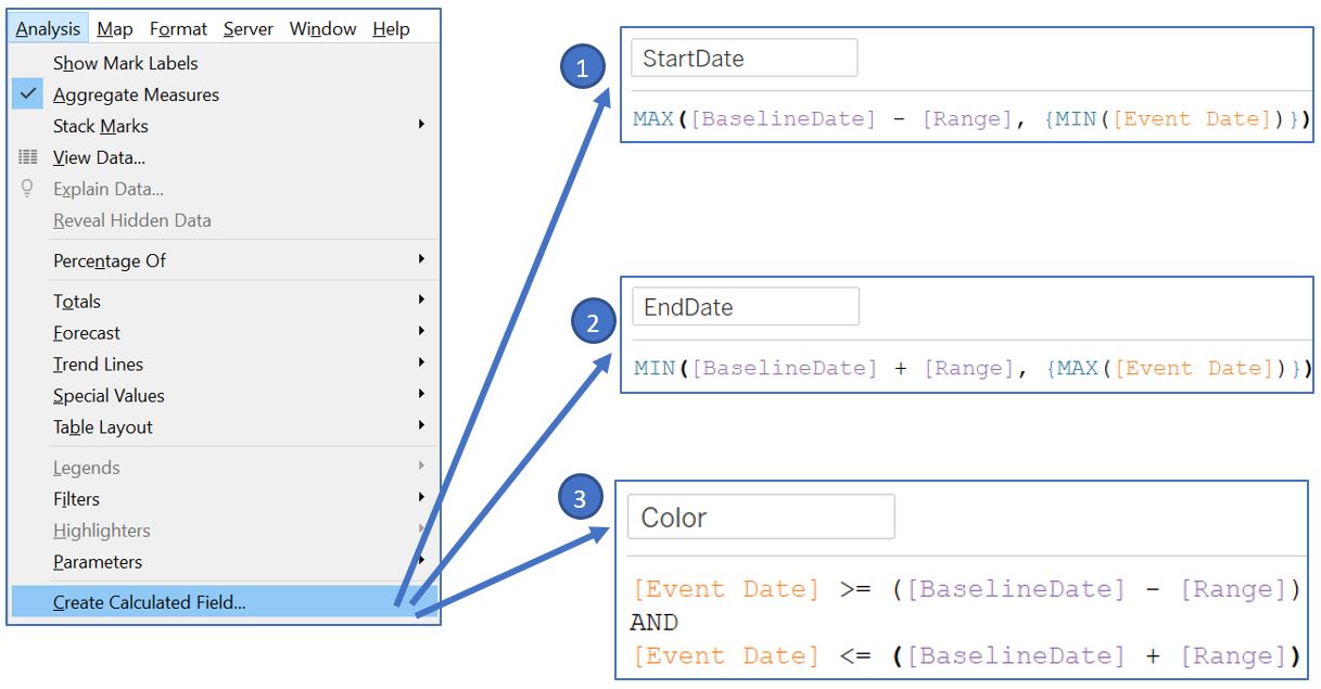
Figure 23: Create calculated fields for start date, end date, and coloring
Drag the Color field to the Color card in Marks shelf. Double click on the legend to adjust the color using Red palette.
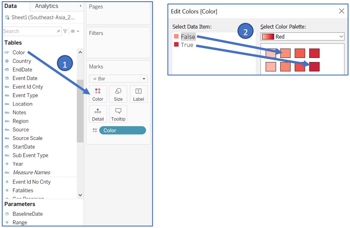
Figure 24: Adjust bar color based on date range
Next, drag both StartDate and EndDate to the Detail card in Marks shelf. Change both of them to Exact Date by right click to open the context menu. Right click on the X-axis and Add Reference Line. Select Band type and assign StartDate and EndDate to the Band From and Band To values, set label, tooltip, and line to None.
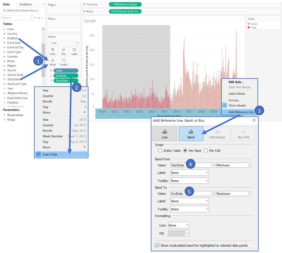
Figure 25: Add reference band based on start and end date
Right click on X-axis and select Edit Axis, leave the Axis Titles as blank. Do similarly for Y-axis.
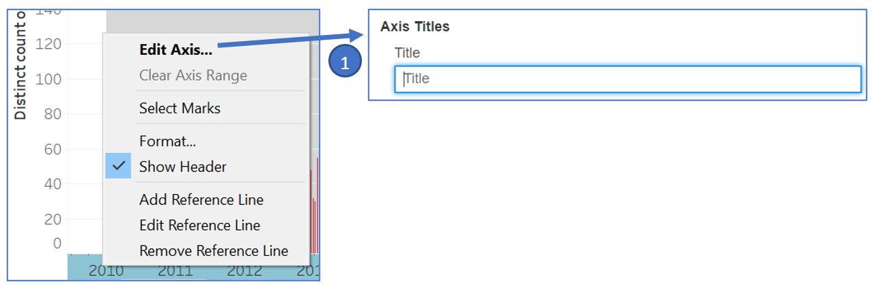
Figure 26: Remove axis title
After we have the start and end date defined by the parameters, we need to set this as filter in other visualisations. Create a new calculated field to filter the Event Date based on the start and end date. Back to our Map worksheet, drag RangeDate to the Filters shelf and select True value. Right click on the filter pill and go to Apply to Worksheets and choose Selected Worksheets…. Tick all worksheets created so far (except Scroll) to enable filtering on those visualisations whenever the parameters are changed.
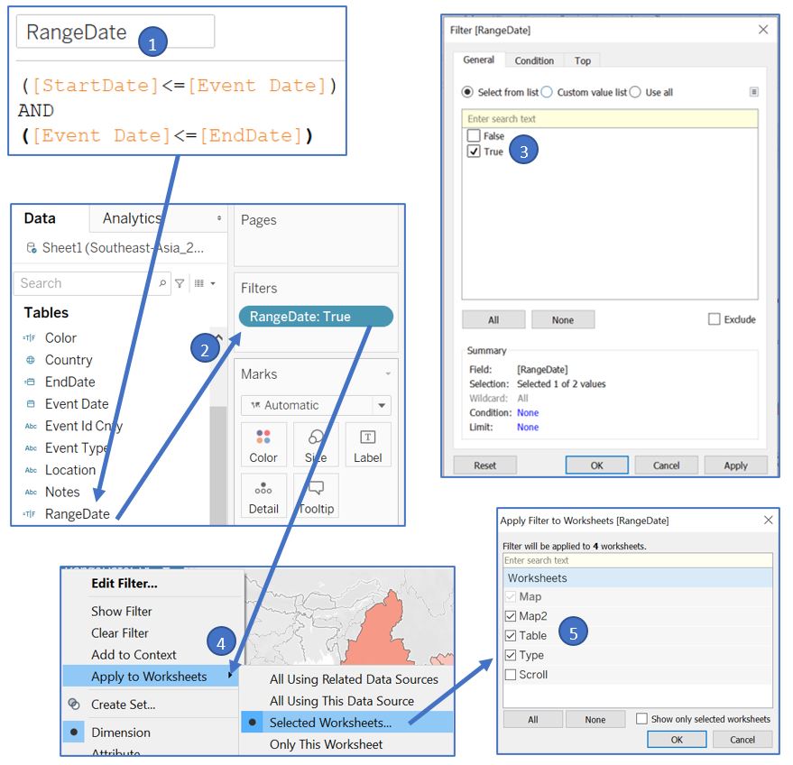
Figure 27: Apply filter to other worksheets
To ease the interaction of the adjustable date range, we will create a clickable “button” to reset the date range to cover the whole data set. This is achieved by setting BaselineDate to the mid-point of the entire date range and Range to the largest value. A good reference on creating button in Tableau can be found here. First, create a new worksheet and rename it to Reset. Double click on the white space of Marks shelf, type in ‘Reset Date’ (with the quotes) and press enter. Next, create new calculated field min(1) and type in the formula. Change the type to Number (decimal).
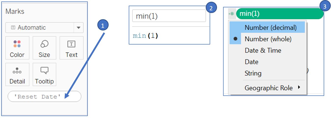
Figure 28: Create dummy variables
Drag the min(1) measure to the Columns shelf. Right click on the X-axis and select Edit Axis…. Set the Range to Fixed and set -0.01 and 1.01 as the start and end points. Untick the Show Header to hide the X-axis.
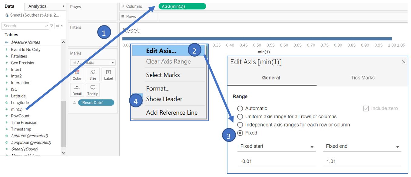
Figure 29: Create bar chart as a button
Drag the ’Reset Date’ in Marks shelf to Label card and drag the bottom of the blue box to enlarge it until the text is visible. Click on the Label card and set the font size to 10 and Bold. Set the Alignment to Center.
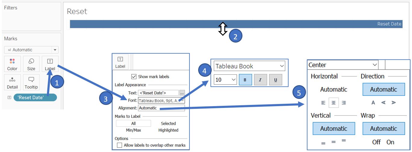
Figure 30: Adjust format of the button
This blue box will serve as our “button” when we add it in the dashboard. However, we need to assign information on the BaselineDate and Range as the Detail of this button so that it can be used to change our parameter when it is clicked. First, create a new calculated field MidDate to store our middle point of our data’s date range. Drag it to the Detail card in Marks shelf. To set max value for Range parameter, double click on the white space of Marks shelf, type in 2000, and press enter.
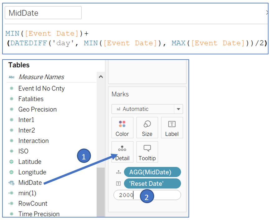
Figure 31: Set the value for BaselineDate and Range parameters
Right click on the grid line and select format. Set all line to None for Sheet, Rows, and Columns.
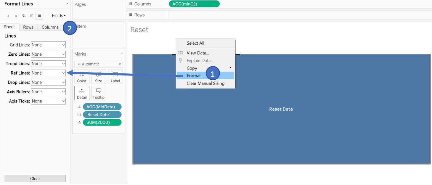
Figure 32: Remove gridline
Finally, add one more worksheet and name it Title. This will serve as the main title in the dashboard later. Multiselect Country, EndDate, StartDate (by Ctrl+click) and drag them to the Detail card in Marks shelf. Right click on EndDate and change the type to Day (continuous). Do the same for StartDate.
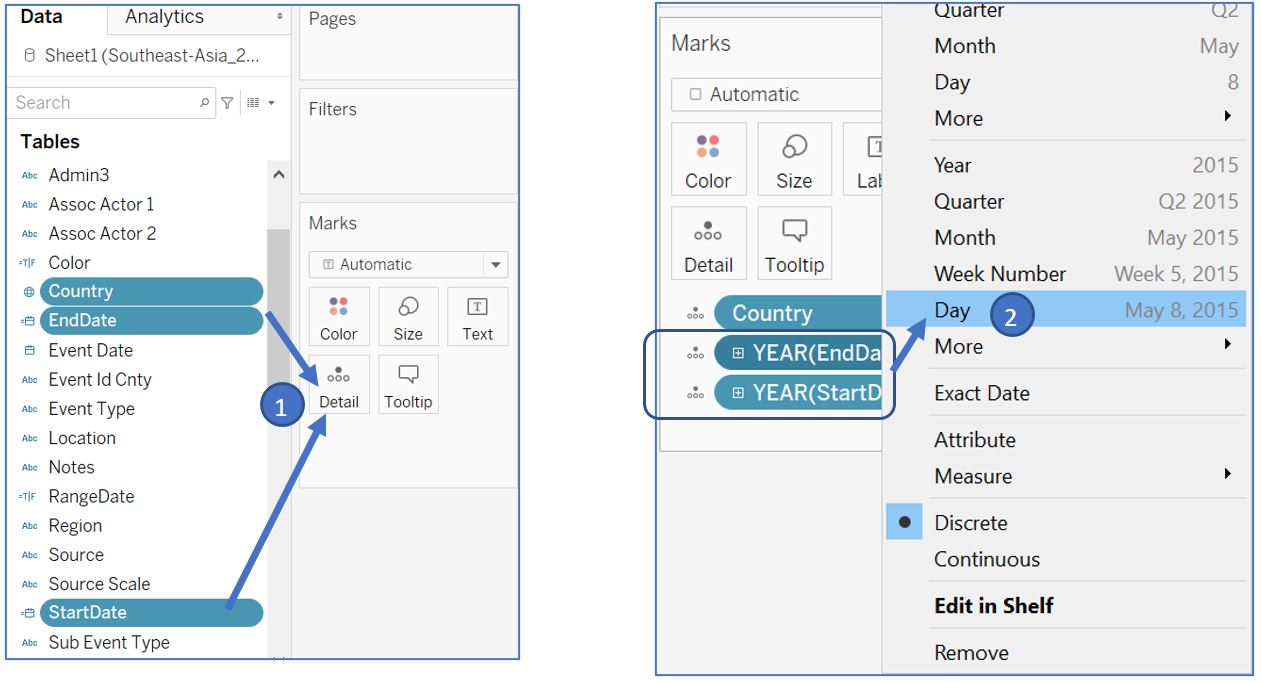
Figure 33: Add variables for title text
Right click on the EndDate pill and select format to open Format pane on the left side. Click on Pane tab and change the Default date format to dd/m/yyyy. Click on the Fields, select StartDate, and similarly change the date format.
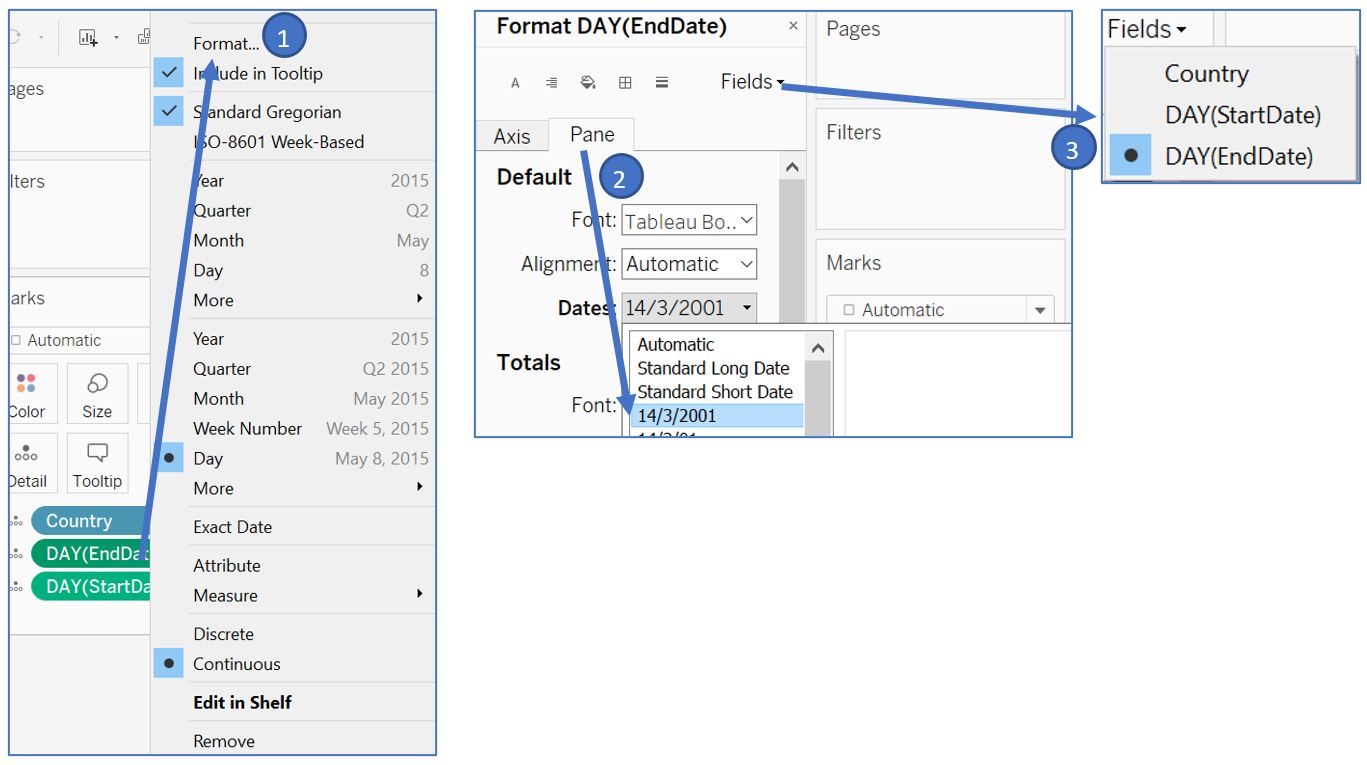
Figure 34: Adjust the date format
Right click on the title bar, select Edit Title…, and add in Country, StartDate, and EndDate to the title as follows. Set font size to 12.
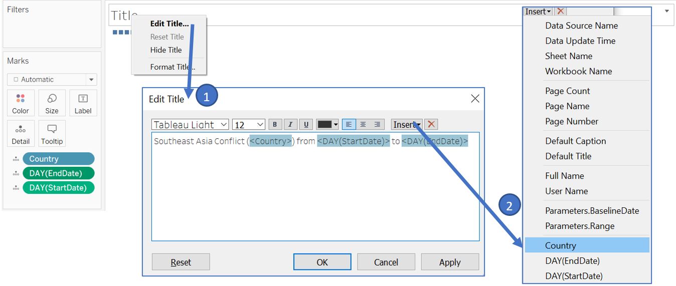
Figure 35: Set the title content from variables
We can make the little blue boxes under our title to be invisible by setting the color to 0% opacity. Our title bar will look like this.
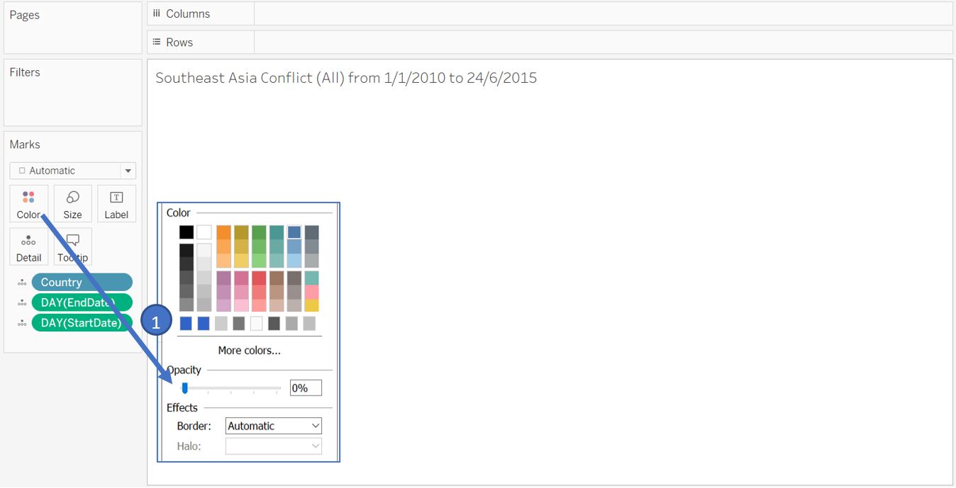
Figure 36: Hide unwanted blue boxes
Setting up dashboard for Southeast Asian region level
Next, we will setup the first dashboard for the comparison among Southeast Asia countries. But before that, ensure that all visualisations are set to Entire View for the Fit setting.
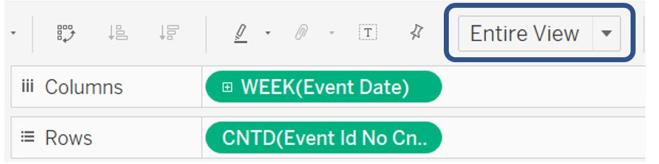
Figure 37: Set Fit to Entire View
Create new dashboard and drag each of the visualisation following the layout below.
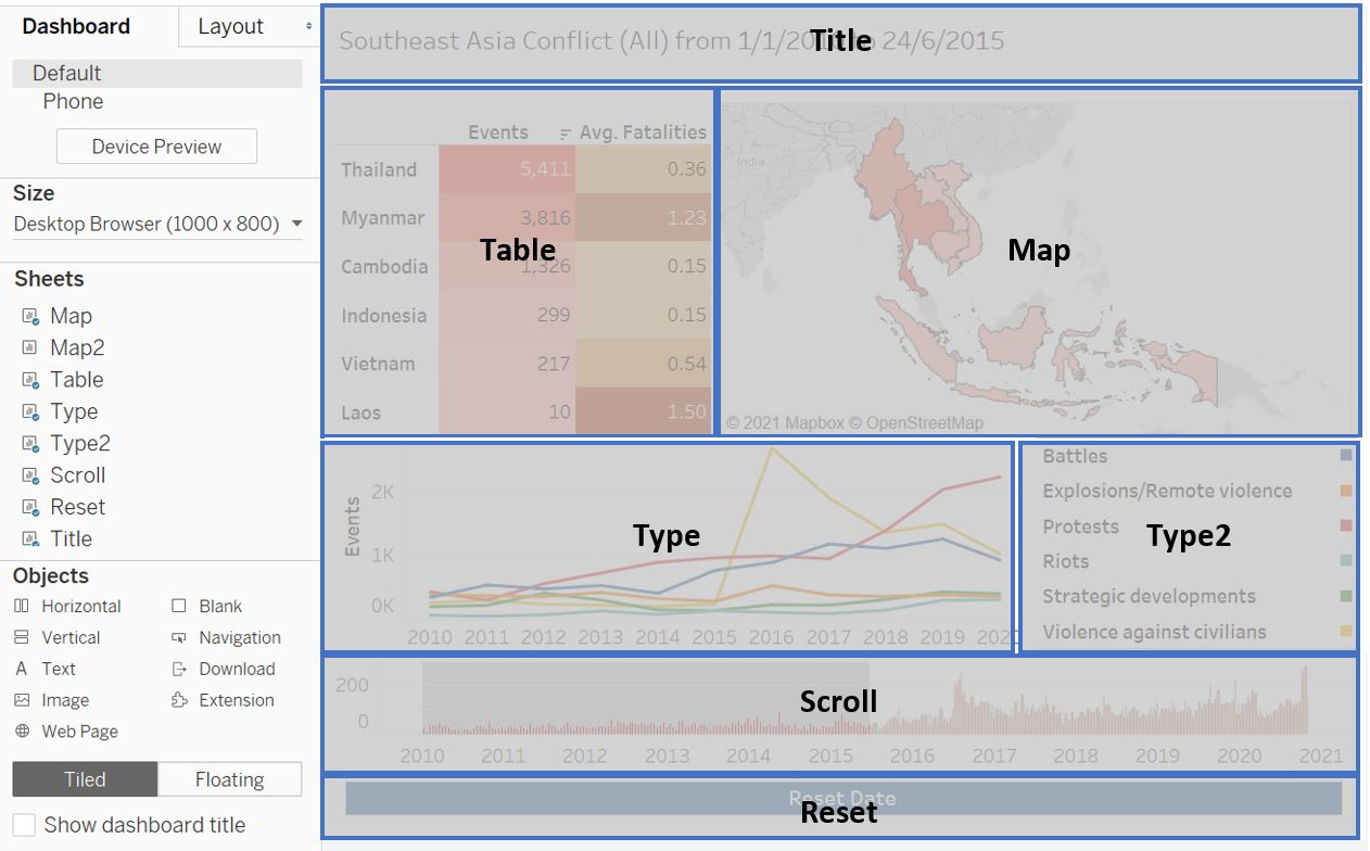
Figure 38: Add worksheets to the dashboard layout
For each of the visualisation, hide the title and label (through right click context menu) as required to achieve the intended appearance.
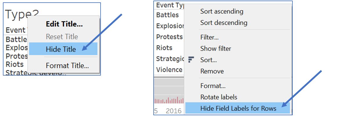
Figure 39: Hide unnecessary title and label
To show the Range parameter slider, go to Analysis menu bar, navigate to Parameters ,and select Range. Right click on the slider, go to Customize and deselect Show readout and Show buttons so that only slider will be displayed.
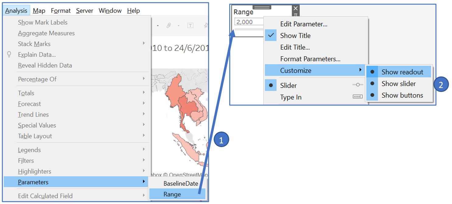
Figure 40: Add Range parameter slider
Move the slider next to the Reset button and adjust the width accordingly. Add a Text box to the bottom right to put our data reference.
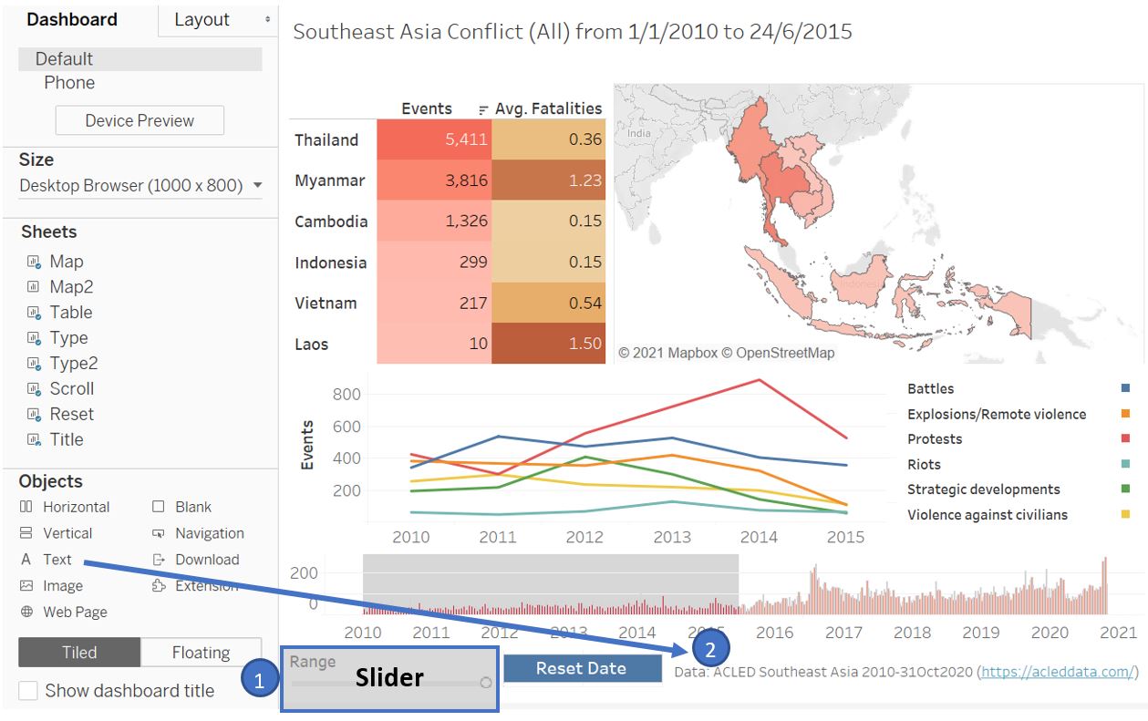
Figure 41: Position the Range parameter slider and add text box
To add interactivity among the individual visualisation inside the dashboard, we will set a few Action settings to link them with a certain user action (e.g. select and hover). First, we will look at our Table. We want the map on the right to be highlighted when reader hover the mouse over a country. To do so, go to Dashboard menu bar and select Actions. In the Actions window, click on Add Action and select Highlight. In the new window, set the Name to “HoverCountry” and set Table as the Source Sheets with Hover option. Set the Target Sheets to only Map and choose Selected Fields for Target Highlighting. Click OK once done.
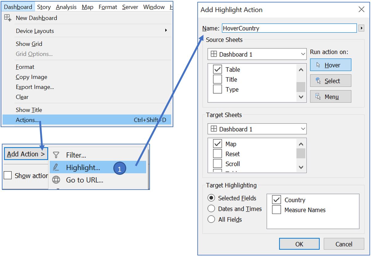
Figure 42: Add highlight action for country
Now, when we hover over a particular country, it will also be highlighted on the map.
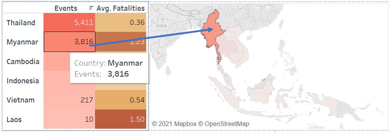
Figure 43: Highlight action when hovering over a country in Table
Next, we also want to add a filter function when a country is clicked on the Table. Once clicked, we should filter the rest of the visualisation to the selected country. Open the Action window and select Add Action. This time around, we will choose Filter. Name it as “FilterCountry” and choose Table as the Source Sheets. For Target Sheets, select Map, Scroll, Title, Type, and Type2. Leave Target Filters as All Fields.
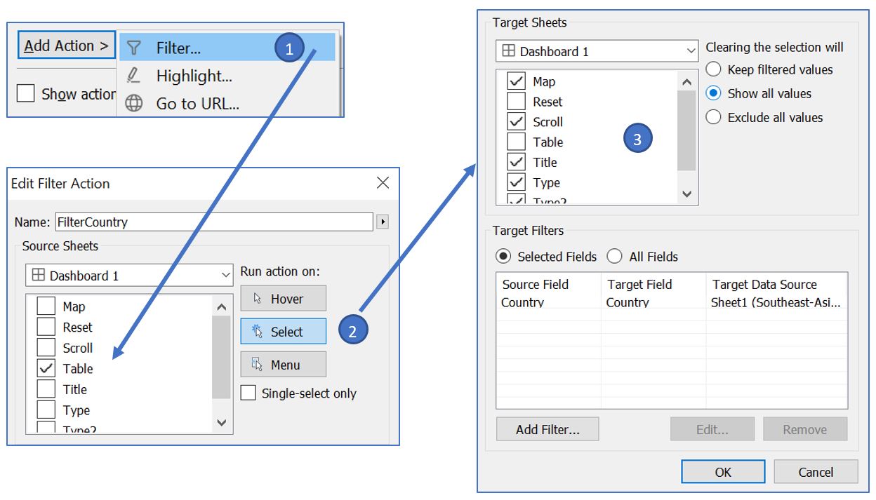
Figure 44: Add filter action for selected country
When we click on the country inside Table, the other visualisations will react based on our selection as follows (including the title).
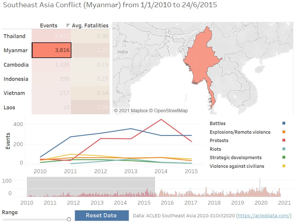
Figure 45: Filter action when selecting a country
Add highlight action with Type line chart as the Target Sheets, Type2 as Source Sheets with hover option, and choose event type as the Selected Fields.
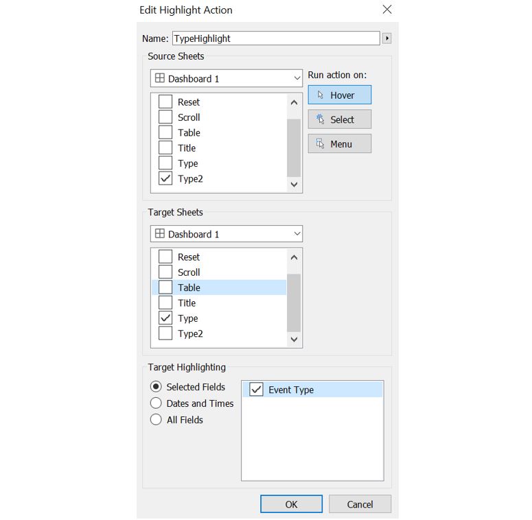
Figure 46: Highlight action when hovering event type
The Range parameter slider is adjustable and we can see the other visualisations also react to it.
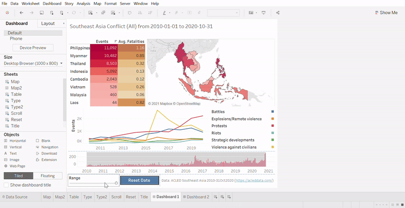
Figure 47: Filter action when changing Range parameter
However, we need to add an action so that reader can click on one of the event weeks from the Scroll chart and set that as the BaselineDate. To do so, open the Action window and select Add Action. We will choose Change Parameter this time. Set the Name as “SetBaselineDate” and Scroll as Source Sheets with Select option. For the Target, we choose BaselineDate as the parameter with WEEK(Event Date) as the Field without aggregation. Click “OK” once done.
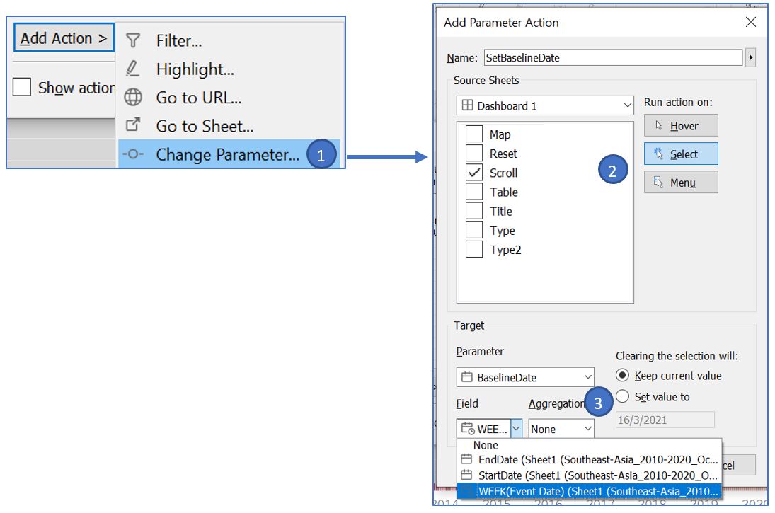
Figure 48: Action to change BaselineDate according to selected date
Now, when we click on the date in Scroll chart, the BaselineDate will follow accordingly.
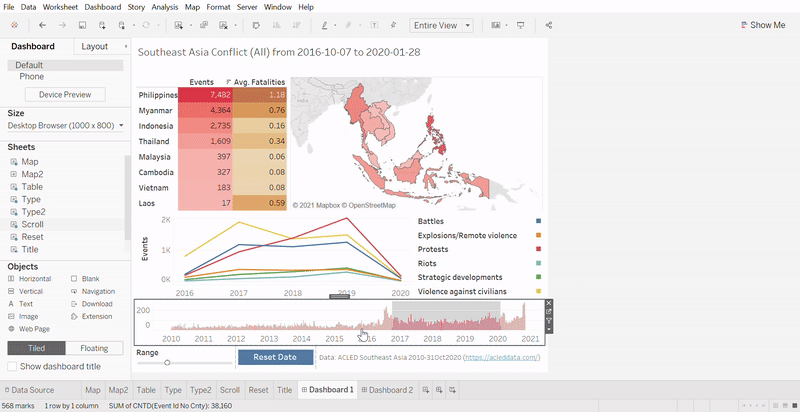
Figure 49: Filter action when changing BaselineDate
However, notice that when we click on the date, the color of the bar in Scroll chart is greyed out. This is undesirable and we will use a workaround suggested in this link. Go back to Scroll worksheet and create new calculated field called “Blank” with formula as shown below. Drag it to the Detail card in Marks shelf.
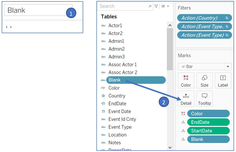
Figure 50: Create calculated field Blank
Back to our dashboard, open Action window and Add Action for Highlight named “Blank”. Set the settings as shown below.
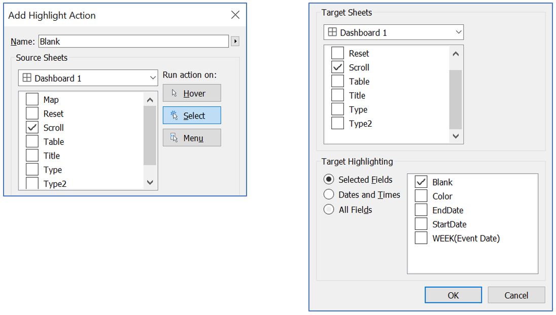
Figure 51: Create highlight action with Blank as target
This will force Tableau to highlight all the bar chart when we select any bar in Scroll chart, overriding the original greyed out effect.
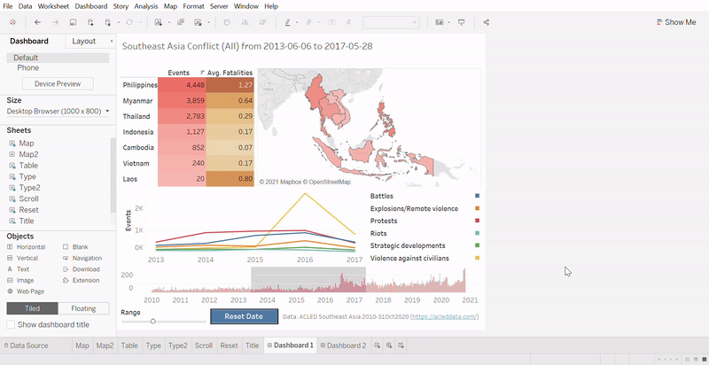
Figure 52: Filter action when changing BaselineDate (without greyed out effect)
After we interact with the adjustable date range, we may want to reset it to show the entire date range. Rather than selecting the midpoint of the Scroll chart and adjusting the Range slider, the reset button will act as a shortcut to do so. Open Action window and Add Action for Change Parameter. We will create 2 new actions named “ResetBaselineDate” and “ResetRange”. The settings for both are shown below. Once done, we can click on the button to reset the date range.
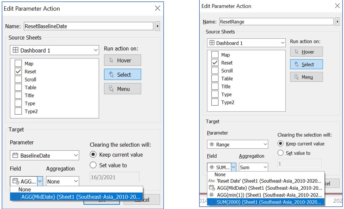
Figure 53: Add action for reset button to assign BaselineDate and Range parameter values
For the Type chart, we will set a filtering action when we click on the yearly event counts per event type. Open Action window and Add Action for Filter. Set the Name as “LineType” and set Type as the Source Sheet and set all as Target Sheet except Reset and Title. For Target Filters, choose Selected Fields and set field to Event Type. Click “OK”.
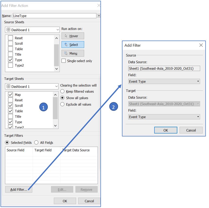
Figure 54: Add action for line chart to filter other visualisations
Now, when we select one of the yearly data points (protests event in 2019 for the screenshot below), the rest of the visualisation will be filtered accordingly. However, as the date range in the title is not updated, it is misleading to the reader.
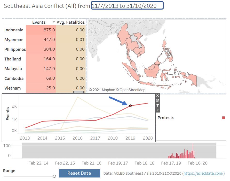
Figure 55: Filter based on line chart
To avoid that, we can set another parameter to capture the action of filtering in the Type chart and hide the date range in the title when such action is recorded. Back to the Type worksheet, create new parameter called “Yearly”, set the parameter as below, and click “OK”. Double click on the white space of Marks shelf, type ‘year’ (with quotes), and press enter. This value will be used to set the parameter when filtering is done on Type chart.
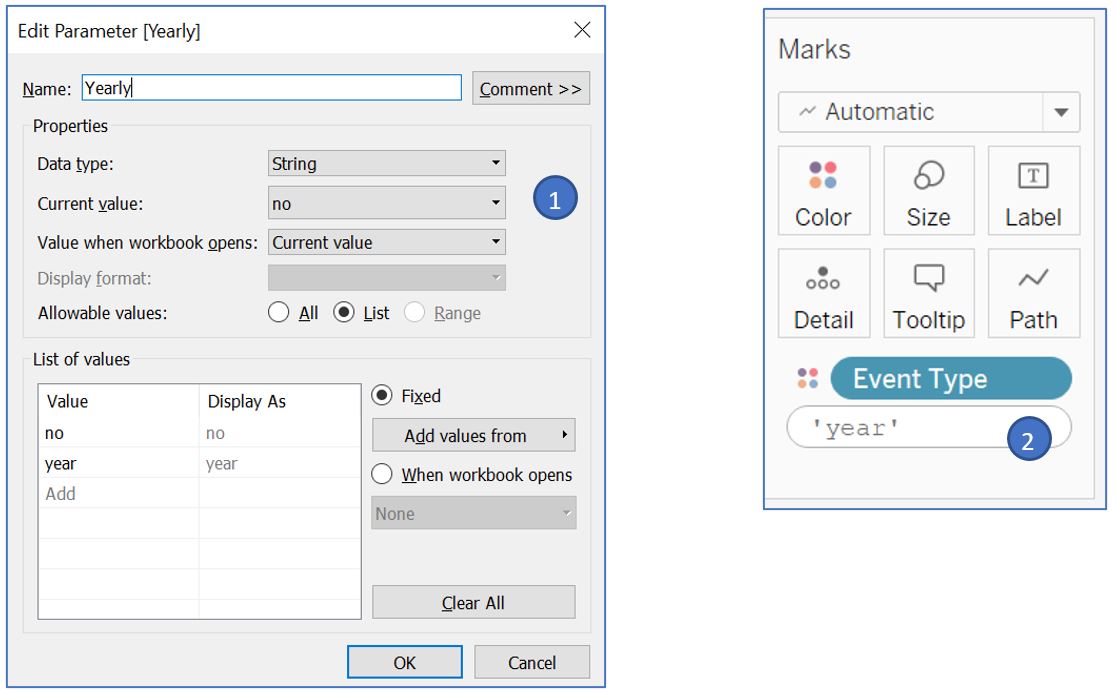
Figure 56: Set parameter to capture action of filtering on line chart
Back to our dashboard, open Action window and Add Action for Change Parameter. Set the setting as shown below. This will set the Yearly parameter to ‘year’ when we do filtering on Type chart and revert it back to ‘no’ when we clear the filter.

Figure 57: Add parameter action for Yearly upon filtering on line chart
Next, we will use Yearly parameter value to decide if we will print out the date range in our title. Go to Title worksheet and create a new calculated field called StrDateRange. Drag it to the Detail card in Marks shelf and we can remove StartDate and EndDate from the detail. Right click on the title and select Edit Title. Change the title content to what is shown below.
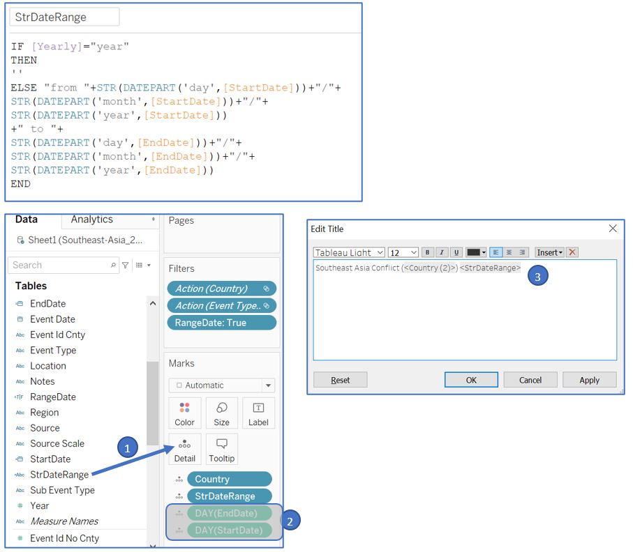
Figure 58: Create calculated field to dynamically change title text
Now, when we perform filtering by selection in Type chart, the date range will disappear from the title to avoid confusing the reader.
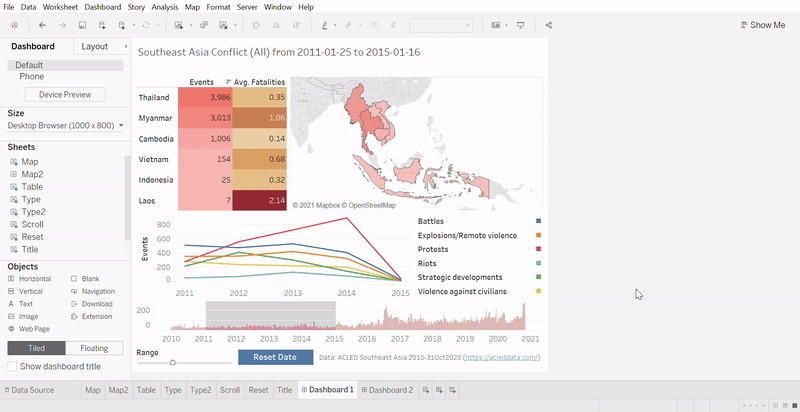
Figure 59: Dynamic title text change based on filter
To allow reader to perform filter by event type in Type2 chart, add new action for Filter called “Type” and set the settings as shown below.
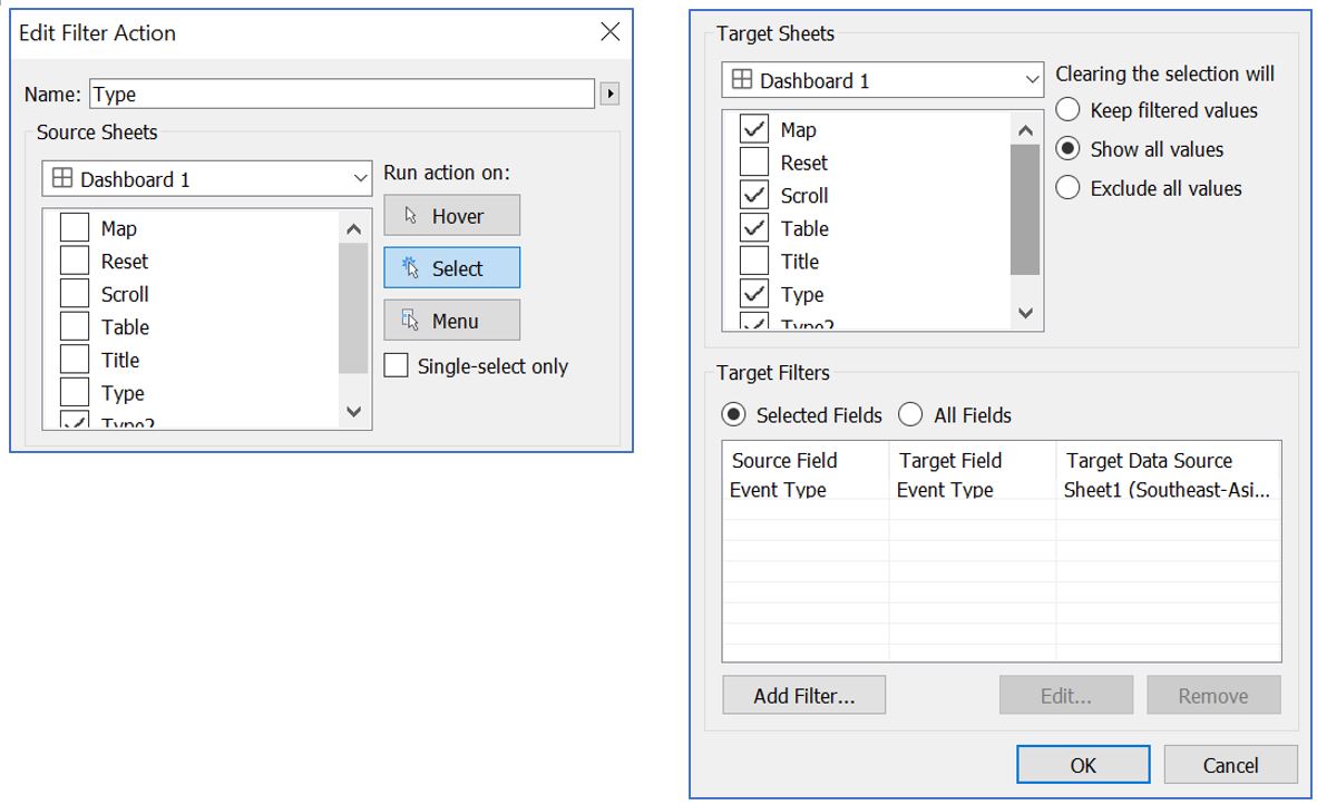
Figure 60: Add filter action for event type from Type2 table
Below example shows events filtered by event type Riots within the date range.
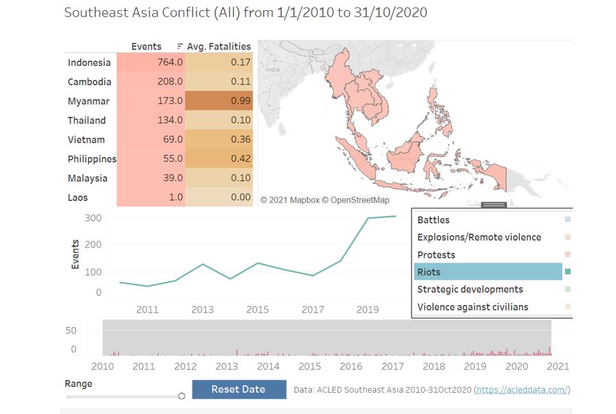
Figure 61: Filter based on event type in Type2 table
For Table visualisation, we don’t really need the tooltip to show us the numbers. Therefore, we can use it to tell the user what interaction can be done with the Table. Go back to the Table worksheet and click the Tooltip card in Marks shelf and set the text to “Click to select this country”.
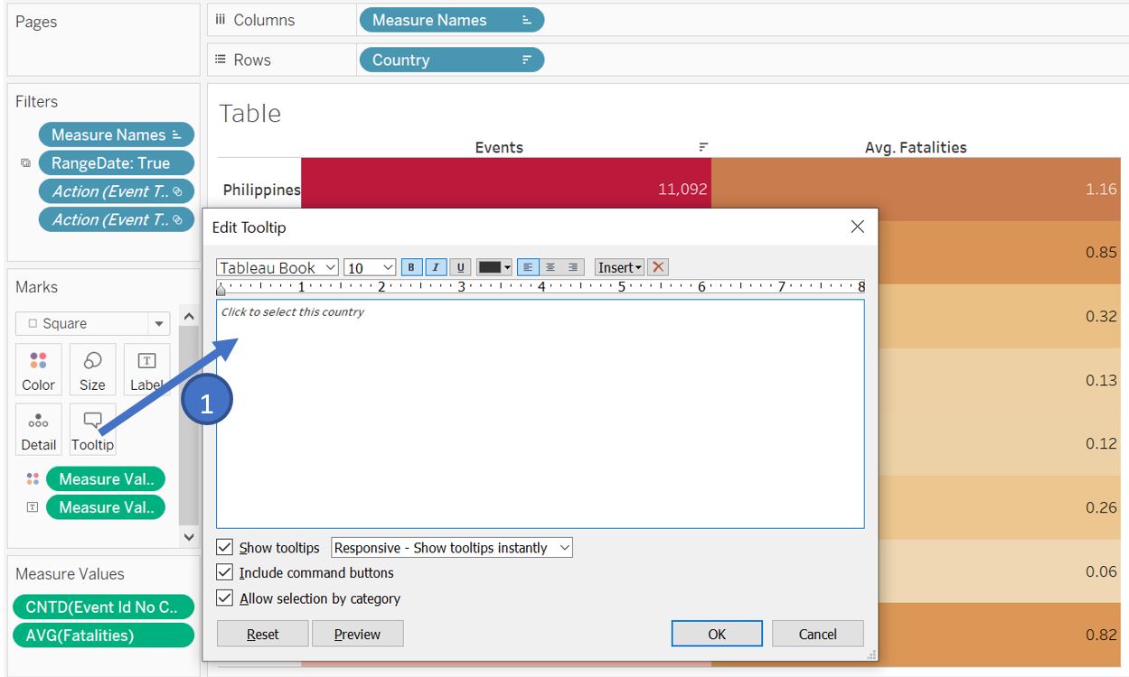
Figure 62: Adjust tooltip content for Table worksheet
Similarly, go to Map worksheet and change the tooltip as follows.
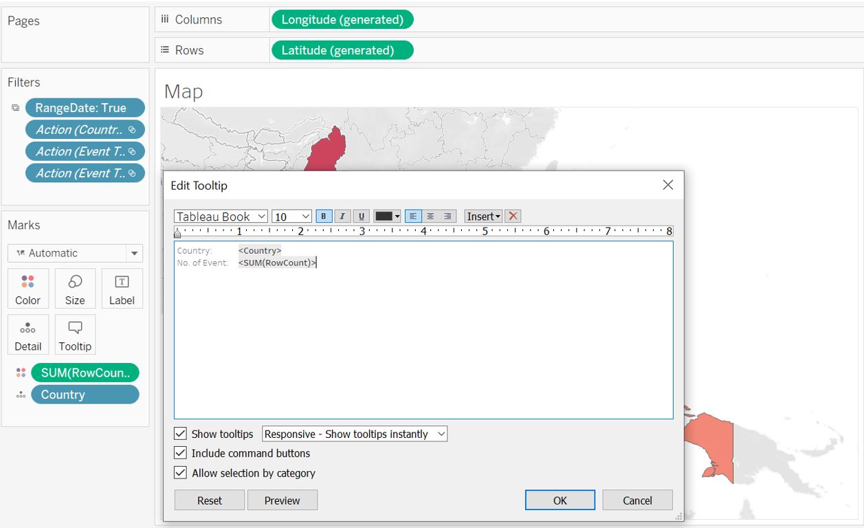
Figure 63: Adjust tooltip content for Map worksheet
Go to Type worksheet and adjust the tooltip as follows.
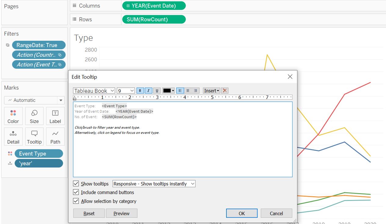
Figure 64: Adjust tooltip content for Type worksheet
Go to Scroll worksheet and adjust the date format and tooltip as follows.
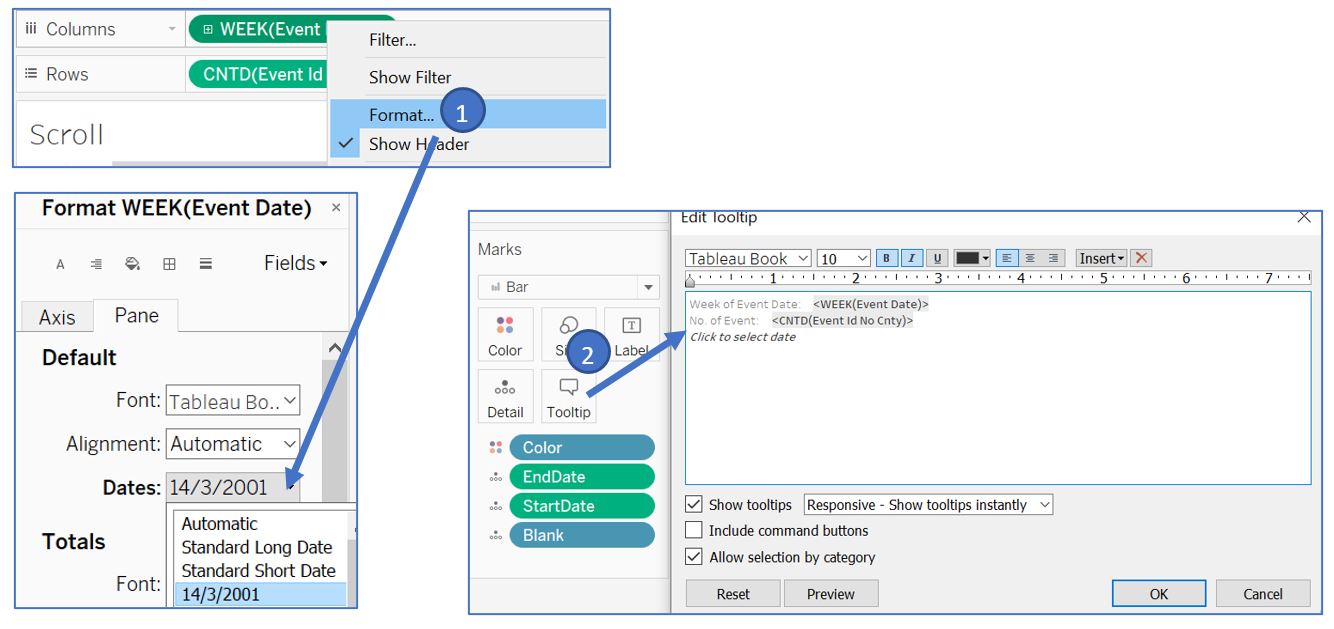
Figure 65: Adjust tooltip content and date format for Scroll worksheet
For Reset worksheet, go to tooltip and change the text as follows.
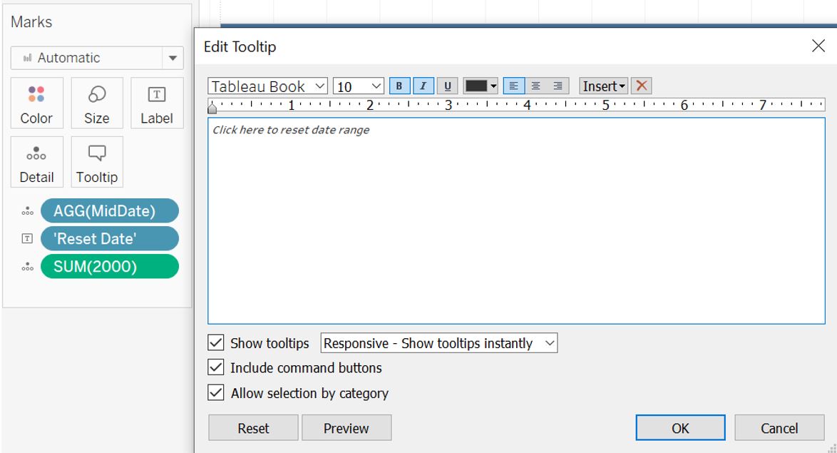
Figure 66: Adjust tooltip content for Reset worksheet
Setting up dashboard for country level
Next, we will create the dashboard for country level visualisation (Map2). Right click on the first dashboard and select duplicate since we will reuse most of the components from the first dashboard. Rename it to Dashboard 2.
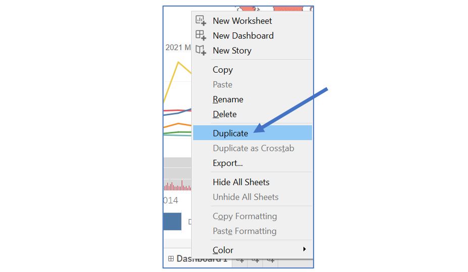
Figure 67: Duplicate Dashboard 1
Drag Map2 into the dashboard below the title and remove Table and Map visualisations.
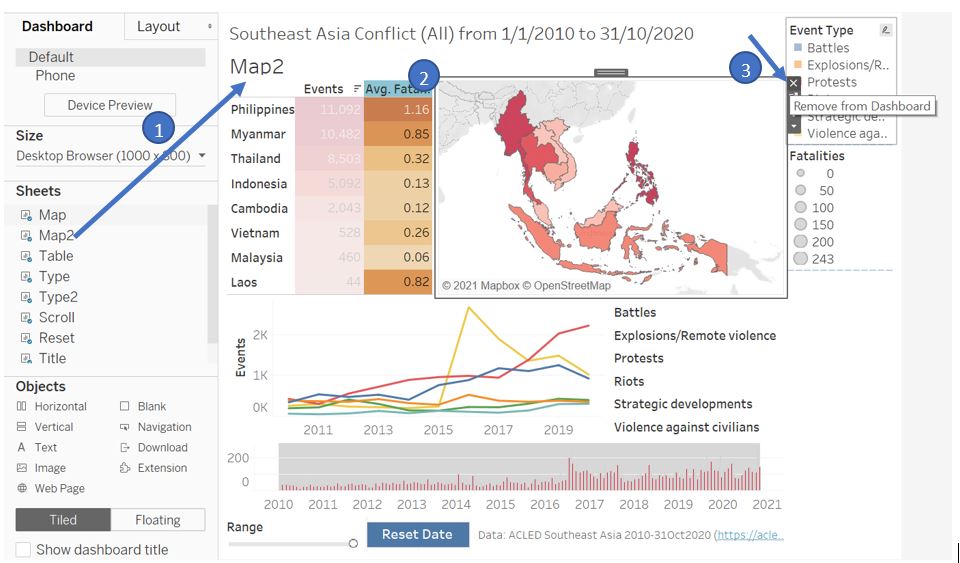
Figure 68: Add Map2 into the dashboard and remove Table and Map visualisation
Hide the title of Map2, remove the Event Type legend, and set the Fatalities legend to Floating.
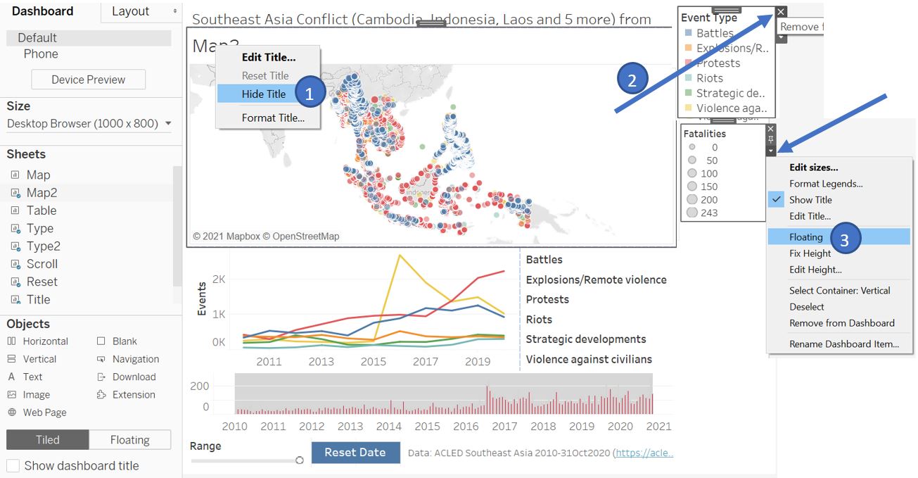
Figure 69: Hide title of Map2 and remove legend
Position the Fatalities legend at the corner of Map2 visualisation and reduce its width.
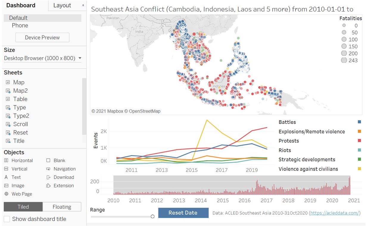
Figure 70: Position Fatalities legend
Next, we will need to create and action to link Dashboard 1 and Dashboard 2. Go back to the Dashboard 1 and open the Action window. Select Add Action for Filter and set the Name to “FilterCountryDash2”. Set Map as the Source Sheets and all visualisations in Dashboard 2 except Reset as the Target Sheets. Choose Selected Fields for the Target Filters and add Country to the list.
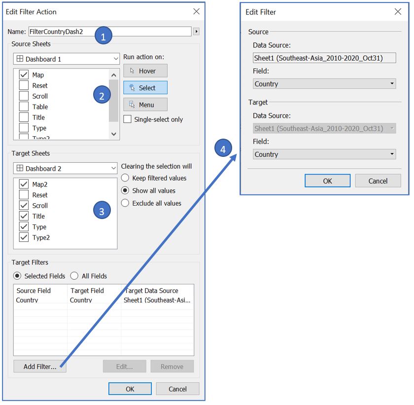
Figure 71: Add filtering action between dashboards
Now, every time reader clicks on a country from the Map display, it will apply Country filter to the Dashboard 2 and automatically navigate the view to Dashboard 2. Go back to Map worksheet and update the tooltip to inform user about this interactivity option.
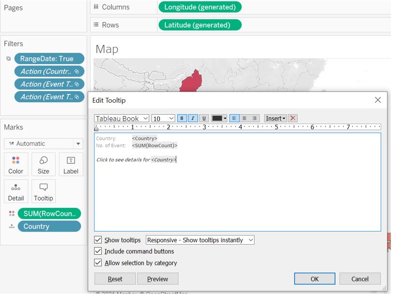
Figure 72: Add interactive information in the tooltip of Map
However, if the reader would like to return to the ASEAN region level in Dashboard 1, we currently have no option for the reader to do so. Therefore, we create a navigation button whereby reader can go back to Dashboard 1 upon clicking the button. Drag Navigation button from the Objects pane and position it at the corner of Map2. Set the button to be Floating and reposition the button.
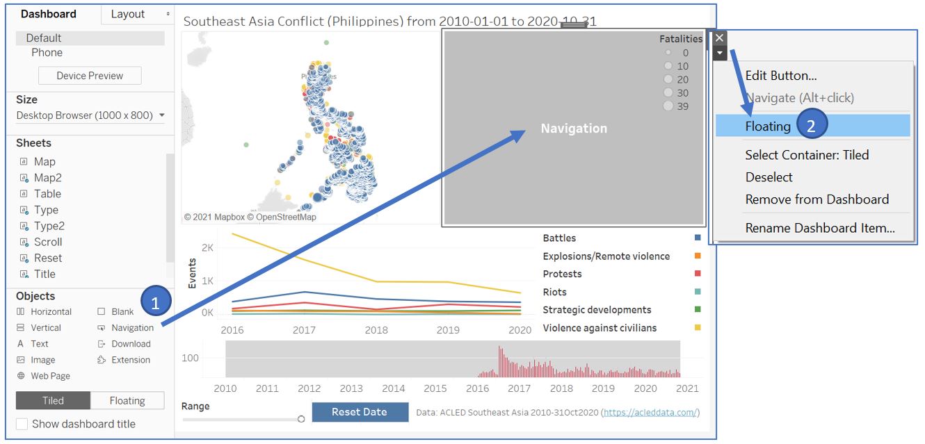
Figure 73: Create navigation button to return to Dashboard 1
Once again, right click on the button and select Edit Button. Set Navigate to to Dashboard 1 and set the title to “Back to overview”. Set the font size to 9 with white color and the background to dark blue. Click “OK” and adjust the button size accordingly.
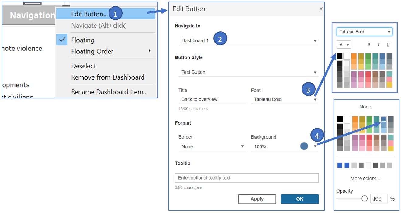
Figure 74: Adjust the format of navigation button
We can use Alt+click to use the navigation button in Tableau desktop. The appearance of the Dashboard 2 will look like this.
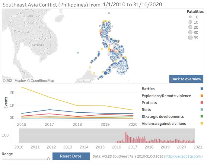
Figure 75: Appearance of Dashboard 2
The rest of the functionality in Dashboard 2 is similar to Dashboard 1. However, if we try to select the date on the Scroll bar chart, we observe a similar issue on the Map 2 display. The color of the event is greyed out due to the highlighting effect.
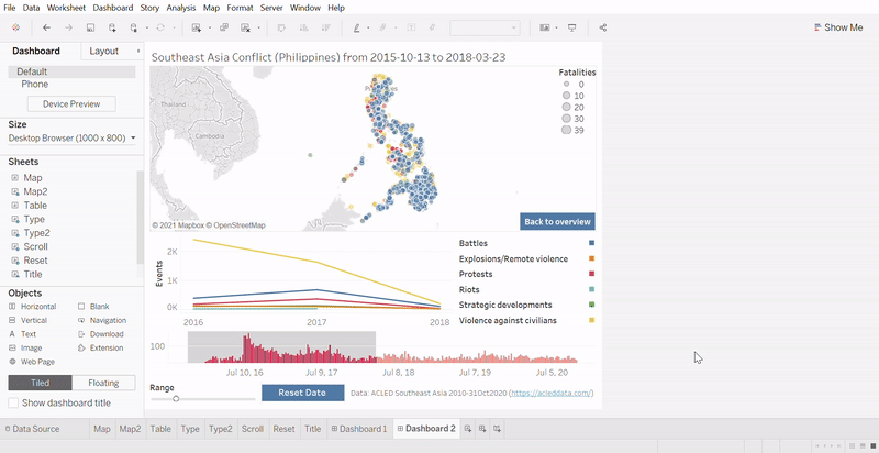
Figure 76: Greyed out issue for Map2 display
To fix this issue, we will again refer to the workaround as before. Go back to Map2 worksheet and drag Blank into the Detail card in Marks shelf. We can also add more info into the tooltip of this map. Drag Actor1, Actor2, Location, and Event Date to the Tooltip card and click on the Tooltip to edit the text as shown below.
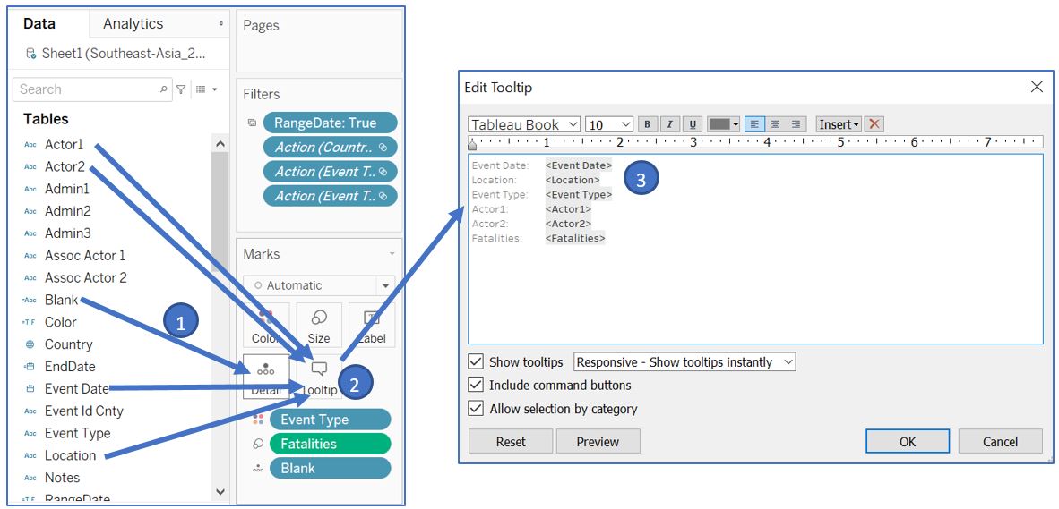
Figure 77: Add Blank to fix greyd out issue and adjust the tooltip content
If we go back to our Dashboard 2, the highlighting issue has now been fixed.
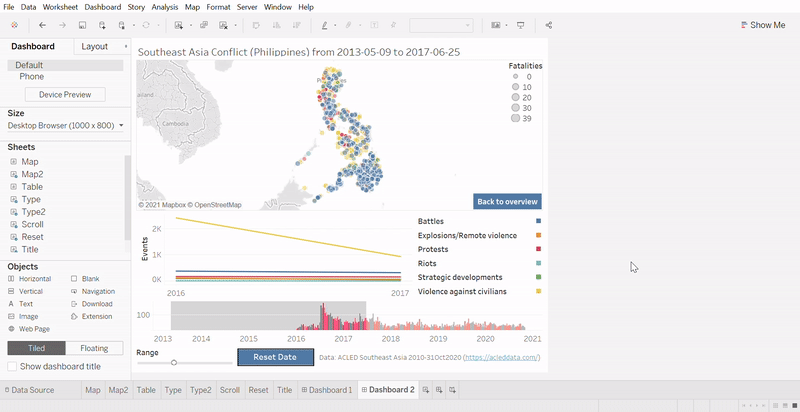
Figure 78: Adjust date without greyed out issue
Since reader has the flexibility to filter based on most components in the dashboard, it will be good to improve the user experience by having a button to reset all filters. To do so, we can duplicate our Reset worksheet and named it Reset2. Double click on the text card and change to ‘Clear Filter’ (with quote). Update the tooltip text accordingly.
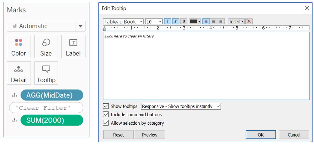
Figure 79: Create button for clear filter
Go back to our Dashboard 1 and insert Reset2 to the dashboard layout. Adjust the sizing of buttons and text at the bottom.
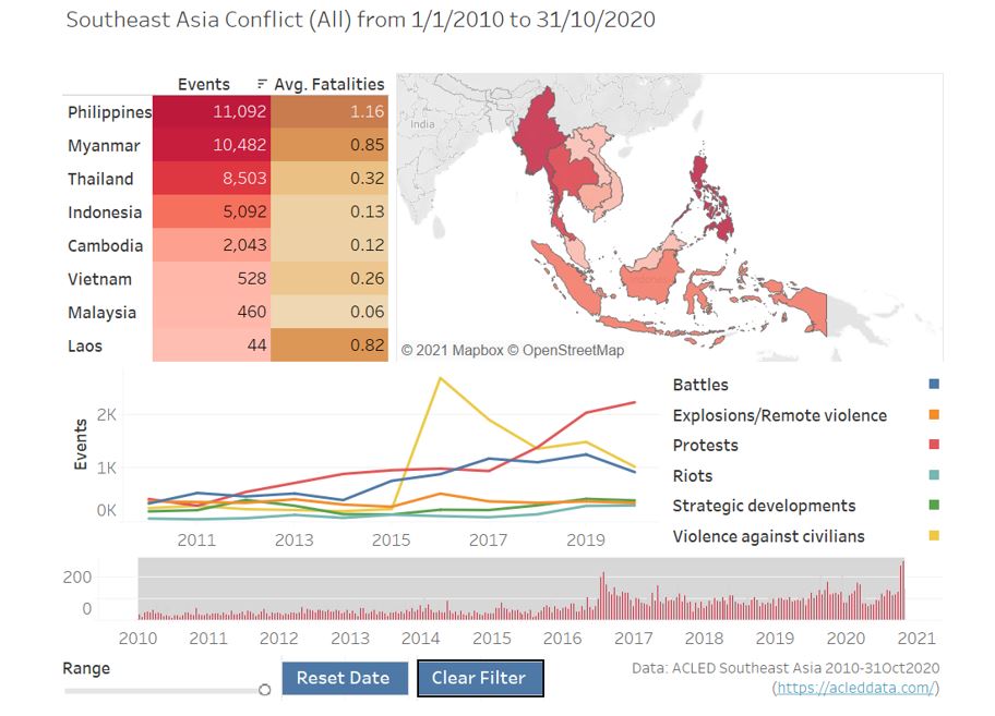
Figure 80: Add clear filter button to dashboard
Add Filter action with Reset2 as Source Sheets, and other visualisations as Target Sheets except Reset and Reset2. Set Select option and Show all values for clearing of selection. Add Country and Event Type to the Target Filters as Selected Fields. Ignore the warning message.
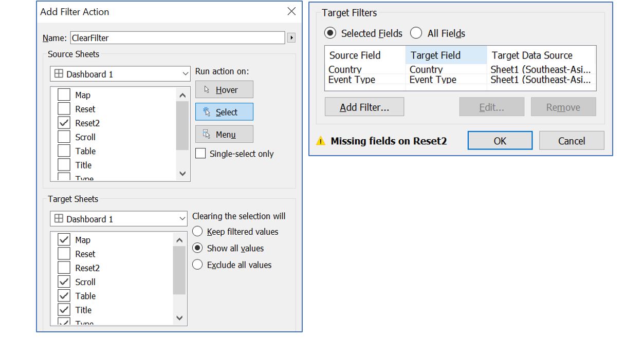
Figure 81: Add filter action by selecting the button
Repeat the same process for Dashboard2, but without Country in the Target Filters for “ClearFilter” action. Also remove Reset2 from all the Target Sheets of existing Filter action in both dashboards.
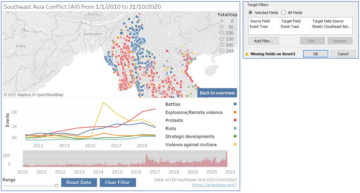
Figure 82: Repeat same process for Dashboard2
4. Observations
- Over the 10-year period from 1/1/2010 to 31/10/2020, the overview dashboard shows us that Philippines has the most events, followed by Myanmar. The casualty for Philippines is also the highest with average 1 fatality per event. However, the color highlight also points us to the bottom of the table where Laos has the least number of events, but the average fatalities is quite high, similar to that of Myanmar.
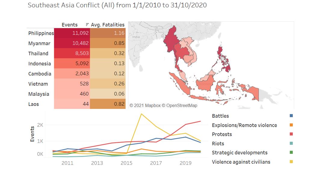
Figure 83: Overview of Southeast Asian countries
- If we look closely between Philippines and Myanmar, they have different period of conflicts even though their total numbers are quite close. As displayed by the bar chart, conflict in Myanmar has been recorded as early as 2010 and the occurrence remains constant throughout the year until 2020. On the other hand, Philippines’ record of events just started in the beginning of 2016 which could be due to the unavailability of pre-2016 data for Philippines. A significant surge in July 2016 points to the start of Philippine President Rodrigo Duterte’s War on Drugs after he took office in June 2016. Towards the end of 2018, we observe a decrease in the number of event, attributed to the President Duterte’s decision to pull police force out of the war on drugs, ending the 15 months of deadly campaign.
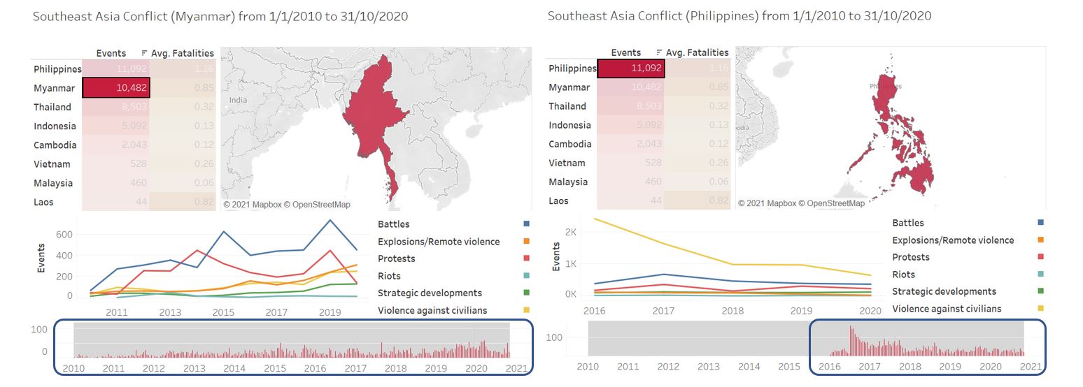
Figure 84: Observation for Philipines
- Filtering the event type by clicking on protest at the Type2 table, an increasing trend is observed especially between 2017-2019. If we do a brushing on the line chart for 2017-2019, we see that Indonesia has the highest recorded protest between this period. Clicking on the detail map for Indonesia shows us there is indeed a steady increase in the number of protests between 2017 and 2020. Most of the protests took place in Java island and South Sulawesi province.
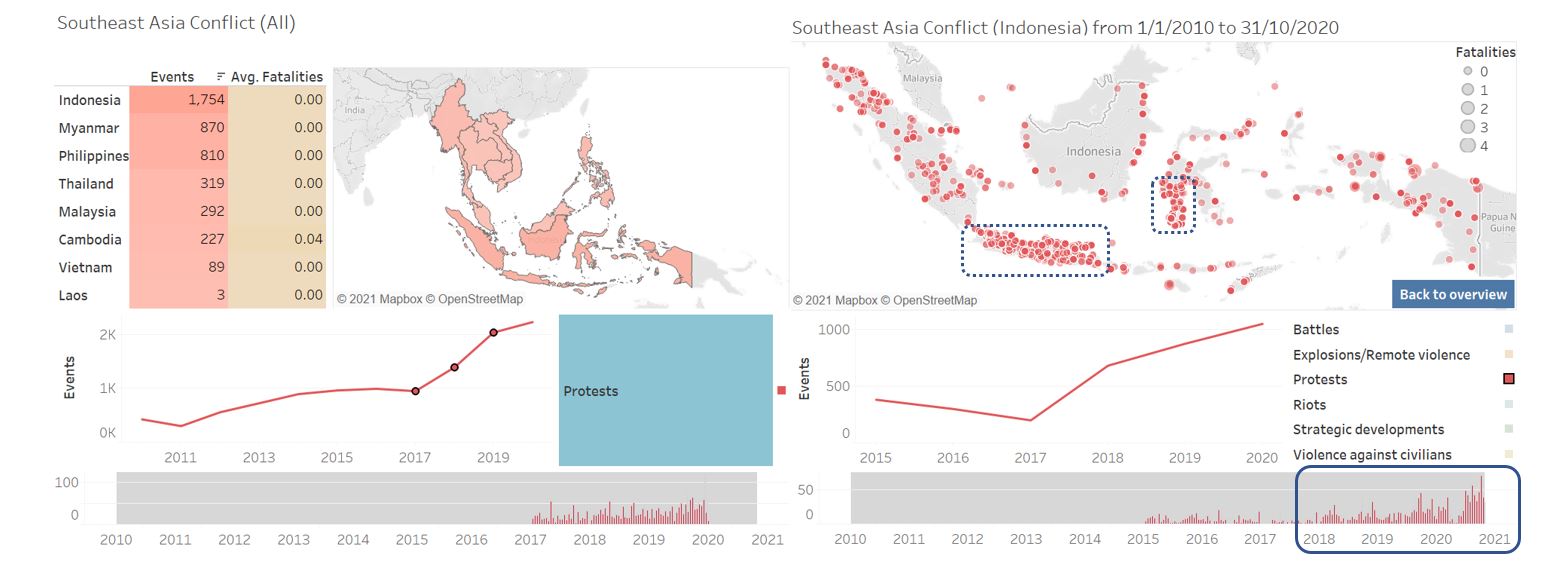
Figure 85: Observation for Indonesia
- Still on protests, if we scroll through each country, we see an interesting trend in Thailand during 2020. The number of protests has remained stable since 2010, until we see a significant spike in 2020. Looking at the detail map and narrowing down the date range to October 2020, protests occurred at various locations, with notable hotspot at Bangkok, Phuket, and Nakhon. This is the period of anti-government protest demanding political reform and denouncing the alleged non-democratic policies of the government.
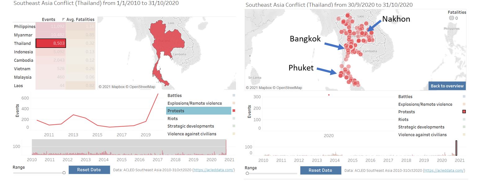
Figure 86: Observation for Thailand
- The overall number of conflicts in Myanmar has been quite constant throughout the 10-year period, with increasing trend observed in the bar chart starting from 2019. Although our data ends in October 2020, we still observe a noticeable decrease in both Battles and Protests events in 2020. However, increasing trend in violent events (Battle, Explosions/Remote violence, and Violence against civilians) is observable, especially between 2017 and 2020. A cluster is observed on the western Myanmar where Rakhine state is located.
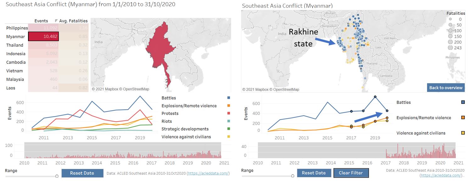
Figure 87: Observation for Myanmar
Ethnically motivated attack on Rohingya Muslims by government official and state security forces has been a prolonged issue in Myanmar. From the spatio-temporal analysis below, we observe relatively intense conflict in 2012, involving sectarian clashes between ethnic Rakhine Buddhists and Rohingya people, which resulted in confinement of displaced Rohingya people in government-setup internment camp. This is followed by a relatively calm period before it started to get brutal from 2016 onwards, with clashes between Arakan Rohingya Salvation Army (ARSA) and state forces started in October 2016.
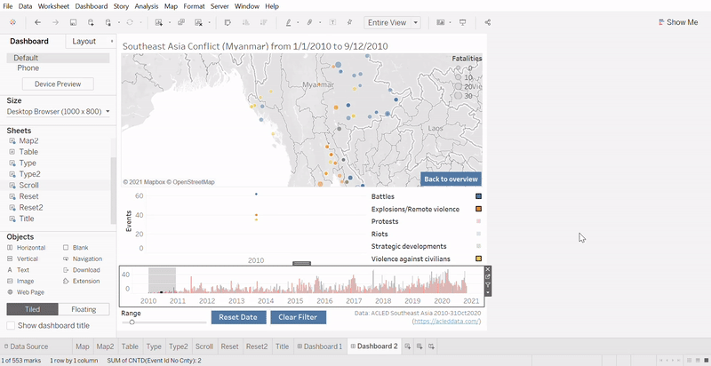
Figure 88: Violent events throughout 10-year period in Rakhine state
5. Conclusions
In summary, a critique on the original dashboard for spatio-temporal analysis of conflict in Southeast Asia was done based on the clarity, aesthetic, and interactivity aspects. An alternative dashboard design was proposed, with step-by-step development in Tableau provided in details. The advantages of proposed dashboard was also elaborated, together with new observations that may not be apparent in the original dashboard.
Any suggestion and feedback is much appreciated! Email: kevin.albindo@gmail.com
References
Tableau idea and inspiration:
http://www.codewander.com/makeover-monday-week-4-tableau/
https://www.tessellationtech.io/tableau-animations-scrolling-bar-chart/
https://www.thedataschool.co.uk/chris-meardon/button-based-parameter-actions
https://community.tableau.com/s/question/0D54T00000C6eyi/how-to-highlight-action-filter-without-greyed-out-caption
Observations:
https://www.hrw.org/tag/philippines-war-drugs
https://www.theguardian.com/world/2017/oct/12/philippines-rodrigo-duterte-police-war-drugs
https://www.garda.com/crisis24/news-alerts/387501/thailand-protests-to-be-held-nationwide-october-9-14-update-1
https://www.hrw.org/report/2020/10/08/open-prison-without-end/myanmars-mass-detention-rohingya-rakhine-state
Tool for creating gif: https://ezgif.com/video-to-gif